Table of Contents >> Show >> Hide
- Quick Prep: 4 Rules That Make Dark Cabinets Look Designer-Level
- 1) Warm White Walls + Dark Cabinets + Brass Hardware
- 2) Cream + Greige + Dark Cabinets (The “Soft-Neutral Sandwich”)
- 3) Sage or Soft Olive Walls + Light Counters + Dark Cabinets
- 4) Dusty Blue-Gray Walls + Dark Cabinets + Polished Nickel
- 5) Navy Accents + White + Dark Wood (Preppy, But Make It Kitchen)
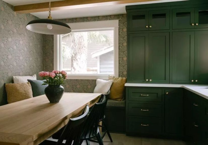
- 6) Emerald or Forest Green + Dark Cabinets (Jewel-Tone Drama)
- 7) Terracotta + Warm White + Dark Cabinets (Mediterranean Cozy)
- 8) Mustard/Ochre Accents + Soft Neutral Walls + Dark Cabinets
- 9) Blush, Ballet Pink, or Pink-Toned White + Dark Cabinets
- 10) Charcoal-on-Charcoal (Monochrome, Textured, and Very Cool)
- 11) Black + Natural Wood + Linen White (Modern Organic)
- 12) Teal Accents + Bright White Backsplash + Dark Cabinets
- 13) Merlot/Burgundy Accents + Dark Cabinets + Creamy Stone
- 14) The “Tuxedo Kitchen”: Dark Lowers + Light Uppers + One Bridging Element
- 15) Stone-Forward Neutrals: Taupe + Warm Gray + Dark Cabinets
- Common Mistakes (and How to Avoid Them Without Crying)
- Conclusion: Your Best Palette Is the One That Fits Your Light, Layout, and Lifestyle
- Extra: Real-World Experience Notes (About )
Dark cabinets are the kitchen equivalent of a good leather jacket: timeless, flattering, and somehow they make everything around them look more interesting.
But they do come with one tiny request: “Please don’t pair me with the wrong colors and then blame me for the vibe.”
If your kitchen has espresso, walnut, deep charcoal, or true-black cabinetry, the right palette can make it feel airy, luxe, cozy, modern, or all of the above.
The wrong palette can make it feel like you’re cooking in a stylish cave (fun for bats, less ideal for breakfast).
Below are 15 color schemes that consistently make dark kitchen cabinets look intentional and expensivewhether you’re repainting walls, picking a backsplash,
swapping hardware, or finally deciding what your countertops should be (no judgmentwe’ve all stared at quartz samples like they’re going to blink first).
Quick Prep: 4 Rules That Make Dark Cabinets Look Designer-Level
1) Match undertones, not just “light vs. dark.”
Dark cabinets can lean warm (chocolate, walnut) or cool (charcoal, blue-black). Your walls and counters should share a similar temperatureor deliberately
contrast in a controlled way (like warm brass against cool charcoal).
2) Use contrast to control the mood.
Want crisp and bright? Go high-contrast: warm white walls, reflective backsplash, light counters. Want cozy and moody? Go lower-contrast: mid-tone walls,
textured tile, layered lighting.
3) Add shine somewhere.
Dark cabinetry loves reflectivitypolished hardware, glossy tile, light quartz, glass pendants. Think of shine as your kitchen’s “ring light.”
4) Pick a “hero surface” and let the rest support it.
If the cabinets are the hero, keep counters/backsplash calmer. If the backsplash is dramatic, let the walls be quiet. Kitchens are like group projects:
too many leaders, and everyone gets stressed.
1) Warm White Walls + Dark Cabinets + Brass Hardware
This is the crowd-pleaser: bright, classic, and ridiculously easy to refresh. Warm whites keep dark cabinetry from feeling heavy, while brass adds instant
warmth and a “custom kitchen” vibe.
Try it with
Walls in a soft warm white (think creamy, not icy), light quartz or marble-look counters, and satin brass pulls. Add wood accents (cutting boards, stools)
to keep it from feeling too stark.
2) Cream + Greige + Dark Cabinets (The “Soft-Neutral Sandwich”)
If pure white feels too sharp, go cream-and-greige. Greige brings depth without going gloomy, and it plays nicely with both warm and cool dark cabinet stains.
The overall effect: calm, elevated, and very “I totally have my life together.”
Try it with
Greige walls, creamy trim, and a backsplash in a warm off-white tile. Hardware can go either waybrass for warmth or matte black for modern edge.
3) Sage or Soft Olive Walls + Light Counters + Dark Cabinets
Green is the ultimate “nature neutral.” Soft sage and muted olive tones bring balance to dark cabinets and look especially good with stone countertops.
It’s cozy without being brown, fresh without being minty.
Try it with
Sage walls, white quartz counters, and a simple backsplash (subway, zellige-style, or a slab). Brass hardware makes it feel warm; nickel keeps it crisp.
4) Dusty Blue-Gray Walls + Dark Cabinets + Polished Nickel
Blue-gray is a flattering backdrop for dark cabinets, especially if your cabinetry is charcoal or blue-black. It adds color without shouting, and polished
nickel brings a clean sparkle that reads “tailored.”
Try it with
Blue-gray walls, a white backsplash, and a light-to-mid countertop (white quartz, pale granite, or marble-look). Keep decor simple: glass, stainless, and linen.
5) Navy Accents + White + Dark Wood (Preppy, But Make It Kitchen)
If your cabinets are dark wood (walnut/espresso), navy is a sophisticated accent color that feels classic. Use it on an island, bar stools, or even a runner.
The combo looks intentional and layered.
Try it with
White walls, dark wood cabinets, navy textiles, and a backsplash with subtle movement (marble veining or handmade-look ceramic). Add brass for warmth.
6) Emerald or Forest Green + Dark Cabinets (Jewel-Tone Drama)
Want your kitchen to feel like a boutique hotel lobbyin a good way? Jewel-tone green does that. Use it on walls, an island, or a statement backsplash
while keeping counters light enough to prevent visual overload.
Try it with
Deep green paint on a focal wall or island, creamy counters, and gold/brass accents. Add a few black details (faucet, pendants) to tie everything together.
7) Terracotta + Warm White + Dark Cabinets (Mediterranean Cozy)
Terracotta and clay tones make dark cabinets feel warmer and more invitingespecially with natural wood floors or warm tile. This scheme is perfect for
people who want “cozy” without “beige overload.”
Try it with
Warm white walls, terracotta accents (tile, rug, pottery), and a creamy backsplash. Bonus points for arched details or wood open shelving.
8) Mustard/Ochre Accents + Soft Neutral Walls + Dark Cabinets
A little mustard goes a long way. It adds sunshine to dark cabinetry without turning your kitchen into a condiment aisle. Keep mustard as an accentthink
stools, art, textiles, or a small tiled niche.
Try it with
Neutral walls (warm white or light beige), dark cabinets, and a simple backsplash. Add wood tones to ground the yellow and prevent it from feeling too punchy.
9) Blush, Ballet Pink, or Pink-Toned White + Dark Cabinets
Hear me out: pink can be neutral when it’s soft and dusty. Pink-tinted whites and pale blush tones make dark cabinets feel warmer and more modernespecially
with brass or champagne bronze hardware.
Try it with
Pink-toned walls, white counters, and a backsplash with gentle texture (handmade-look tile). Keep the rest grounded with natural wood and black accents.
10) Charcoal-on-Charcoal (Monochrome, Textured, and Very Cool)
If you love moody kitchens, go monochromebut layer textures so it doesn’t look flat. Matte cabinets + honed stone + ribbed glass + plaster-like walls
create depth without needing bright colors.
Try it with
Charcoal walls, dark cabinets, and a countertop that has subtle movement (soapstone look, black quartz with soft veining). Add lighting like your happiness depends on it.
11) Black + Natural Wood + Linen White (Modern Organic)
This palette is everywhere for a reason: it’s clean, warm, and timeless. Natural wood tones (white oak, ash) keep black or very dark cabinets from feeling harsh.
Linen whites make it soft and livable.
Try it with
Linen-white walls, natural wood shelves or stools, and black or dark cabinets. Add a backsplash in creamy stone or warm white tile with subtle variation.
12) Teal Accents + Bright White Backsplash + Dark Cabinets
Teal is a fun way to energize dark cabinets without going neon. Use teal in controlled doseslike accessories, art, or a patterned runnerwhile the backsplash
stays bright and simple.
Try it with
White subway tile (classic), a light countertop, and teal accessories. If you want bolder: try a teal-glazed backsplash tile and keep walls soft white.
13) Merlot/Burgundy Accents + Dark Cabinets + Creamy Stone
Rich red-brown accents (merlot, oxblood, deep burgundy) pair beautifully with dark cabinets when the rest of the room stays creamy and warm. Think: a vintage rug,
leather stools, and warm metals.
Try it with
Cream walls, warm stone counters, burgundy accents in textiles, and brass or antiqued hardware. It’s classic, but with a little “plot twist.”
14) The “Tuxedo Kitchen”: Dark Lowers + Light Uppers + One Bridging Element
Two-tone cabinetry is a smart way to keep dark cabinets grounded without making the whole room feel dark. The key is a bridging element that connects the two
like matching hardware, a continuous countertop, or consistent wood flooring.
Try it with
Dark base cabinets, warm white uppers, and a backsplash that ties into both (white tile with dark grout, or marble that includes soft gray veining).
15) Stone-Forward Neutrals: Taupe + Warm Gray + Dark Cabinets
If your countertop is the starespecially if it’s dramatic quartz or granitelean into stone-friendly neutrals. Taupe and warm gray make dark cabinets feel rich
and grounded while letting the veining do the talking.
Try it with
Warm gray walls, a backsplash that matches the counter (slab or simple tile), and hardware in brushed nickel or mixed metals. Keep decor minimal so the stone shines.
Common Mistakes (and How to Avoid Them Without Crying)
Mistake 1: Choosing a cool white that turns the kitchen “icy cave.”
Some bright whites can look clinical next to dark cabinets. If your cabinets are warm-toned, pick a warm white. If your cabinets are cool, choose a soft white
with a gentle undertone (not a blinding, blue-leaning white).
Mistake 2: Going dark everywhere without adding enough lighting.
Dark cabinets plus dark walls plus dark counters can look stunning in photosbecause photos don’t have to chop onions at 7 p.m. Add layered lighting: under-cabinet,
pendants, and warm overheads. Also, reflective finishes (glossy tile, metallics) help bounce light.
Mistake 3: Ignoring durability and maintenance.
Very dark painted cabinetry can show chips and dings more easily than stained wood or mid-tone colorsespecially in busy kitchens.
If your household treats cabinet corners like bumper cars, consider touch-up plans, a more forgiving finish, or stain where possible.
Conclusion: Your Best Palette Is the One That Fits Your Light, Layout, and Lifestyle
Dark cabinets aren’t “hard to decorate”they’re just honest. They show you exactly what your walls, counters, backsplash, and hardware are doing.
Pick a scheme that matches your home’s natural light and your daily habits, then lock it in with one or two unifying choices (a consistent metal finish,
a repeating wood tone, or a backsplash that ties it together).
Whether you go crisp white and brass, moody monochrome, or warm clay tones, the goal is the same: make your dark cabinetry look like it belongs there on purpose.
Because it does. (And because your cabinets deserve better than being blamed for “the vibe.”)
Extra: Real-World Experience Notes (About )
After seeing a lot of dark-cabinet kitchens in real homes (and not just perfectly staged photos where nobody owns a toaster), a few patterns show up again and again.
First: lighting is not optional. A kitchen with espresso cabinets and a single ceiling light will feel like you’re preparing dinner in a tasteful eclipse.
The fix isn’t always “repaint everything.” Often it’s adding under-cabinet lighting, swapping bulbs to a warmer temperature, and choosing a backsplash with
a bit of sheen. Even basic white tile can reflect light like it’s trying to help.
Second: undertones are sneaky. People pick “white” paint, then wonder why it looks blue next to their dark walnut cabinets. Or they choose a trendy gray
and it suddenly turns lavender in the afternoon. The easiest workaround is the unglamorous one: sample boards. Paint a couple of big swatches on poster board
(not the wall), tape them up, and look at them in the morning, afternoon, and at night. If a color behaves like a moody teenagersweet at 10 a.m., dramatic at 8 p.m.
you’ll know before it costs you a weekend of repainting.
Third: dark cabinets don’t automatically mean “modern.” I’ve seen deep-stained cabinets look rustic, traditional, coastal, and ultra-minimal depending on what’s paired
with them. That’s why hardware matters so much. Warm brass makes dark cabinets feel classic and inviting; polished nickel feels crisp and tailored; matte black can look
modern and graphic. Switching hardware is one of the fastest ways to “change the whole kitchen” without changing the whole kitchen.
Fourth: countertops can either calm the room down or turn it into a high-stakes design argument. If your cabinets are dark and your countertop is also dark, it can be
gorgeousespecially in a monochrome lookbut only if you add contrast somewhere else (backsplash, walls, floors, or lighting). For most everyday kitchens, a lighter
countertop is the easiest path to “bright but still dramatic.” And if you’re choosing a bold countertop with strong veining, keep the backsplash quieter so you don’t end
up with competing patterns that make your eyes tired before dinner is even ready.
Finally: plan for real life. Very dark painted cabinets can show chips more easily, and glossy finishes reveal fingerprints like they’re collecting evidence.
If you have kids, pets, roommates, or a habit of opening drawers with your elbow while holding groceries, forgiving finishes and easy-to-clean surfaces are your friends.
The best color scheme is the one that still looks great when the dishwasher is open, the coffee maker is steaming, and somebody just walked in asking what’s for dinner.