Table of Contents >> Show >> Hide
Packaging is supposed to do a few simple jobs: protect the product, explain what you are buying, and help you get it home without turning your trunk into a confetti cannon of plastic film. But somewhere along the way, many brands decided packaging should also perform magic tricks. It should make six ounces look like twelve. It should make “barely recyclable” feel like “planet-saving.” It should make the same old product seem bigger, fancier, greener, and more luxurious than it really is. In other words, it should sell first and tell the truth later.
That is where the ethics problem begins. When companies use packaging design to exaggerate value, hide shrinkflation, blur recyclability, or dress waste up as premium branding, they are not just making aesthetic choices. They are making moral ones. A bigger box, a false bottom, a roomy snack bag, a vague leaf icon, or a “store drop-off” label that sends consumers on a field trip to nowhere can all shape what people believe they are buying. The product inside may be legal, but the impression outside can still be deeply misleading.
Consumers are tired of paying for air, decoding microscopic labels, and being guilt-tripped by eco-language that sounds noble but collapses under daylight. So here is a closer look at 50 common ways companies let profit call the shots while packaging ethics gets shoved into the recycling bin.
Why Packaging Ethics Matter More Than Brands Like to Admit
Packaging is not neutral. It influences price perception, trust, convenience, waste, and even whether a customer believes a product is environmentally responsible. When packaging is oversized, confusing, or wasteful by design, shoppers lose twice: once at checkout and again when they are left with trash they did not need in the first place. Ethical packaging is not about making everything ugly and brown like it came from a monastery gift shop. It is about honesty, clarity, and restraint. If the package creates a false impression, that is not clever branding. That is manipulation wearing a designer jacket.
50 Times Companies Put Profits Above Ethics With Their Packaging Designs
Making Tiny Products Look Like Big Deals
- The oversized chip bag. A puffed-up bag can make a small serving look like a family event, only for the buyer to discover that half the experience is seasoned oxygen.
- The giant cereal box with a modest interior. The package stands tall on the shelf, but the actual contents sit low enough to need emotional support.
- The false-bottom carton. A brand adds extra depth where shoppers cannot easily see it, creating the illusion of more product without the burden of actually providing it.
- The thick-walled jar trick. Glass or plastic is made unusually heavy and bulky so a tiny amount of cream or sauce looks “substantial.”
- The tray that is mostly empty space. Snacks, candy, and cosmetics often sit in custom-shaped plastic cradles that protect the product from absolutely nothing except honest expectations.
- The wide-mouth illusion. A container opens with a broad dramatic flourish, while the usable product sits at the bottom like a sad little afterthought.
- The luxury box for a tiny accessory. Earrings, chargers, or beauty tools sometimes arrive in boxes large enough to qualify as studio apartments.
- The windowed box with strategic angles. A clear cutout reveals the fullest-looking part of the product while hiding how little is actually inside.
- The stacked insert scam. Cardboard risers or molded inserts lift products upward to make the package seem fuller than reality.
- The “value size” bluff. The words shout bargain, but the net weight whispers, “Please compare me carefully before I embarrass myself.”
Hiding Shrinkflation in Plain Sight
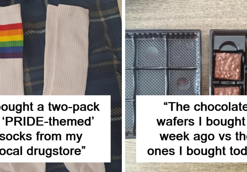
- The same package, less product. Brands reduce ounces, sheets, or pieces while keeping the box nearly identical so customers do not notice until later.
- The bottle that got slimmer by stealth. It still looks familiar in the hand, but the contents have quietly gone on a budget diet.
- The “new look” distraction. A redesign arrives at the exact moment the amount shrinks, because apparently graphics can be used as camouflage.
- The roll-count math circus. Toilet paper and paper towels love to announce that 12 rolls are somehow equal to 48, 72, or the moon landing.
- The serving-size shuffle. Companies keep the front-of-pack claims cheerful by changing the serving size instead of the value proposition.
- The package that stays tall but gets shallower. Shelf presence remains dramatic while the volume sneaks away through dimensional trickery.
- The candy bar slimming act. Same wrapper, same price, slightly less chocolate, and suddenly the consumer becomes an unwilling participant in portion-control theater.
- The multipack with smaller units. The outer box still feels big, but every individual pouch inside has been put on an austerity plan.
- The “bonus” claim after a reduction. Brands shrink a product, then later re-add a little and market it like a gift from the heavens.
- The visual overstatement of quantity. Front-of-pack imagery shows piles, scoops, or overflowing bowls that bear only a philosophical relationship to what is inside.
Greenwashing the Guilt Away
- The vague “eco-friendly” label. It sounds reassuring, means almost nothing by itself, and is often used precisely because it sounds better than facts.
- The leaf icon with no context. A few green graphics can make virgin plastic look like it grew on a kindly little farm.
- The chasing-arrows halo. A recycling symbol on packaging can create confidence even when the item is rarely accepted or processed in real-world systems.
- The “store drop-off recyclable” scavenger hunt. If a package is only recyclable after a special trip to a participating location that may not actually recycle it, the claim deserves side-eye.
- The paper-looking pouch lined with plastic. It feels earthy and wholesome until you realize it is a materials mash-up that recycling programs generally loathe.
- The “compostable” item that needs industrial composting. Many shoppers hear “compostable” and think backyard bin, not specialized facility with limited access.
- The refill pouch that is less recyclable than the original bottle. It uses less material, sure, but if it becomes unrecoverable trash, the environmental brag deserves an asterisk the size of Nebraska.
- The “made with recycled content” victory lap. A tiny percentage gets celebrated like a heroic turnaround while the rest of the package remains business as usual.
- The earthy color palette as evidence. Beige, sage, and kraft-paper vibes are not sustainability metrics, no matter how convincingly they cosplay as moral virtue.
- The “plastic neutral” aura. Offsetting language can make ongoing waste sound solved when it often functions more like brand deodorant than structural reform.
Choosing Waste Because Waste Looks Premium
- The box inside a box inside a sleeve. Some products arrive nested like Russian dolls of unnecessary expense and landfill ambition.
- The magnetic luxury box. It feels upscale, photographs beautifully, and is much harder to recover responsibly than a simpler design.
- The velvet tray for a mass-market item. When a basic product comes on a plush insert, the company is not protecting quality; it is manufacturing drama.
- The plastic shell around a cardboard box. Double packaging often exists because the first layer was not deemed theatrical enough.
- The individually wrapped everything trend. Single cookies, tea bags, wipes, and candies get nested in layer after layer until convenience becomes absurdity.
- The sampler pack that creates a small mountain of waste. Variety is fun, but not when every mini-unit arrives armored for battle.
- The e-commerce box for an item that could have shipped in a mailer. Sometimes brands are not shipping products; they are shipping air with confidence.
- The decorative plastic window. It adds visual appeal while making an otherwise recyclable paper package harder to process.
- The black plastic tray problem. Dark packaging can look sleek and expensive while creating headaches for sorting systems that cannot reliably detect it.
- The “giftable” everyday package. When routine household goods get dressed like luxury presents, shoppers usually end up paying more for the costume than the performance.
Designing Confusion, Frustration, and Waste Into the Experience
- The impossible clamshell. Hard plastic packs can be so difficult to open that they practically require a toolkit and a tetanus plan.
- The tiny net-weight disclosure. The truth is technically present, just not in a form designed for human beings shopping under fluorescent lights.
- The front label that screams while the back label confesses. Brands use the front for seduction and the back for legal survival.
- The deliberately confusing unit comparison. Price-per-ounce, count-per-pack, and equivalent-size language can be arranged so comparison shopping feels like an SAT section.
- The “resealable” package that barely reseals. A flimsy closure suggests freshness and convenience, then fails after one use like a paper umbrella in a hurricane.
- The tamper-evident theater. Some packages add layers that look protective but mostly increase waste and consumer hassle without meaningful benefit.
- The pump bottle that strands product. If the design prevents buyers from accessing the last chunk of lotion, sauce, or soap, that is not elegance. That is engineered leftovers.
- The opaque bottle that hides remaining quantity. You cannot judge how much is left, which makes it easier to buy early and waste what remains.
- The “family pack” that discourages portion awareness. Massive containers may seem economical, but they often fuel overbuying, spoilage, and unnecessary material use.
- The package that turns disposal into homework. If recycling or separating components requires a tutorial, the design has failed ordinary people while pretending to empower them.
Why These Packaging Tricks Keep Working
The answer is depressingly simple: packaging works fast. Most shoppers are making decisions in seconds, not staging a forensic investigation in the snack aisle. A larger-looking bag signals abundance. Green graphics suggest responsibility. Premium materials imply quality. Familiar shapes reduce scrutiny. That means brands can get a lot of mileage from impressions alone, even when the measurable value is less impressive than the photo on the front panel.
There is also a loophole culture at play. Companies know they do not always need to tell a direct lie if the design itself does the misleading for them. A package can be technically compliant and still leave the average buyer with a distorted understanding of quantity, recyclability, or overall value. That gap between literal accuracy and practical honesty is where many of the ugliest packaging decisions thrive.
Truly ethical packaging would look boring to the wrong kind of executive. It would be right-sized, plainly labeled, easy to compare, realistic about disposal, and designed around real consumer use rather than shelf illusions. It would not require a decoder ring, a separate trip to a specialty bin, or a pair of industrial scissors. It would respect the customer’s money, time, and intelligence. Which, apparently, is a lot to ask from a box of crackers.
What Shoppers Actually Experience When Packaging Ethics Go Missing
Most people do not describe packaging as an ethical issue at first. They describe it as annoying. They say things like, “Why is this box so huge?” or “Didn’t this used to have more in it?” or “Why do I need a knife, scissors, and the patience of a saint just to open a USB cable?” That irritation matters because it is usually the first sign that a company designed a package to serve sales optics more than real-life use.
Think about the everyday experience. You buy a bag of snacks that looks generous on the shelf, toss it in your cart, and imagine sharing it during movie night. Then you open it and realize the company has sold you a gust of air with some chips rattling around at the bottom like loose change. The same thing happens with cereal, candy, frozen food, cosmetics, and supplements. The disappointment is small in the moment, but repeated over dozens of purchases, it creates a low-grade mistrust that sticks to the brand.
Then there is the slow-burn frustration of shrinkflation. A shopper does not always notice the first time a package gets smaller. The label still looks familiar. The color is the same. The mascot is still smiling like nothing happened. But eventually the product seems to run out faster, the rolls feel shorter, the bottle empties sooner, and the weekly grocery bill starts acting like it got a promotion. Consumers are not just reacting to inflation; they are reacting to the feeling that someone tried to sneak past them wearing a nametag that says “New Look!”
The environmental angle adds another layer of fatigue. Many shoppers genuinely want to make better choices. They look for recyclable packs, refill systems, paper alternatives, and lower-waste options because they are trying to be responsible. When brands use vague green language or misleading icons, they hijack that good faith. A customer believes they are doing the right thing, only to discover later that the package is accepted almost nowhere, needs a specialized composting facility, or is made from mixed materials that ordinary recycling systems cannot handle. That does not just create trash. It creates cynicism.
And cynicism spreads. Once people start believing every eco-claim is marketing perfume, even genuinely better packaging has a harder time earning trust. That is one of the most damaging side effects of unethical packaging design: it punishes honest brands by making consumers suspicious of everyone. In that sense, deceptive packaging is not just rude to buyers. It is corrosive to the whole market.
There is a physical cost, too. Overbuilt packaging fills trash cans faster, clutters kitchens, and wastes storage space. Older adults, people with arthritis, and busy parents often bear the brunt of impossible seals, rigid clamshells, and fiddly closures. What looks sleek in a product meeting can become a genuine barrier in a real household. Ethical packaging is not merely a sustainability issue or a pricing issue. It is also an accessibility issue.
In the end, the lived experience is simple: shoppers want packaging that tells the truth, opens without drama, protects the product without staging an Oscar campaign, and can be disposed of without requiring a research fellowship. That is not anti-business. It is pro-respect. And if more brands remembered that, consumers might stop approaching every oversized box like it is about to insult them personally.
Conclusion
Packaging design can be smart, useful, beautiful, and environmentally responsible all at once. But when companies let profit outrank honesty, packaging becomes a quiet little con artist. It flatters the shelf, distorts value, inflates sustainability claims, and leaves customers paying for confusion, waste, and disappointment. The worst part is that many of these tricks are so common they start to feel normal. They should not. Consumers deserve packaging that communicates clearly, wastes less, and respects both their intelligence and their wallets. Until that becomes the standard, suspiciously roomy boxes and noble-sounding green labels will keep doing what they do best: smiling politely while they pick your pocket.
Note: This article is intended for informational publishing purposes and is based on public reporting, regulatory guidance, and widely discussed packaging practices in the U.S. market. It avoids raw source links for cleaner web publication.