Table of Contents >> Show >> Hide
- Secret #1: Choose a Hue With a Job Description (Not Just a Vibe)
- Secret #2: Start Small, Then Graduate to Full-On Color Drenching
- Secret #3: Build a 5-Step Shade Ladder (So the Room Has Depth)
- Secret #4: Texture Is What Keeps Monochrome From Looking Like a Spreadsheet
- Secret #5: Mix Finishes and Sheens Like You Mean It
- Secret #6: Ground the Room With a “Rule-Breaker” Accent (Usually Black)
- Quick Room Recipes (So You Can Picture It)
- Conclusion: Monochrome Works When You Build Dimension on Purpose
- Experiences & Field Notes: What Really Happens When You Go Monochromatic (and How to Fix It)
A monochromatic room sounds simple: pick one color, repeat until your paint store starts greeting you by name. And yet, “simple” is exactly how people end up with a space that looks like a giant sticky noteor worse, a perfectly nice room that somehow feels like it’s holding its breath.
Done well, monochromatic interior design is the ultimate cheat code: cohesive, calming, and quietly expensive-looking. Done poorly, it’s a one-note song that won’t leave your head. The difference isn’t luckit’s a handful of pro moves designers use to make a single-hue palette feel layered, intentional, and alive.
Below are six designer-grade secrets for nailing a monochromatic color scheme (without turning your home into a showroom mannequin). You’ll get practical rules, specific examples, and the kind of “why didn’t anyone tell me this sooner?” details that save time, money, and emotional energy.
Secret #1: Choose a Hue With a Job Description (Not Just a Vibe)
The first mistake people make is choosing a color like they’re picking an ice cream flavor: “This one is pretty!” Sure. But what is the room supposed to do? A monochromatic room magnifies mood, so your hue needs a clear role.
Match the color to the room’s mission
- Bedrooms, reading nooks: cooler, muted tones (think smoky blue-gray or soft sage) for calm.
- Dining rooms, studies: warmer tones or jewel shades for drama and presence.
- Living rooms: mid-tone neutrals (taupe, caramel, warm greige) for flexibility and warmth.
Light is the bossact accordingly
A color that looks rich at noon can look like wet cardboard at 7 p.m. Natural light, direction of windows, and bulb temperature all change how your “one color” reads. North-facing rooms often need warmer undertones to feel welcoming; rooms with intense sunlight can handle deeper saturation without feeling heavy.
Pro move: pick two close candidates, sample them, and look at them in the morning, afternoon, and at night. If one option is doing weird things under lamplight, it’s not “your imagination.” It’s physicsand physics always wins.
Secret #2: Start Small, Then Graduate to Full-On Color Drenching
If monochromatic room design feels intimidating, don’t start with your open-concept living/dining/kitchen mega-space. Start with a room that’s already naturally “contained.” Small rooms are where monochrome looks most intentional and least risky.
The best beginner rooms
- Powder rooms and bathrooms (they love bold moves)
- Bedrooms (cozy is the point)
- Entryways (instant personality, minimal furniture required)
Once you’re comfortable, you can try color drenching: painting walls, trim, and even the ceiling in the same hue (or near-identical variations). This is where monochrome goes from “nice” to “wow.” It can also blur visual edges, making a small space feel larger and more envelopinglike stepping into a designed moment instead of just “a room.”
The key is commitment. A half-hearted monochrome reads like you ran out of paint or confidence. A fully considered one reads like you hired someone with a tape measure and opinions.
Secret #3: Build a 5-Step Shade Ladder (So the Room Has Depth)
A monochromatic scheme isn’t “one color everywhere.” It’s one hue expressed through tints (lighter), tones (muted with gray), and shades (deeper). Think of your palette like a staircaseif every step is the same height, you’re not climbing anywhere.
The “paint-strip” method designers love
Paint brands literally organize colors on strips from light to dark. Use that to your advantage: choose a strip, then pull multiple values from itat least five if you want the room to feel layered instead of flat.
A simple formula that works in real rooms
- One light value (ceiling, large rug base, or sheer curtains)
- Two mid values (walls, sofa, bedding, main drapery)
- Two deep values (accent chair, headboard, built-ins, artwork frames)
Example: you want a blue monochromatic bedroom. Instead of buying “blue stuff,” you plan it: pale misty blue on the ceiling, a medium denim-blue wall, a muted slate quilt, deeper navy pillows, and a nearly-ink lamp shade or side table. Suddenly it feels intentional, not accidental.
Bonus pro tip: when you’re unsure, let the largest surfaces stay mid-to-light and save your darkest shade for the pieces that create punctuation (like a chair, a console, or a bold art frame).
Secret #4: Texture Is What Keeps Monochrome From Looking Like a Spreadsheet
When color contrast is limited, texture becomes the drama. This is the heart of tone-on-tone decor: your eye needs something to do besides stare at “the same color” like it’s waiting for a twist ending.
Texture checklist (steal this)
- Soft texture: bouclé, velvet, chenille, brushed cotton
- Natural texture: linen, wool, jute, sisal, rattan, cane
- Hard texture: wood grain, stone veining, ribbed glass, ceramic
- Wall texture: grasscloth, plaster, paneling, subtle pattern wallpaper
The magic is mixing “quiet” materials with “interesting” materials. A beige monochromatic living room can look pricey if it includes boucle pillows, a linen sofa, a chunky wool rug, and a little stone or travertine on the coffee table. Same color familycompletely different sensory experience.
Patterns are allowed (yes, even in monochrome)
If you’re allergic to “busy,” pick a pattern that reads like a texture: tone-on-tone stripes, subtle geometrics, small-scale prints in the same palette. It adds movement without breaking the monochromatic look. Think of it as your room whispering instead of shouting.
Secret #5: Mix Finishes and Sheens Like You Mean It
The fastest way to make a monochromatic room look flat is using the same finish everywhere. Professionals mix paint sheen, surface reflectivity, and material finishes so the room shifts as you move through it. That subtle variation is what makes monochrome feel “designed.”
Paint sheen: the low-key hero
- Walls: matte or eggshell (soft, forgiving, cozy)
- Trim/doors: satin or semi-gloss (crisper definition)
- Ceiling: flat for calmor higher sheen if you want drama and bounce
Even if the color is identical, sheen changes how light hits the surface. Matte absorbs; satin reflects. That’s instant dimension without adding a single “accent color.”
Reflective elements prevent monochrome from feeling heavy
This matters especially with darker palettes (charcoal, forest, navy, black). Add reflective notes: glossy tile, a big mirror, polished metal, glass lighting, lacquered accessories. The room stops feeling like a cave and starts feeling like a moody boutique hotel.
Finish mixing without chaos
Keep the undertones consistent (warm with warm, cool with cool), then play with finish: brushed brass + matte ceramics + ribbed glass + a little polished stone. Same color story, different shine levels. Your room will look “collected,” not “catalog.”
Secret #6: Ground the Room With a “Rule-Breaker” Accent (Usually Black)
Here’s the truth designers won’t say out loud at the paint counter: the best monochromatic rooms aren’t perfectly monochromatic. They just look like they arebecause the rule-breakers are strategic.
The easiest grounding accent: black (or near-black)
A small dose of black adds structure and contrast without turning your scheme into a rainbow. Think: picture frames, cabinet hardware, a reading lamp, a slim side table, or a dark vase. It’s like eyeliner for your roomeverything looks sharper, and nobody asks why you did it.
One tiny contrasting moment can make the monochrome feel richer
If you’re working with warm neutrals, a cool-toned white or a small black accent can keep the space from feeling dated or overly “beige-on-beige.” If you’re doing deep green, a touch of natural wood or a muted blush artwork can create that “healthy tension” that makes a room feel alive.
The rule: keep your accent small and intentionallike a sentence-ending period, not a plot twist. If it’s taking over, it’s no longer an accent; it’s a second theme.
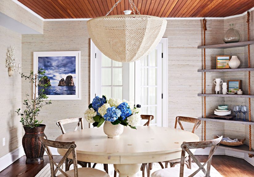
Quick Room Recipes (So You Can Picture It)
1) Cozy Greige Living Room (Warm, inviting, not boring)
- Walls: mid-tone greige
- Sofa: slightly lighter oatmeal fabric
- Rug: chunky wool in a pale warm neutral
- Texture: boucle pillows + linen drapes + wood coffee table
- Accent: black metal floor lamp + thin black frames
2) Blue Monochromatic Bedroom (Calm, modern, grown-up)
- Walls: denim-blue
- Ceiling: misty blue (lighter value)
- Bedding: slate + navy layering
- Texture: velvet throw, ribbed glass lamp, woven rug
- Accent: a single warm brass sconce for glow
3) Green Color-Drenched Study (Moody, sophisticated)
- Walls/trim: same green hue, different sheen for trim
- Built-ins: slightly deeper shade of the same green
- Texture: leather chair, wool rug, subtle patterned drapery
- Reflectivity: large mirror or glass-front cabinet doors
- Accent: black hardware + one bold art piece
Conclusion: Monochrome Works When You Build Dimension on Purpose
The secret to a successful monochromatic room isn’t owning 47 objects in the same color family. It’s choosing a hue that fits the room’s purpose, building a ladder of values, and letting texture and sheen do the heavy lifting. Then you add one or two grounding accents so the space feels finishednot fuzzy around the edges.
Monochromatic design is less about restriction and more about control. When you control value, texture, and finish, you get a room that feels cohesive, stylish, and surprisingly personal. Also, your future self will thank you when decorating gets easier instead of harder.
Experiences & Field Notes: What Really Happens When You Go Monochromatic (and How to Fix It)
In real homesnot magazine spreadsmonochromatic rooms teach a few lessons fast. The first is that your “perfect” color will behave differently across surfaces. Walls, trim, ceiling, upholstery, and rugs don’t just show color; they translate it. A paint shade that looks velvety on a wall can look harsher on glossy trim, and the same “white” can suddenly lean pink next to warm wood floors. The fix is simple but unglamorous: test, then test again. Put samples on multiple walls, view them at different times, and don’t decide based on a single sunny afternoon when everything looks charming.
The second experience people run into is the “flat pancake” problem: everything technically matches, but the room has no depth. This usually happens when the palette has only two valueslight and medium, or medium and darkand no real range. You’ll know it’s happening when the room feels oddly unfinished, like it’s waiting for furniture that never arrived. The fastest fix is adding one deeper anchor (a near-black frame, a dark side table, a deep-toned pillow) and one lighter lift (sheer curtains, a pale rug, a light lampshade). That extra value spread gives your eyes a path to travel, which makes the space feel layered instead of stuck.
Another common moment: you fall in love with color drenching, do it, then realize the room feels smalleror just intense. This is especially true with very dark colors in rooms with limited natural light. If you love the drama but not the “did the walls move closer?” sensation, you don’t have to undo the whole thing. Add reflectivity: a big mirror, glossy ceramics, metallic accents, glass lighting, even a higher-sheen finish on trim. Reflective surfaces bounce light around and prevent deep monochrome from swallowing the room whole.
Then there’s the beige-on-beige trap. A monochromatic neutral room can feel timeless, but if everything is the same “builder neutral” (similar value, similar texture, similar finish), it can read stale. The fix isn’t adding bright colorunless you want tobut adding personality through materials and shapes. Swap one smooth, predictable fabric for something tactile (bouclé, nubby linen, chunky knit). Add sculptural forms: a curvy lamp, an interesting chair leg, a coffee table with a bold silhouette. In a monochromatic interior, shape and texture are essentially your accent colors.
A practical experience that surprises people: monotone rooms show clutter faster. When the palette is unified, the “visual noise” stands outrandom packaging, stray cords, mismatched plastic bins. The upside is that monochrome encourages better editing. A quick fix is choosing a few storage pieces that match your palette (woven baskets, lidded boxes, or bins in the same tone). Suddenly the room looks calmer without you having to become a minimalist monk.
Finally, the best real-world lesson is that monochrome gets more forgiving when you treat it as a spectrum, not a single shade. The most successful rooms aren’t chasing perfect matches; they’re building a family. When your tones share undertones and your values step gradually from light to dark, you can mix pieces from different brands, woods, and materialsand the room still looks cohesive. That’s the win: a monochromatic room that feels effortless, even though it’s secretly doing a lot of work behind the scenes.