Table of Contents >> Show >> Hide
- The Pink Chairs Heard Round the Shoreline
- Why Pink Felt So Wild in New England
- Pink Is Not the Villain People Think It Is
- Why the Gray-and-Pink Pairing Actually Works
- The Real Scandal: Taste Is Social Before It Is Personal
- How to Use Pink Outdoors Without Starting a Neighborhood Uprising
- What the Pink-Chair Affair Ultimately Teaches Us
- Extended Reflections: Living With a Color Choice That Everyone Notices
New England is many things: historic, handsome, deeply attached to weathered shingles, and occasionally so committed to tasteful restraint that a pink chair can feel like a full-blown constitutional crisis. Not a real crisis, obviously. Nobody called in the National Guard. No one had to be talked down from a widow’s walk. But in the world of coastal home design, where gray shingles and white trim often reign like a polite monarchy, one rosy design decision can absolutely become neighborhood gossip.
That is the delicious tension at the center of A Scandal in New England (Pink Paint Is Involved). The phrase sounds like the title of a lost Edith Wharton novella, yet the scandal itself is wonderfully domestic: a set of pink-painted outdoor chairs on a Connecticut porch. Small move. Big feelings. The more you think about it, the more the whole episode becomes a perfect case study in how Americans talk about color, class, tradition, and the invisible rules of good taste. In other words, this is not really a story about paint. It is a story about permission.
The Pink Chairs Heard Round the Shoreline
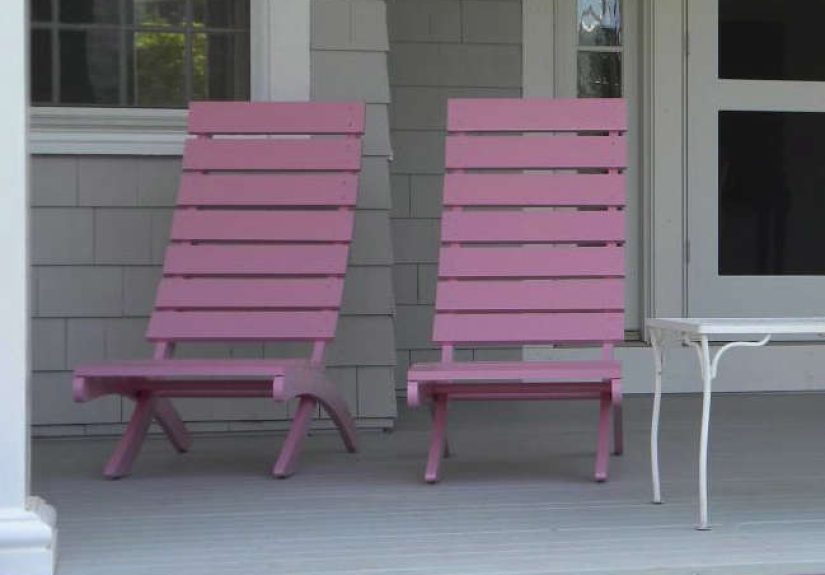
The now-famous “scandal” comes from designer and architect Christine Chang Hanway’s account of painting her deck chairs pink for a coastal Connecticut home. In her telling, the chairs became a local conversation piece: some people loved them, others very much did not, and a seemingly simple color choice turned into the kind of summer debate that flourishes in small communities with strong visual identities.
What made the choice feel so provocative was not that it was loud in the Las Vegas sense. This was not neon flamingo territory. It was softer, subtler, more nuanced than that. The chairs were chosen to work with a gray-painted house and nearby hydrangeas, which makes the decision feel less like rebellion for rebellion’s sake and more like a designer’s instinct pushed just far enough to make traditionalists nervous.
That, right there, is the magic of the story. Good design scandals are almost never about bad taste. They are about taste that lands one step outside the approved neighborhood script. A truly ugly decision unites people. A smart, slightly daring one splits the room.
Why Pink Felt So Wild in New England
To understand the fuss, you have to understand the visual language of New England homes. The region has a powerful architectural identity: clapboards, cedar shingles, white trim, black shutters, weathered grays, muted blues, oyster tones, soft beiges, and the occasional confident red door that says, “I am fun, but only within reason.” It is a landscape that prizes understatement. Houses are often expected to harmonize with sea, sky, stone walls, and history all at once. That creates beauty, yes, but it also creates unwritten rules.
Those rules are reinforced by preservation culture. Historic-home guidance often emphasizes disciplined color placement rather than random splashes of whimsy. On older houses, body color, trim color, and sash or door color each have a role to play. Accent colors can work, but only when they are applied with consistency and restraint. In other words, historic design welcomes personality; it just prefers that personality not arrive wearing tap shoes.
Coastal design conventions push things in the same direction. The classic seaside palette leans into blues, creams, taupes, grays, washed finishes, sandy neutrals, and soft greens. Even when experts encourage more color, they often recommend using it selectively on doors, furniture, and accents rather than drenching the entire exterior in boldness. So when pink shows up on a porch in a place where gray has already been elected mayor, people notice.
But here is the key point: the chairs were movable objects, not the siding. That matters. A pink porch chair is not the same thing as a pink historic facade. One reads as seasonal wit; the other reads as a manifesto. In design, scale changes the argument.
Pink Is Not the Villain People Think It Is
The funniest part of this whole affair is that pink is not even some outlandish intruder in the history of American color. It just has a reputation problem. In many design circles, pink gets treated like the unreliable friend who might either elevate the party or spill prosecco on the rug. But historically, color palettes have often been richer and stranger than modern nostalgia suggests.
Historic New England’s color resources make that plain. The organization’s paint references include plenty of nuanced reds, mulberries, peachy tones, and other shades that live much closer to pink’s family tree than the gray-everything crowd might want to admit. Its twentieth-century palette even includes a color called Pristine Pink among period-appropriate exterior options for Art Deco and Art Moderne applications. Translation: pink is not some ahistorical invader parachuting into polite society. It has receipts.
Even broader historic-house guidance supports the idea that American houses were not always as monochrome as we now pretend. Victorian homes, for example, were often associated with richer and bolder schemes, while Colonial-inspired palettes used restrained but still clearly differentiated combinations of pearl, blue, and claret. A historically aware exterior has never meant “paint everything agreeable and apologize for existing.”
What changed, then? Part of it is the visual myth of New England. Over time, the region’s most celebrated imagery has become heavily edited toward restraint: foggy grays, cedar shingles gone silver, navy cushions, sun-bleached rope, white hydrangeas, and enough quiet good taste to make a maximalist break out in hives. Pink interrupts that fantasy. It introduces play, irony, and a little social danger. Which, to be fair, is exactly why it is interesting.
Why the Gray-and-Pink Pairing Actually Works
The chairs in question were not chosen at random. They were selected to work with a gray house and the surrounding garden. That is why the story still resonates: beneath the neighborhood chatter was a genuinely intelligent color decision. Pink and gray are one of those pairings that can look silly in the wrong hands and incredibly chic in the right ones. The trick is temperature and balance.
A cool or neutral gray creates structure. Pink, especially a softened pink with violet undertones, brings warmth and life. One keeps the other from becoming saccharine; the other keeps the first from becoming dreary. It is the design equivalent of inviting one charming extrovert to dinner with one very composed introvert and watching them somehow become the evening’s best couple.
Benjamin Moore’s Countryside Pink is described as a mid-tone pink with violet notes, which explains why it can sit beside gray without turning childish. It is not bubblegum. It is not nursery drama. It has enough depth to behave like a grown-up color. Paired with a gray such as Stonington Gray, it becomes less “princess tea party” and more “coastal house with excellent instincts and no interest in being boring.”
There is also the landscape factor. Pink can echo blooms, sunset light, brick dust, faded awnings, and summer fabrics. In a garden setting, it often looks less like a statement color and more like a continuation of what the outdoors is already doing. That is likely why the chairs made sense to supporters. They were not trying to overpower the setting. They were flirting with it.
The Real Scandal: Taste Is Social Before It Is Personal
What makes this story endure is not merely that someone painted chairs pink. It is that the reaction exposed how design choices are judged by communities. Color is never just visual. It is social. A front porch is public-facing, which means it operates like a sentence spoken into the street. Neighbors read it. Visitors read it. Passersby read it. Everyone decides whether the sentence sounds elegant, off-key, smug, cheerful, or brave.
In New England, where local character and historic continuity matter deeply, color often becomes a proxy for bigger anxieties. Is the homeowner honoring the house? Are they trying too hard? Are they turning a coastal town into a theme park? Are they refreshing tradition or disrespecting it? Pink, because it has long been coded as playful, decorative, and emotionally expressive, tends to trigger stronger reactions than, say, sage green. Nobody has ever whispered, “Did you hear about the beige ottoman?”
And yet the whole episode also proves something lovely: people care. They notice. They argue. They have opinions because the built environment shapes daily life. That is not pettiness alone; it is also a form of civic attention. Sometimes irritating civic attention, sure. But attention nonetheless.
How to Use Pink Outdoors Without Starting a Neighborhood Uprising
If this story has you suddenly tempted to pick a fight with your own zip code, there is good news. Pink can be used outdoors beautifully when handled with restraint and context. The safest approach is to borrow the logic of the original scandal and keep it to accents.
1. Start with furniture, not architecture.
Chairs, benches, planters, side tables, and porch accessories let you test the mood without locking yourself into a full exterior commitment. Movable pieces are brave but reversible, which is the ideal design relationship.
2. Pair pink with a grounding neutral.
Gray, warm white, soft taupe, weathered wood, and muted green all help pink feel intentional. Without that counterweight, pink can drift from “fresh and witty” to “bakery box left in the rain.”
3. Let the garden join the conversation.
If your landscaping already includes hydrangeas, roses, geraniums, or flowering shrubs that echo rosy tones, pink accents will look more integrated and less theatrical. Repetition is what makes a color feel like part of a system instead of a dare.
4. Test in natural light.
Outdoor paint is never one static thing. Morning light can make a pink read dusty and elegant; afternoon sun can make that same shade feel sweeter and brighter. If there is a law of paint, it is this: the sun always gets a vote.
5. Respect the house’s personality.
Not every house wants the same version of pink. A cedar-shingled cottage might love a faded blush. A crisp Colonial may prefer pink only on cushions or a single garden gate. The best design choices feel like a continuation of the architecture, not a hostage situation.
What the Pink-Chair Affair Ultimately Teaches Us
A Scandal in New England (Pink Paint Is Involved) lasts in the imagination because it captures a truth designers know well: the line between “timeless” and “too much” is often just a matter of who got there first. Once a daring choice settles into the landscape long enough, people stop calling it scandalous and start calling it charming. Tradition is often just yesterday’s rebellion with better press.
That is why the pink chairs matter. They reveal how color can challenge a place without betraying it. They show that restraint and joy do not have to be enemies. Most of all, they remind us that a home should not disappear entirely into the expectations of other people. A porch can honor context and still wink at the street.
And honestly, if your biggest local controversy involves a tasteful pink accent on a summer porch, you are probably doing all right.
Extended Reflections: Living With a Color Choice That Everyone Notices
There is a particular kind of experience that comes with choosing a color other people were not expecting. At first, it feels private. You stand there with a paint swatch in one hand and a brush in the other, telling yourself this is about your house, your porch, your eye, your mood. It feels intimate, almost quiet. Then the piece is painted, set outside, and suddenly you realize that exterior color is not private at all. It is a public sentence written in a visible place.
That is what makes the pink-chair story so relatable, even for people who have never lived in Connecticut or cared deeply about hydrangeas. The experience is not just about pink. It is about that strange moment when your personal taste steps into public view and the world answers back. One neighbor smiles. Another pauses too long. Someone else says, “Interesting,” in the tone people use when they are trying very hard to behave.
And yet the emotional life of a bold color choice changes over time. On day one, you mostly notice yourself noticing it. You ask whether it was too much, too sweet, too whimsical, too unlike the rest of the block. By week two, the color begins to settle into the rhythms of the house. Morning light softens it. Evening shadows dignify it. The paint starts having different personalities depending on weather, season, and distance. What looked cheeky at noon might look almost poetic at sunset.
Then something else happens: the color begins to create memory. Visitors start referring to “the pink chairs.” Kids identify the house more quickly. Friends know summer has arrived when the porch looks a certain way. The choice becomes part of the home’s calendar and character. What was once a risk turns into a signal. The color is no longer a statement for strangers to debate; it becomes a familiar note in the house’s voice.
There is also a small thrill in discovering that a controversial color can make you more attentive to everything around it. Pink next to gray teaches you something about undertones. Pink against cedar teaches you something about texture. Pink beside blue hydrangeas teaches you that gardens and painted surfaces can either quarrel or harmonize. Living with color is not passive. It sharpens your seeing.
Most of all, choices like this teach a useful lesson about confidence. Not swagger. Not defiance for its own sake. Just the quieter confidence of understanding why something works and letting that be enough. You do not need every passerby to approve. You need the decision to make sense in the life of the house and in the life you are actually living there.
That may be the best part of the so-called scandal. Pink paint, in this case, did not flatten the spirit of New England. It revealed that even in places famous for restraint, delight still has a place at the table. Sometimes all it takes is one slightly shocking porch chair to remind people that tradition is strongest when it leaves a little room for fun.