Table of Contents >> Show >> Hide
- Why Designers Love Redesigning Famous Logos
- What Makes a Strong Logo Before You Even Redesign It
- Inside the Bored Panda-Style Logo Redesign Trend
- Logo Redesign Wins and Fails: What Real Brands Teach Designers
- How Designers Might Tackle Iconic Logos
- Design Principles You’ll See in These Redesigns
- How to Critique a Logo Redesign (Without Just Saying “I Hate It”)
- What Brands Can Learn from Playful Logo Redesigns
- Run Your Own Mini Logo Redesign Challenge
- Designer Experiences: What It’s Really Like to Redesign Famous Logos
- Conclusion: Why We Can’t Stop Redesigning the Logos We Love
When a designer decides to “fix” a famous logo, the internet does what it does best:
it judges. That’s exactly why posts where designers share how they’d redesign famous
brand logos go viral on platforms like Bored Panda. These playful rebrands are half
portfolio, half meme, and 100% a masterclass in how we relate to brands.
On the surface, they’re fun thought experiments: What if McDonald’s went ultra-minimal?
What if Starbucks lost the mermaid? What if Google suddenly loved monochrome? But under
the jokes and side-by-side comparisons, these redesigns reveal something deeper about
logo design, brand strategy, and why people get so emotional when a company dares to
change a few lines and colors.
In this article, we’ll unpack why designers love reimagining iconic logos, what makes
a redesign work (or crash and burn), and how you can use the same design thinking in
your own brand. Then, at the end, we’ll zoom in on the behind-the-scenes experience of
designers who take on these big-name logos just for the creative challenge.
Why Designers Love Redesigning Famous Logos
Famous logos are like modern hieroglyphs. You don’t need words to know what the Nike
swoosh or Apple’s bitten apple stands for. That recognition is exactly what makes
them irresistible targets for designers:
- Everyone knows the “before.” That makes the “after” instantly understandable and shareable.
- The stakes feel high, but the risk is low. These are usually unofficial, fan-made concepts, so designers get freedom without the brand’s legal department hovering over them.
- They’re the perfect sandbox. Designers can test ideas about simplicity, symbolism, and storytelling on logos the whole world already recognizes.
There’s also a psychological angle. People tend to hate brand redesigns at first.
Studies and essays on public reaction to rebrands have shown that we’re wired to
resist change; we feel like something familiar is being taken away from us. Designers
know this, so when they share their own versions of famous brand logos, they’re
playing with that tension between comfort and novelty.
What Makes a Strong Logo Before You Even Redesign It
Before a logo can be “fixed,” it has to be solid at the core. Modern logo design
guidelines from branding agencies and design educators repeat the same core principles:
- Simplicity: Clean shapes and limited details so the logo is instantly recognizable.
- Versatility: It should work on a billboard, a phone screen, an app icon, or a shipping label.
- Scalability: The logo needs to look good at 16 pixels and 16 feet.
- Relevance: Colors, shapes, and typography should match the brand’s personality and audience.
- Memorability: A clever twist, strong silhouette, or unique composition helps it stick.
- Timelessness: Good logos age slowly; they don’t chase every trend.
Many fan-made redesigns featured in viral collections take those core principles and
push them further. Designers strip away gradients, soften harsh geometry, or refine
awkward typography to create marks that feel more flexible and digital-friendly, while
still recognizable at a glance.
Inside the Bored Panda-Style Logo Redesign Trend
Bored Panda has showcased multiple projects where designers from around the world
reimagine well-known logossometimes to improve them, sometimes to poke fun at them.
These posts usually share:
- Side-by-side comparisons of the original logo and the redesigned version.
- Short explanations from the designer about what they changed and why.
- A clear concept hook, like “honest logos,” “medieval-style logos,” or “logos on the wrong products.”
Together, the collections become a gallery of design thinking. You’ll see:
- Minimalist versions of complex logos.
- Satirical redesigns that highlight hidden truths (“Netflix: Always Watching”).
- Concepts that turn flat symbols into 3D objects or useful items.
The tone is playful, but the design decisions are serious. Every tweak to spacing,
shape, and color tells a story about how a logo could better communicate what the
brand stands foror how it sometimes misses the mark.
Logo Redesign Wins and Fails: What Real Brands Teach Designers
Fan concepts are fun, but real-world logo redesigns come with real-world consequences.
When brands change their logos, they’re touching something deeply tied to customer
memory and trust.
When Redesigns Go Wrong
A few legendary flops show up in almost every logo-design case study:
-
Gap (2010): Gap swapped its classic blue box wordmark for a generic
Helvetica-style logo with a tiny gradient square. Public reaction was brutal; the
company reverted to the original within about a week, proving how emotionally
attached people can be to a familiar mark. -
Tropicana (2009): Instead of the orange-with-a-straw image that clearly
said “fresh orange juice,” the brand rolled out a sterile, generic carton design.
Sales reportedly dropped dramatically, and Tropicana quickly walked back the change.
These failures underline a key lesson: a logo redesign isn’t just a visual puzzle.
It’s a business decision that can affect revenue, loyalty, and how customers feel
when they see your product on the shelf.
When Redesigns Get It Right
On the flip side, some redesigns are considered textbook examples of smart evolution:
- Apple: The brand gradually evolved from a detailed, rainbow-striped logo to a simple, monochrome appleperfect for screens, packaging, and devices.
- Starbucks: Over time, the logo zoomed in on the siren and removed text entirely, relying on pure visual recognition.
- Airbnb and Mastercard: Their simplified symbols are designed for digital-first use while maintaining strong brand recognition.
These “wins” tend to respect the core equity of the original logo while adapting to new
platforms and audiences. They don’t try to be clever just for the sake of it; they
focus on clarity and consistency.
How Designers Might Tackle Iconic Logos
When Bored Panda-style posts invite designers to reimagine famous logos, the results
often fall into recognizable patterns. Let’s look at the kinds of changes you’ll
typically see, using a few iconic brands as examples.
McDonald’s: From Fast Food to Friendly Minimalism
A designer might:
- Simplify the golden arches into a single, ultra-clean “M” that works perfectly as an app icon.
- Reduce the color palette to one or two shades of yellow and red for stronger consistency.
- Pair it with a more contemporary, rounded typeface to feel less industrial and more playful.
The goal? Keep the instant recognition of the arches, but make the system feel lighter,
more digital, and less cluttered across packaging and screens.
Starbucks: The Siren Goes Super Symbolic
Many “fan” redesigns experiment with the Starbucks siren:
- Reducing the siren to a more abstract, circular icon that still hints at the figure but with fewer details.
- Exploring one-color variants that reproduce easily in black-and-white or embossing.
- Rebalancing the negative space around the icon to make it more legible at small sizes.
These changes reflect a broader trend toward simplified, symbol-first logos that work
on tiny mobile screens and physical merchandise alike.
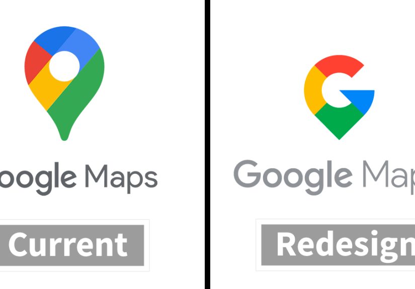
Google: Playing with Color Without Losing Identity
Google’s logo is already minimalist, but designers often imagine alternate takes:
- Shifting from a full wordmark to a “G” monogram as the hero mark.
- Experimenting with softer curves or custom letterforms that feel more human and less default.
- Subtly adjusting the brand colors to feel more harmonious or toned-down.
The challenge is to preserve the four-color identity while pushing the shape language
into something a little more distinctive and crafted.
Design Principles You’ll See in These Redesigns
Strip away the jokes and dramatic before-and-after graphics, and you’ll find a handful
of recurring principles guiding most logo redesign concepts:
- Negative space: Clever use of empty space (think the arrow in the FedEx logo) adds meaning without adding clutter.
- Geometric harmony: Circles, grids, and consistent angles create a sense of order and professionalism.
- Typographic refinement: Custom letters, tighter kerning, and balanced strokes make wordmarks feel premium and considered.
- Responsive systems: Instead of a single static logo, designers create versions for tiny icons, social avatars, and large-scale signage.
Fan redesigns are basically mini case studies in these principles. Designers take what
they know from real client work and crank up the contrast so the lessons are easier
to see.
How to Critique a Logo Redesign (Without Just Saying “I Hate It”)
When a new logo dropsor when a designer posts a conceptmost people jump straight to:
“It looks bad” or “I like the old one.” That’s normal, but not very helpful. A better
critique looks at:
- Clarity: Can you tell what the company does or at least what vibe it’s going for?
- Consistency: Does the logo feel like it belongs with the brand’s website, packaging, and ads?
- Practicality: Will it work in one color? At very small sizes? On multiple backgrounds?
- Distinctiveness: Could you confuse it with another brand?
- Continuity: Does it honor the brand’s history, or does it feel like a total identity swap?
Designers participating in “redesign famous logos” challenges often explain their
choices in these terms: they’ll say they improved readability, modernized the shapes,
or fixed issues that only become obvious at small sizes or in digital environments.
What Brands Can Learn from Playful Logo Redesigns
For brands, these online redesign galleries can function as free user research:
- They reveal perception gaps. If fan-made logos consistently emphasize qualities like “eco,” “tech,” or “premium” that the official logo doesn’t, that’s a clue about how people seeor want to seethe brand.
- They surface fresh visual ideas. Even if you’d never adopt a fan logo as-is, elements like color palettes, icon shapes, or type styles can inspire a future refresh.
- They highlight emotional attachment. Strong backlash to certain concepts is a reminder that your current logo might carry more equity than your internal team realizes.
Smart brands pay attention. They don’t necessarily crowdsource their logo, but they do
absorb the feedback, look for patterns, and consider how to evolve without breaking
what people already love.
Run Your Own Mini Logo Redesign Challenge
You don’t need to be a global fast-food chain to benefit from this kind of creative
exercise. Whether you’re a freelancer, a small business owner, or an in-house designer,
you can recreate the Bored Panda-style experience for your own brand:
- Start with your current logo. Print it out or put it side-by-side with your competitors’ logos.
- List what works and what doesn’t. Focus on clarity, flexibility, and emotional impact.
- Define three adjectives. How should your brand feel? (For example: bold, friendly, techy.)
- Sketch three concepts. One conservative (small tweaks), one bold (major exploration), one experimental (just for fun).
- Test at different sizes. Put each logo on a mock app icon, a social avatar, and a product mockup.
- Ask for feedback. Share side-by-sides with your audience or team and ask structured questions instead of “Do you like it?”
Even if you never ship the redesign, you’ll understand your own logo betterand your
audience’s expectationsby the end of the process.
Designer Experiences: What It’s Really Like to Redesign Famous Logos
So what does it actually feel like to take on the logo of a huge brand, even if it’s
“just for fun” on a site like Bored Panda? Many designers describe the experience as
equal parts exhilarating and nerve-wracking.
First, there’s the research phase. Designers often start by collecting the brand’s
entire visual historyolder versions of the logo, vintage packaging, regional variants,
and recent campaigns. This helps them understand which elements are sacred and which
are negotiable. For example, McDonald’s arches, Nike’s swoosh, or Apple’s silhouette
have become so iconic that removing them entirely would feel like erasing the brand’s
identity, not updating it.
Then comes the sketching and experimentation. Designers might fill pages with
quick pencil drawings, exploring how far they can push the shapes while still keeping
the logo recognizable. They test bolder geometry, adjusted proportions, or entirely
new compositions of familiar elements. Digital tools make this even more playful:
a designer can quickly create dozens of variations in different color systems, align
them to grids, and view them in real-world mockups like coffee cups, billboards, or
mobile app icons.
One of the biggest realizations designers share is how much context changes a logo.
A concept that seems underwhelming on a blank white slide suddenly feels powerful
when placed on product packaging or a storefront. Conversely, a wild, clever logo
that looks great in a Behance gallery sometimes falls apart when shrunk down to a
social media avatar. That’s why many designers treat these fan projects as a
chance to practice “real” constraints even when there’s no real client.
Feedback is another key part of the experienceespecially when the work is published
in a public gallery. Designers quickly learn that:
- People will compare their work to the “real” logo, even if the brief was purely conceptual.
- Non-designers tend to focus on familiarity and emotion (“This doesn’t feel like Starbucks anymore”) more than technical details.
- Other designers are more likely to comment on hierarchy, spacing, stroke consistency, and color harmony.
Instead of taking criticism personally, many designers treat it as a crash course in
audience reaction. They see which ideas resonate, which ones confuse people, and which
tiny changeslike softening a corner or thickening a strokemake a surprisingly big
difference in how the logo is perceived.
Perhaps the most valuable part of the process is the shift in perspective. When you
spend hours trying to redesign a well-known logo, you start to appreciate how much work
goes into the “simple” shapes you see every day. A lot of viral logo memes make it
seem like brands are careless or clueless when they change their marks. But once you
’ve wrestled with keeping a logo distinctive, legible, and scalable across dozens of
applications, you realize how hard it is to get right.
That’s why these projects are so addictive. Designers get to flex their creativity,
sharpen their skills, and spark conversations about branding, all while playing with
icons the whole world already knows. And for the rest of us, scrolling through those
side-by-side comparisons is a reminder that logos aren’t just decorationthey’re tiny,
concentrated stories about who a brand is and how it wants to show up in the world.
Conclusion: Why We Can’t Stop Redesigning the Logos We Love
Designers sharing how they’d redesign famous brand logos have become a staple of the
internet’s visual culture. These concept projects are funny, thought-provoking, and
occasionally controversialbut they’re also powerful tools for understanding how
logos work.
Behind every clever tweak is a set of serious questions: What does this brand really
stand for? How should it feel on a phone screen versus a storefront? What parts of
its identity are timeless, and what needs to evolve? Whether you’re a professional
designer, a small business owner, or just someone who loves a good before-and-after,
these redesigns offer a front-row seat to the way brands communicate in a
fast-moving, design-savvy world.
The next time you see a viral post where designers “fix” famous logos, look past the
punchlines. Notice the use of negative space, the typographic choices, the simplification
of shapes, and the way each concept tries to respect (or intentionally subvert) what
made the original logo iconic. That’s where the real magicand the real learninglives.