Table of Contents >> Show >> Hide
- What a Drop Shadow in InDesign Actually Does (and When It’s Worth Using)
- Before You Start: Choose the Right Target (Object vs. Fill vs. Stroke vs. Text)
- Quick Tutorial: Add a Drop Shadow in InDesign in Under a Minute
- Understanding Drop Shadow Settings (So Your Shadow Looks Expensive)
- Three Practical Examples (Copy These Settings and Look Like a Wizard)
- Make Shadows Reusable: Copy Effects + Use Styles Like a Pro
- Troubleshooting: When Drop Shadows Act Weird
- Best-Practice Checklist (Avoid Drop Shadow Jail)
- Extra: of Real-World Shadow “Experience” (Collected from the Trenches)
- Conclusion
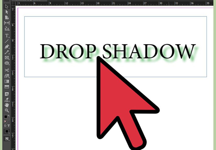
Drop shadows in Adobe InDesign are like hot sauce: a tiny dab makes everything better, but one enthusiastic squeeze can ruin dinner. This quick tutorial shows you exactly how to add a drop shadow in InDesign (to text, images, and shapes), how to dial it in so it looks intentional, and how to avoid the classic “why does my PDF look haunted?” moment.
What a Drop Shadow in InDesign Actually Does (and When It’s Worth Using)
A drop shadow is a transparency effect that creates the illusion of depthlike your object is floating slightly above the page. In print layouts, it can separate text from a busy photo, make a callout feel clickable, or give a product shot a subtle lift. In digital layouts (interactive PDFs, social graphics, presentations), it can add hierarchy and “tap-me” energy.
The trick: the best InDesign drop shadow is the one readers don’t notice. If someone says, “Whoa, sick shadow,” you may have accidentally entered the realm of 2007 web buttons.
Before You Start: Choose the Right Target (Object vs. Fill vs. Stroke vs. Text)
InDesign lets you apply effects to different parts of an element. This matters more than people realize. A shadow on the frame looks different from a shadow on the text inside that frame.
- Object: Applies to the whole object (frame and its contents as a unit).
- Fill: Shadow follows the filled area only (great for shapes and buttons).
- Stroke: Shadow follows the outline (useful for lines or stroked shapes).
- Text: Shadow follows the actual characters (perfect for headlines on photos).
If you’ve ever added a shadow to “text” and somehow shadowed the entire text frame like a mysterious rectangle… that’s usually a targeting issue, not a personal failure.
Quick Tutorial: Add a Drop Shadow in InDesign in Under a Minute
Method 1: The Classic Menu Route (Object > Effects > Drop Shadow)
- Select the object with the Selection tool (black arrow). This can be a shape, image frame, or text frame.
- Go to Object > Effects > Drop Shadow. Handy shortcut many designers use: Ctrl+Alt+M (Windows) or Cmd+Option+M (Mac).
- Turn on Preview so you can see changes live (this saves time and prevents guessy-chaos).
- Adjust settings (Opacity, Distance, Size, etc.).
- Click OK.
Method 2: The “FX” Shortcut (Properties Panel or Effects Panel)
- Select your object.
- Open Window > Effects (Effects panel) or use the fx button in the Properties panel (depending on your workspace).
- Choose Drop Shadow.
- Enable Preview, tweak, and click OK.
How to Add a Drop Shadow to Text (Not the Whole Text Frame)
- Select the text frame with the Selection tool (black arrow).
- Open Window > Effects.
- In the Effects panel, click Text (not Object). This is the “apply-to-text” target.
- Click the fx icon and choose Drop Shadow.
- Turn on Preview, adjust settings, and click OK.
Pro tip: If you only need one word shadowed (like a highlighted keyword), you can either apply the effect to selected characters (targeting Text) or put that word in its own text frame. The second option is less glamorous, but extremely stablelike using a seatbelt.
Understanding Drop Shadow Settings (So Your Shadow Looks Expensive)
Blending Mode + Opacity: The “How Loud Is This Shadow?” Controls
Most of the time, you’ll leave the blending mode at Multiply because it behaves naturally on light backgrounds. Then set Opacity to something subtle. If you’re working in print, start modestthink 15–35%and go up only if the background is busy.
Angle + Distance: The “Where’s the Light Coming From?” Controls
Angle sets the direction; Distance sets how far the shadow sits from the object. If your layout has multiple shadows, consider keeping a consistent angle so the lighting feels unified (InDesign includes a global light option for that).
Size: The Softness (a.k.a. Blur) Control
Size controls how soft the shadow edge is. Bigger isn’t always better. A small, soft shadow often reads more premium than a giant fog bank. For UI-like buttons, a slightly softer size looks friendly; for editorial type on photos, keep it just enough to separate the letters.
Spread + Noise: The “Realism” Knobs
Spread makes the shadow edge harder and more soliduse sparingly unless you’re going for a crisp, poster-ish look. Noise adds texture to avoid perfectly smooth gradients (handy in some print workflows). A tiny amount can help; too much looks like your shadow rolled in sand.
“Object Knocks Out Shadow”: The Overlooked Checkbox
This usually stays on, so the object doesn’t get muddy where it overlaps the shadow. But if you’re creating special effects (like a glow-ish shadow, layered shadows, or stylized depth), toggling it can change the vibe dramatically.
Three Practical Examples (Copy These Settings and Look Like a Wizard)
Example 1: A Subtle Card Shadow (Great for Pull Quotes or Sidebars)
- Mode: Multiply
- Opacity: 20–30%
- Angle: 120° (or consistent with your layout)
- Distance: 0.05–0.1 in (or a few pixels for screen work)
- Size: 0.08–0.2 in
- Spread: 0–5%
- Noise: 0–3%
Use this on a white or light-tinted box over a photo background. It improves readability without screaming “DROP SHADOW.”
Example 2: Product Photo Lift (Shadow on the Frame, Not the Image Content)
If your image is in a rectangular frame, a shadow on the Object can work nicely. If the photo has a cutout (transparent background) or you want the shadow to match the subject shape, you may need a different approach (often handled in Photoshop). In InDesign alone, you can still get a clean “frame lift” by applying the shadow to the frame/object and keeping it light.
Example 3: Headline on a Busy Photo (Shadow on Text Only)
- Mode: Multiply
- Opacity: 30–45%
- Distance: very small (just enough to separate letters)
- Size: small-to-medium (soft edge, but not hazy)
- Spread: 0%
This is the classic “save readability without adding a big opaque box.” The key is restraint: if the shadow starts to look like an outline, it’s probably too strong.
Make Shadows Reusable: Copy Effects + Use Styles Like a Pro
Copy a Drop Shadow from One Object to Another
You can copy effects in a few ways:
- Drag the FX badge from an object in the Effects panel onto another object (quick and satisfying).
- Use the Eyedropper tool if you enable object transparency/effects in its settingsgreat when you’re applying a consistent look across a layout.
Object Styles: The Fastest Way to Stay Consistent
If you’re adding drop shadows in InDesign more than twice, you’re basically begging for an Object Style. An Object Style can store strokes, fills, transparency, and drop shadowsso you can apply a consistent shadow to every button, card, photo frame, or sidebar with one click.
Workflow you’ll thank yourself for later:
- Create one “perfect” object with your preferred shadow.
- Open Window > Styles > Object Styles.
- Create a new style (name it something human, like Card Shadow – Soft).
- Apply that style wherever you need the same look.
Bonus: when art direction changes (and it will), you can update the style once and your entire document obeys. It’s the closest InDesign gets to magic.
Troubleshooting: When Drop Shadows Act Weird
“My shadow disappeared” (or looks different than yesterday)
- Check Display Performance: InDesign can show effects in low quality to keep things snappy. Switch to High Quality Display if needed.
- Zoom in/out: Sometimes it’s just a preview redraw issue.
- Confirm targeting: Make sure you applied the effect to Text (for characters) rather than Object (for the frame).
“My PDF has weird boxes / the shadow looks chunky”
Drop shadows are transparency effects, and PDFs/print workflows can handle transparency differently depending on export settings. If you see “white box” artifacts or odd flattening, try an export preset designed for modern transparency handling, and always review your PDF carefully.
Print + transparency reality check
For print production, transparency can trigger flattening in some workflows. Complex pages (type + spot colors + images + effects) can also increase the chance of unexpected results. If your printer has a preferred PDF standard, follow it. When in doubt, do a proof export and inspect it at high zoom.
Best-Practice Checklist (Avoid Drop Shadow Jail)
- Start subtle: Lower opacity first; don’t immediately crank size and distance.
- Use Preview: Always. Your future self will send you a thank-you note.
- Be consistent: One lighting direction across the page looks intentional.
- Target correctly: Text shadows should be applied to Text, not the frame.
- Use Object Styles: Especially for recurring UI-like components (buttons, cards, callouts).
- Export and inspect: Check your PDF at high zoom, and watch for artifacts.
Extra: of Real-World Shadow “Experience” (Collected from the Trenches)
Designers rarely sit down and say, “Today I will add a drop shadow in InDesign.” It’s more like: “Why can’t anyone read this headline?” or “This button looks like a sad rectangle.” That’s where drop shadows quietly earn their paycheck.
One common scenario: a magazine cover line over a bright, high-contrast photo. You try a solid box behind the text. Suddenly the cover looks like a meme. The better move is often a text-only drop shadow: just enough separation to improve readability, but not so much that the type looks stamped onto the image. In practice, teams will test a few variantsslightly different opacity, a hair less distancebecause the “perfect” shadow depends on the image detail and the type weight. Thin fonts usually need a gentler shadow; bold fonts can tolerate a touch more softness.
Another classic: product catalogs. A grid of product photos can look flat, especially when all the backgrounds are white. A minimal, consistent frame shadow gives the entire page structurelike the products are neatly placed on cards instead of floating in emptiness. Production teams love this because it’s repeatable: create an Object Style for “Photo Frame Shadow,” apply it across the document, and you’ve instantly upgraded the visual hierarchy without editing images one by one.
Then there’s the “button that refuses to look clickable.” InDesign isn’t a UI design tool, but plenty of marketing teams build one-pagers, event flyers, and PDF promos that need clear calls to action. A small shadow on the Fill (not the whole object) can make a rounded rectangle look pressable. Designers often pair it with a slight tint change and a consistent shadow angle. It’s less about realism and more about signaling: “This is important.”
Of course, shadows can also start a tiny civil war in a design review. Someone says “Make it pop,” someone else says “Shadows are tacky,” and suddenly you’re negotiating like a hostage mediator. The best compromise is usually a restrained shadow plus better spacing and contrast. When the shadow is subtle, it reads as depth; when it’s heavy, it reads as decoration. If you’re stuck, try lowering opacity before changing anything else. That one move solves an astonishing number of problems without anyone feeling like they lost the argument.
Finally, real-world experience includes the unglamorous step: exporting a PDF and checking it. Many designers learn this lesson exactly once. Effects can preview beautifully in InDesign and still surprise you in a PDF depending on transparency handling. A quick proof export (and a high-zoom inspection) is the professional version of “measure twice, cut once.” Shadows are easy. Reliable shadows are a skill.