Table of Contents >> Show >> Hide
- What a Mood Board Really Is
- Why Mood Boards Work So Well
- The Ingredients of an En Fuego Mood Board
- How to Make a Mood Board Without Losing Your Mind
- Physical vs. Digital Mood Boards
- Common Mood Board Mistakes
- Examples of Mood Boards That Run Hot
- Experience Notes: What Mood Board Making Feels Like in Real Life
- Conclusion
Some projects begin with a spreadsheet. Others begin with a panic spiral and seventeen open tabs labeled things like “warm modern but not boring” and “why does this lamp feel emotionally unavailable?” That, dear reader, is exactly why mood boards exist. They turn a pile of scattered instincts into something visual, usable, and surprisingly honest. A good mood board does not just look pretty. It tells you what your project wants to be when it grows up.
Whether you are decorating a living room, building a brand identity, planning a photo shoot, refreshing a bedroom, or trying to give your tiny coffee shop a personality bigger than its square footage, mood board making is the bridge between vague feelings and actual decisions. And when the board is en fuego, it does more than organize inspiration. It creates momentum. It helps you stop wandering and start choosing.
This is where mood board making gets interesting. The process is part strategy, part collage, part visual psychology, and part ruthless editing. You gather images, colors, textures, type styles, products, materials, keywords, and references until the vibe finally stops mumbling and starts speaking in full sentences. Suddenly, “I want it cozy but sharp” becomes walnut wood, smoky green paint, brushed brass, slubby linen, rounded corners, and one dramatic lamp that looks like it knows jazz.
What a Mood Board Really Is
A mood board is a curated visual composition built to express a direction, style, atmosphere, or emotional tone for a project. That definition matters because many people still treat mood boards like decorative scrapbooks with ambition problems. They are not random collages. They are decision-making tools.
At their best, mood boards help you answer tough early questions before money, time, and energy start flying out the window. What is the emotional target? What visual language fits the goal? Which colors support the tone? Which materials or textures belong together? What should stay, and what should absolutely be escorted off the premises?
There is also an important distinction worth knowing: a mood board is not exactly the same thing as a concept board. A concept board often leans broader and more atmospheric, while a mood board can move closer to specific finishes, products, materials, and visual decisions. In plain English, one says, “Here’s the vibe,” and the other can say, “Great, now here’s the rug, the tile, the font, and the chair that won’t ruin it.”
Why Mood Boards Work So Well
They translate feelings into choices
People are often better at reacting to visuals than describing what they want from scratch. Ask someone what kind of room they like and you may get “modern, but warm, but not too minimal, but also calm, but not grandma.” Show them six images, though, and the truth comes out fast. Suddenly they know they hate cold gray walls, love natural texture, and would like every light fixture to stop screaming.
They create alignment
One of the biggest strengths of mood board making is alignment. Teams, clients, partners, and even your future self can all look at one board and understand the same direction. That matters because words like “elegant,” “bold,” or “playful” mean wildly different things depending on who is talking. A mood board gets everyone speaking visual language instead of interpretive dance.
They save time and reduce expensive mistakes
It is much cheaper to reject an image on a board than a sofa in your living room. The same goes for logos, packaging systems, campaign photography, wedding decor, and website visuals. Mood boards let you experiment early, revise quickly, and avoid committing to an idea that only sounded good in your head at 11:48 p.m.
They help editing happen sooner
Creativity is not only about collecting more. It is about choosing better. Once a board starts taking shape, patterns reveal themselves. Maybe every image you love has earthy reds and tactile fabrics. Maybe every layout you save uses clean spacing and one weird accent object. Maybe your “eclectic” vision is actually just “I enjoy beautiful chaos with rules.” A mood board makes those patterns visible.
The Ingredients of an En Fuego Mood Board
Not every mood board needs the same pieces, but the strongest ones usually include a smart mix of the following:
1. Anchor images
These are the heavy hitters. The images that instantly capture the tone. Think full-room photos, campaign references, editorial images, packaging examples, or cinematic shots that nail the emotional temperature. Start with a few anchor images before you drown yourself in thirty-seven “maybe” screenshots.
2. Color palette
Color is not decoration. It is emotional infrastructure. Warm terracotta, saffron, oxblood, and clay can make a board feel grounded, rich, and alive. Pale oat, chalk white, faded denim, and dusty sage can feel airy and soft. Pull a small palette from your strongest visuals and let it act like a bouncer. If a new image does not belong with the palette, it does not get in.
3. Texture and materials
Great mood boards are rarely flat. Even digital ones benefit from tactile references. Linen, boucle, leather, travertine, concrete, velvet, raw wood, glossy lacquer, handmade paper, brushed metal, ribbed glass, and worn ceramic each carry emotional weight. Texture gives your board realism. It says, “This idea can actually live somewhere.”
4. Typography and words
Fonts whisper brand personality before anyone reads a sentence. A crisp sans-serif feels very different from a moody serif or a hand-drawn script. Add a few descriptive words too, but keep them disciplined. Three to six words is usually enough. Think: sunbaked, cinematic, grounded, spicy, layered, polished. That is a direction. That is a board with a pulse.
5. Specific objects or references
If your board is for interiors, include furniture silhouettes, hardware finishes, textiles, tile, lighting, and paint references. If it is for branding, include packaging, logos, icon styles, type treatment, photography style, and social media references. The more real-world elements you include, the easier it becomes to move from inspiration to execution.
How to Make a Mood Board Without Losing Your Mind
Step 1: Define the feeling before the look
Start with the emotional target. Ask: What should this space, brand, or project feel like? Inviting? Dramatic? Clean? Nostalgic? Energetic? Luxe but human? Write down five adjectives. This becomes your compass.
Step 2: Collect widely, then judge later
At the gathering stage, do not over-edit. Pull room shots, product images, textures, landscapes, artwork, typography, color swatches, and even film stills. Inspiration often hides in places that are not direct category matches. A restaurant interior might inspire a skincare brand. A vintage poster might unlock a bedroom palette. A desert photo might explain the exact warmth your kitchen has been begging for.
Step 3: Look for repetition
Once you have enough material, step back. What keeps showing up? Curved shapes? Matte black? Burnt orange? Grainy photography? Glossy red? High contrast? Soft shadows? Repetition is your clue that the board is finding itself.
Step 4: Build around three heroes
Pick three hero references that define the board best. These should carry the strongest emotional and aesthetic signal. Let everything else support them. This is how you avoid the classic mood board tragedy known as “too many beautiful ideas fighting in a parking lot.”
Step 5: Edit until it feels inevitable
Remove anything that is only “kind of” right. Mood boards get stronger by subtraction. The goal is not maximum variety. It is coherence with enough contrast to stay interesting. A powerful board feels like it could only have become itself.
Step 6: Add structure
Arrange the board so the eye moves naturally. Group similar materials. Keep the palette visible. Let the hero images breathe. Digital boards can use grids or deliberate asymmetry. Physical boards can layer clippings and swatches in a looser, more tactile way. Both formats work. Messy can be expressive, but confusing is still confusing.
Step 7: Explain the “why”
Even a visual tool benefits from a short explanation. Add a sentence or two describing the direction. Example: “This board aims for a warm, elevated, sunbaked modernism with tactile materials, spicy accents, and soft architectural curves.” That line helps people understand the logic, not just the look.
Physical vs. Digital Mood Boards
Physical mood boards still have serious charm. They invite touch, scale, and material honesty. Fabric swatches, paint chips, torn magazine pages, ribbon, tile samples, and handwritten notes can create a sensory richness that screens cannot fully replace. They are especially useful for interiors, fashion, and anything material-forward.
Digital mood boards, meanwhile, are fast, flexible, and easy to share. They are ideal for collaboration, remote work, brand development, content planning, and projects that change often. You can resize, crop, rearrange, duplicate, compare versions, and get feedback without gluing anything to poster board or sacrificing your dining table for three days.
The smartest creatives do not worship one format. They use the one that fits the project. Sometimes that means a digital board first and a physical sample board later. Sometimes it means both living together like a very productive design marriage.
Common Mood Board Mistakes
Collecting only pretty images
Aesthetic without purpose is how you end up with a board that looks expensive and says nothing. Beauty matters, but relevance matters more.
Using too many disconnected references
If your board includes Scandinavian calm, tropical maximalism, brutalist concrete, cottage florals, and neon diner energy, you may not have a vibe. You may have a hostage situation.
Ignoring texture and scale
Projects become more believable when the board includes surfaces, materials, and close-up details. Wide shots alone can feel dreamy but vague.
Forgetting the audience
A personal bedroom board and a mass-market coffee brand board should not speak the same way. Mood board making gets stronger when it considers who the project is for, not just what looks good on your screen.
Examples of Mood Boards That Run Hot
The small apartment refresh
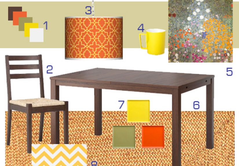
An en fuego apartment board might combine rust accents, creamy walls, walnut finishes, black-framed lighting, woven textures, and one or two sculptural pieces. The result feels warm, urban, and grown-up without turning the place into a beige apology.
The spicy brand relaunch
For a food or beverage brand, the board might pull deep reds, paprika tones, grainy flash photography, bold serif type, hand-torn labels, and glossy close-ups of ingredients. The brand starts to feel flavorful before a customer reads a single word.
The bedroom with a pulse
Maybe the board pairs smoked plum, camel, brass, rumpled linen, low lighting, and quiet vintage references. Suddenly the room is not just “nice.” It feels cinematic. Restful, but with taste. Soft, but not sleepy in the boring sense.
Experience Notes: What Mood Board Making Feels Like in Real Life
In real projects, mood board making rarely arrives as one glorious lightning strike. It usually begins as a mild visual mess. You save too many images. Half of them contradict each other. One looks incredible on its own but turns weird the second it sits next to the others. Another seems forgettable until it quietly becomes the piece that holds the entire board together. That is a normal part of the process, and honestly, it is where the best insight shows up.
One common experience is realizing that your original idea was too literal. Maybe you thought you wanted a “modern Mediterranean” room, but once you gathered references, what you actually loved was not the style label. It was the mood underneath it: sun-faded warmth, tactile walls, natural wood, imperfect ceramics, and shadows that made everything feel slower and more human. The board helps you graduate from trend vocabulary to visual truth. That shift is huge.
Another very real experience is discovering your deal-breakers faster than your favorites. You may not know exactly what you want at first, but your board will reveal what you definitely do not want. Too glossy. Too cold. Too precious. Too farmhouse. Too corporate. Too “this boutique hotel charges $28 for olives.” That kind of clarity is gold. A board is not only a collection of yeses. It is also a respectful pile of no thank yous.
There is also a confidence boost that comes from seeing your instincts become coherent. At first, your taste can feel random. Then you notice that you keep choosing similar contrast levels, similar color families, similar materials, similar compositions. The board starts proving that your eye is not random at all. It is selective. It has preferences. It has a point of view. You were not confused; you were just still gathering evidence.
In collaborative settings, mood boards can save a surprising amount of emotional energy. Instead of arguing in vague terms, people can point to something specific. “More like this texture.” “Less like this photography style.” “This feels too polished.” “This one has the warmth we’re missing.” Those are productive conversations. Without a board, teams often waste time debating adjectives that everyone interprets differently.
And then there is the final, deeply satisfying stage: when the board clicks. Not when it becomes perfect, but when it becomes unmistakably itself. You can feel it. The palette locks in. The hero images stop fighting each other. The materials begin to echo instead of compete. The typography suddenly looks inevitable. That moment is the reward for all the collecting, sorting, questioning, and deleting. It is also the moment the project starts moving faster, because now decisions have a standard to measure against.
That is why mood board making remains so useful across interiors, branding, fashion, events, and digital design. It gives shape to instinct. It turns atmosphere into evidence. And when it is done well, it does not just help you make something that looks good. It helps you make something that feels right, which is usually the difference between a project people like and a project they remember.
Conclusion
Mood board making is not fluff, filler, or an excuse to hoard attractive images. It is a serious creative tool disguised as a fun one. A strong mood board helps define tone, sharpen choices, guide spending, align collaborators, and give your project a visual backbone before execution begins. In other words, it helps you think better by seeing better.
So yes, make the board. Make it fiery. Make it tactile. Make it specific. Pull colors that do something, textures that tell the truth, and images that carry emotional weight. Then edit without mercy until the board stops being a mood and starts becoming a direction. That is when it goes from interesting to en fuego.