Table of Contents >> Show >> Hide
Some dinnerware is just dinnerware. It holds pasta, catches salad dressing, survives the dishwasher, and quietly returns to the cabinet like a dependable character actor. Then there is the colorful Chez Panisse line from Alice Waters and Heath Ceramics, which manages to do all of that while also carrying a serious design pedigree, a distinctly California point of view, and a charitable mission that makes each plate feel a little more meaningful. In other words, this is not your average “pretty bowl” situation.
The collaboration brings together two names that practically glow with West Coast credibility. Alice Waters, the chef and activist behind Chez Panisse, has spent decades shaping how Americans think about seasonal food, local sourcing, and the simple radical act of eating well. Heath Ceramics, meanwhile, has been making timeless California ceramics since the mid-century era, building a reputation for handcrafted pieces that are sturdy enough for everyday life and attractive enough to make leftovers look vaguely intentional. Put them together, add color, and you get a collection that feels equal parts design object, practical tableware, and feel-good purchase.
What makes this story especially compelling is that the collection is not merely a style exercise. A portion of proceeds supports the Edible Schoolyard Project, the nonprofit Alice Waters founded to promote hands-on food education through school gardens, kitchens, and cafeterias. So yes, the plates are beautiful. But they also point to a larger idea: the table can be a place of pleasure, community, and change, not just a parking spot for Tuesday night takeout.
Why This Collaboration Still Feels So Fresh
The Chez Panisse line has roots going back to the mid-2000s, when Alice Waters worked with Heath Ceramics and designer Christina Kim to create dinnerware for her legendary Berkeley restaurant. The original collection leaned neutral and understated, designed to frame food rather than compete with it. That decision made perfect sense for Chez Panisse, where produce is the star and the plating philosophy is closer to “let the tomato live its truth” than “build a foam tower and call it dinner.”
Years later, the line was reintroduced with a wider range of glazes, and that shift changed the mood completely. Suddenly, the collection was not just serene and classic; it was lively. New shades brought more personality to the table without tipping into chaos. Think less rainbow explosion, more sophisticated produce market at golden hour. The result is colorful dinnerware that still honors Waters’s original desire for plates that harmonize with food, while giving home cooks more freedom to mix, match, and build a table that feels personal.
That balance is a big reason the collaboration still resonates. It understands something many brands miss: color does not have to be loud to be expressive. It can be earthy, layered, and quietly joyful. In a market crowded with tableware trends that shout for attention, this collection speaks in a confident indoor voice.
A Bay Area Story Told Through Clay
Part of the appeal here is geography. Heath Ceramics is deeply tied to California design history, and Alice Waters is inseparable from Northern California food culture. Together, they create a collection that feels genuinely rooted in place. The pieces are made in Sausalito, and the color palette carries that moody, natural, Bay Area sensibility: greens that feel like coastal hills, blues that echo fog and sky, warm neutrals that look right at home beside sourdough, roast chicken, and a slightly overdressed chicory salad.
This is the kind of collaboration that works because it makes emotional sense before it makes commercial sense. You can imagine these bowls at Chez Panisse. You can imagine them in a Berkeley kitchen with a basket of citrus on the counter. You can imagine them at a long dinner where someone says, “Please pass the fennel,” and somehow means both the vegetable and the glaze color.
What Makes the Dinnerware Special
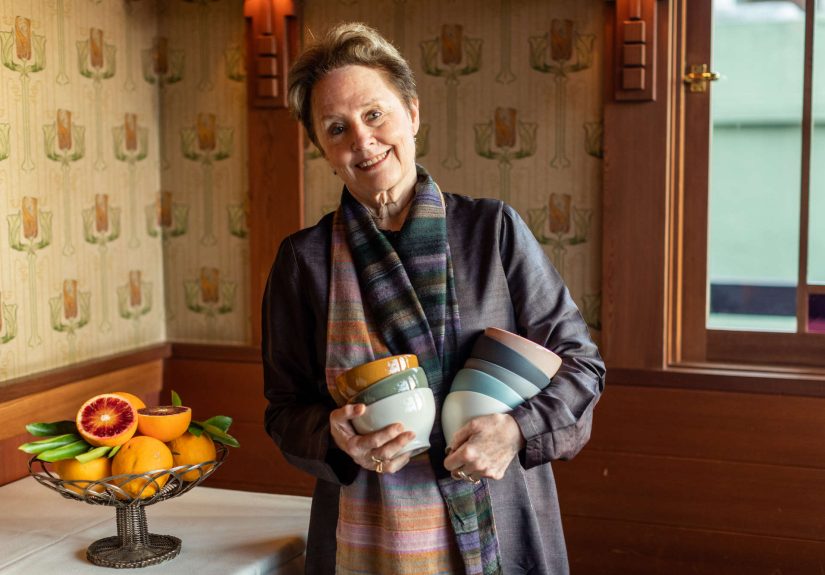
Let’s talk about the actual pieces, because noble intentions only go so far if the plate itself is a flop. Fortunately, this collection succeeds where it counts. The shapes are simple, timeless, and easy to live with. Main plates, salad plates, side bowls, and café bowls are designed for real use, not just tablescape theater. These are forms that can handle an elegant dinner party, a bowl of soup at lunch, or an emotionally necessary serving of pasta after a long workday.
The design language takes cues from classic French porcelain restaurant ware, but with Heath’s signature warmth and handmade character. That is an important distinction. The pieces are refined, but they do not feel precious. They have the kind of tactile appeal that makes you want to hold them for an extra second before setting them down. In the age of mass-produced sameness, that slight variation in glaze and finish feels like a feature, not a flaw.
The expanded palette is another strength. Rather than locking buyers into one rigid set, the line encourages mixing matte and glossy finishes, warm and cool tones, and lighter and darker shades. A stack of bowls in Indigo, Bluejay, Aloe, Sorbet, or Slate does not look random; it looks collected. The effect is curated without being fussy, which is the sweet spot for modern tabletop design.
Color That Actually Helps the Food
One of the smartest ideas behind this collection is that color changes how food is seen. Alice Waters herself has spoken about how different foods behave on different backgrounds, and she is right. A dark green plate can make roast carrots look richer. A soft neutral main plate gives grilled fish, spring peas, or a tomato tart room to shine. A blue café bowl can make yogurt with berries look far more photogenic than it has any right to be at 8 a.m.
This is not just about Instagram, though your lunch may suddenly become suspiciously camera-ready. It is about appetite, atmosphere, and the psychology of the table. Good dinnerware supports the meal. Great dinnerware changes how the meal feels. It slows things down. It turns eating into a small ritual instead of another task wedged between emails.
Why the “Good Cause” Matters
The charitable element is not tacked on here like a glittery sticker on a gift box. It is central to why the collaboration has depth. A portion of proceeds from the Chez Panisse line supports the Edible Schoolyard Project, which uses gardens, kitchens, and cafeterias as teaching spaces and promotes the values of nourishment, stewardship, and community.
That mission fits seamlessly with Alice Waters’s long-standing belief that food is never just food. For decades, she has argued that how we grow, prepare, and share meals shapes culture, health, education, and even social justice. The Edible Schoolyard model extends that thinking into public education, giving students hands-on experiences with cooking, gardening, and the food system itself.
That makes this dinnerware collection more than a home decor story. It becomes an example of design participating in a larger ecosystem of values. Buying a plate will not solve the challenges facing school lunch in America, obviously. If only public policy were as easy as adding four bowls to cart. But a product that channels part of its success into edible education has more substance than the average lifestyle launch.
Purpose Without the Preaching
What is refreshing is that the collection does not lecture the buyer. It simply aligns beauty with usefulness and usefulness with purpose. That is a more persuasive model than guilt. You are not told to be a better person because you bought a salad plate. You are just invited to bring a better set of values to the table: craft over disposability, longevity over trend-chasing, and community over empty branding language.
And honestly, that is a relief. The modern consumer has endured enough performative “meaningful products” to last several lifetimes. This collaboration feels more credible because the cause is already woven into Alice Waters’s work and Heath’s long-running relationship with the project. The mission existed before the marketing copy, which is how you know it is real.
Why Heath Ceramics Gives the Collection Weight
Heath Ceramics is not some pop-up label that discovered pottery last Tuesday. The company was founded in 1948 and has built a lasting reputation through California-made ceramics that prioritize craftsmanship, durability, and thoughtful design. Its pieces are formed and glazed with a level of care that design lovers notice immediately and everyday users appreciate over time.
That heritage matters because it gives the collaboration credibility. When a collection promises timelessness, Heath can actually back it up. This is a brand known for products that stay in homes for years, even decades. The dinnerware is not designed to be exciting for one season and then disappear into the storage bin next to your regrettable novelty mugs. It is meant to live on the table and age gracefully.
There is also something reassuring about Heath’s manufacturing model. In a retail landscape addicted to speed and scale, the company still emphasizes making in California and preserving the human side of production. That does not just make for a nicer origin story. It helps explain why the finished pieces feel grounded. They come from a system that values process, not just output.
Who This Collection Is Really For
This dinnerware will obviously appeal to Alice Waters fans, Heath collectors, and people who know exactly what “California modern” means without needing a slideshow. But its audience is broader than that. It is for home cooks who want their table to feel intentional without looking staged. It is for gift buyers who would like to give something useful and beautiful, rather than another candle that smells vaguely like “forest library.” It is for hosts who understand that people remember how a meal felt, and that plates are part of that feeling.
It is also for anyone trying to break up with throwaway consumption. Investing in fewer, better objects has become a practical and emotional strategy for many households. Good dinnerware does not just reduce clutter; it improves daily life. That may sound dramatic for a bowl, but try eating soup from something thoughtfully made and then tell me objects have no effect on mood.
And for people building a registry, refreshing a kitchen, or upgrading from random plates collected through a long series of bad apartment decisions, this line offers something rare: a set that feels adult, but not boring; colorful, but not childish; stylish, but still entirely usable.
The Experience of Living With Colorful, Purpose-Driven Dinnerware
Here is where the collaboration becomes more than a design headline. The real magic of dinnerware like this shows up in ordinary life. Morning coffee in a thoughtfully glazed café bowl feels different from drinking it out of a mug you inherited from an office holiday party in 2014. A simple lunch of bread, cheese, and fruit looks more generous on a plate with depth and texture. Even leftovers seem to behave better when served in ceramics that were clearly made by people who respect meals.
There is also the pleasure of visual rhythm. A table set with mixed colors creates movement without fuss. Maybe the salad plate is Slate, the main plate is Sand, and the bowl is Indigo. Maybe one person gets Aloe and another gets Bluejay. Suddenly the table feels alive, but not chaotic. It has the warmth of something assembled over time, even if you bought it all in one very deliberate online shopping session while telling yourself it was “an investment in the home.” Which, to be fair, it is.
For hosts, the experience is especially strong. Handmade dinnerware changes the tone before the first course arrives. Guests notice it when they sit down, even if they cannot name why the table feels more inviting. The colors soften the setting. The shapes suggest comfort rather than performance. You do not need towering floral arrangements or eight kinds of folded linen to make dinner feel special. Sometimes all it takes is a beautiful plate, a good loaf of bread, and enough confidence to let the ceramics do some of the entertaining.
There is also a quieter experience that should not be underestimated: using meaningful objects alone. Not every meal is a dinner party. Sometimes it is roasted vegetables eaten at the counter while reading the news. Sometimes it is cake on a Wednesday because the day required cake. Purpose-driven dinnerware lends dignity to those moments too. It reminds you that daily life deserves beauty, not only special occasions.
Then there is the emotional appeal of the cause itself. Knowing that part of the purchase supports edible education changes the feeling of ownership. The object carries a story outside your home. It connects your table to school gardens, kitchen classrooms, and a broader vision of food as something that teaches and nourishes. That does not make the plate morally superior to every other plate in the cabinet, but it does give the purchase a little more resonance. The best home objects often do that: they make private routines feel connected to public values.
Over time, those small experiences add up. A bowl becomes the one you always reach for. A plate becomes tied to favorite meals, holiday rituals, or the first dinner in a new home. Chips and scratches, if they come, tell the honest story of use. Good ceramics are not sterile. They are companions to living. And that may be the strongest argument for this collaboration of all. It is not about buying something perfect. It is about buying something thoughtful enough to become part of real life.
Final Thoughts
The colorful dinnerware from Alice Waters and Heath Ceramics works because it succeeds on three levels at once. First, it is genuinely attractive, with earthy glazes and timeless forms that elevate everyday meals. Second, it is credible, thanks to Heath’s long-standing craftsmanship and Alice Waters’s deeply influential food philosophy. Third, it channels part of its appeal toward a cause that makes sense for the people involved and the values they represent.
That combination is rare. Plenty of products are beautiful. Plenty are useful. Plenty claim to stand for something. Far fewer manage to be all three without looking like they tried too hard. This collection does. It proves that dinnerware can be more than a tabletop accessory. It can be a frame for good food, a piece of American design culture, and a small but meaningful way to support a better food future.
So yes, these plates and bowls are colorful. Yes, they will make your dinner look better. But the bigger story is that they bring together craft, community, and conscience in a way that feels unusually sincere. And in a world overflowing with things that want to be seen, there is something lovely about a collection that simply wants to be used well.