Table of Contents >> Show >> Hide
Some homes whisper. This one absolutely does not. It greets you with color at the door, pattern on the walls, texture underfoot, and the kind of collected charm that makes you want to sit down, stare around, and ask one very important question: “Why does my house suddenly feel so emotionally underdressed?”
That is the magic of a well-designed early-1900s home. When the architecture already brings stained woodwork, tall ceilings, graceful moldings, generous windows, and rooms with actual personality, layering pattern and color is not a reckless decorating move. It is the natural next chapter. In the best versions, the result feels warm rather than wild, curated rather than crowded, and lively rather than loud.
This kind of home proves that pattern mixing is not about throwing florals, stripes, plaid, and wallpaper into a room and hoping for divine intervention. It is about rhythm. It is about scale. It is about repeating colors with enough variation to keep the eye interested. Most of all, it is about understanding that historic homes tend to look their best when they are allowed to be expressive instead of scrubbed into bland, all-white submission.
In this house, every room teaches the same lesson in a slightly different accent: bold design works best when it respects the bones of the building. The original millwork is not fighting with the wallpaper. The upholstery is not trying to outshout the rug. The paint colors are rich, but they are not random. Even the busiest spaces still have a sense of order. That is why this 1900’s home feels less like a decorating stunt and more like a masterclass in layering pattern and color.
Why the House Works So Well
The success of a richly layered interior almost always comes down to structure. Before the first patterned fabric, botanical wallpaper, or lacquered lamp enters the conversation, the house already has a framework that guides the rest. Older homes are especially good at this. Their trim, doors, mantels, staircases, and room divisions create natural stopping points for color and pattern. Instead of one giant open box begging for visual CPR, you get rooms with shape, hierarchy, and purpose.
That architectural clarity makes decorating easier. A floral wallpaper can live happily in a formal dining room because the wainscoting grounds it. A striped stair runner feels intentional because the staircase already provides a strong visual path. A jewel-toned library can go moody without turning gloomy because the millwork gives the depth a reason to exist.
In other words, this home does not look good because it uses more color and pattern than everyone else. It looks good because it uses them with discipline.
1. The Original Character Gets to Stay the Main Character
The smartest thing this home does is refuse to erase its age. That decision alone changes everything. Instead of flattening the interior into something generic, the design lets the early-1900s details do their job. Original trim, paneled walls, old fireplace surrounds, wood floors, and built-in cabinetry act like anchors. They keep the bolder decorative moves from floating off into theme-park territory.
There is a major difference between decorating a historic home and merely placing trendy furniture inside an old shell. In a successful renovation, original details are not background props. They shape the palette, influence the material choices, and determine where the boldness should go. Dark wood trim, for example, may call for muddier blues, dusty greens, tobacco browns, oxblood reds, or blush tones with a little age in them rather than bright, candy-colored paint that feels disconnected from the architecture.
That is why the house feels layered in the best sense of the word. The layering starts with time itself. You can read the past in the architecture and the present in the fabrics, art, and finish choices. Together, they create the coveted collected-over-time look that so many newer homes try very hard to fake.
2. The Color Palette Is Rich, but It Is Not Random
If you walked through this home with a paint fan deck and a strong sense of curiosity, you would notice that the colors are doing a lot of quiet teamwork. The walls, trim, upholstery, rugs, and decorative accents may look varied at first glance, but they are usually connected by undertones. That is the trick. Great layered interiors rarely rely on a rainbow free-for-all. They work from a tight, flexible palette.
Here, the likely foundation is a set of historic-feeling hues: mossy greens, inky blues, softened reds, warm creams, aged golds, and earthy browns. Those shades feel right at home in an early-1900s setting because they carry visual weight. They have gravity. They can hold their own against substantial architecture and antique furniture without looking flimsy.
Even brighter moments are handled thoughtfully. A mustard banquette, a rosy wallpapered ceiling, or a lacquered blue cabinet may step forward, but it still speaks the same language as the rest of the house. The effect is confident, not chaotic. Like a dinner guest who wears velvet at noon and somehow pulls it off.
3. Pattern Mixing Follows a Clear Pecking Order
One of the biggest reasons this home succeeds is that it understands pattern scale. That sounds technical, but it is really just common sense with better lighting. Large-scale motifs belong on surfaces that can handle the drama, such as wallpaper, drapery, or a large rug. Medium-size patterns do the supporting work on chairs, headboards, and Roman shades. Smaller prints show up in pillows, lampshades, trims, and accessories.
When every pattern in a room is medium-size, the space starts to vibrate in a very unhelpful way. When there is one dominant print, one or two supporting patterns, and a few solids or textural quiet zones, the room suddenly makes sense. That is exactly what this home gets right.
You can imagine a sitting room with a botanical wallpaper, a striped sofa, a small-scale floral on accent pillows, and a checked ottoman. On paper, that sounds like the setup for a nervous breakdown. In practice, it works because each pattern serves a different function. One creates atmosphere. One adds structure. One introduces softness. One injects charm. The room is layered, but it is legible.
4. Wallpaper Is Used Like Architecture, Not Just Decoration
Wallpaper is doing heavy lifting in this house, and thank goodness for that. In a historic home, wallpaper often feels more natural than a bare painted wall because it echoes the decorative confidence of the era. But the best rooms do not use wallpaper as a random accent. They use it to shape mood and define identity.
In the entry, a small-scale print can make the space feel intimate and gracious. In the dining room, a leafy or scrolling motif can bring ceremony without stiffness. In a powder room, the design might go full maximalist with walls, trim, and even ceiling working together for a cocooning effect. That is how pattern starts to feel immersive rather than merely applied.
What keeps the wallpaper from taking over is repetition elsewhere. If the wall covering contains olive, terracotta, and cream, those tones reappear in art, upholstery, ceramics, and textiles. Suddenly the wallpaper is not “too much.” It is the room’s host, and everything else is just politely dressed for the party.
5. Antiques and New Pieces Are Mixed Like Old Friends
A home like this does not rely on a showroom-perfect set of matching furniture. That would be far too easy and far too boring. Instead, it mixes antique case goods, inherited pieces, vintage lighting, updated upholstery, and a few practical modern items that keep daily life from becoming a historical reenactment.
This balance matters. Antiques give the rooms soul and visual depth. A worn chest, a carved side table, a brass floor lamp, or a mahogany dining table brings patina, and patina is one of the best stabilizers for a colorful interior. It reassures the eye. It says, “Relax, this room has stories.”
Meanwhile, updated elements make the house livable. Performance fabrics, comfortable seating, durable rugs, and thoughtful built-ins allow the rooms to function for real people instead of just admiring glances. The result is a home that feels both personal and polished, which is a much harder trick than choosing a pretty wallpaper sample while standing under flattering showroom lights.
Room-by-Room Lessons in Layering Pattern and Color
The Entry: A Hint of Drama Right Away
The best version of this home begins at the door with confidence. The entry does not waste time pretending to be neutral until the “real” decorating starts deeper inside. It sets the tone immediately with color on the walls, a runner underfoot, art that feels personal, and lighting with presence.
Because entry halls in older homes are often narrower or more compartmentalized, they can handle bolder gestures than larger rooms. A wallpapered ceiling, a saturated trim color, or a patterned stair runner feels decorative, not overbearing. It also creates anticipation. You already know this house has opinions, and honestly, that is half the fun.
The Living Room: Pattern-on-Pattern Without the Panic
The living room is where the home’s layering strategy becomes most obvious. Here, pattern is likely spread across multiple surfaces: curtains, pillows, rugs, upholstery, and maybe even the walls. But the room still leaves room for breathing. A solid sofa might sit against patterned drapes. A bold rug might be paired with quieter chairs. Wood tables and brass accents provide visual pauses between textile moments.
Texture also matters enormously. Velvet, linen, wool, caning, grass cloth, marble, and wood all add interest without demanding another print. That is one reason the room feels lush instead of busy. Pattern gets the applause, but texture does most of the backstage work.
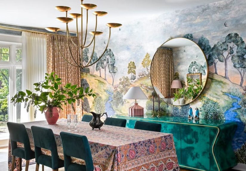
The Dining Room: Where Formality Gets Loosened Up
Dining rooms in older homes are natural candidates for stronger color and pattern because they are meant to feel a little special. In this house, that might mean verdant wallpaper, painted millwork, a patterned table skirt, or dining chairs upholstered in something that would look far too glamorous in a mudroom but absolutely perfect under a chandelier.
The key is contrast. If the walls are lively, the table might be dark and grounding. If the chairs are patterned, the drapery might pick up one quiet tone from the fabric rather than trying to introduce a whole new personality. Good rooms do not match. They relate.
The Kitchen: Historic Spirit, Modern Function
A layered early-1900s home should not lose its nerve in the kitchen. This is where so many renovations suddenly go bland, as if the rest of the house can wear brocade while the kitchen must report for duty in plain white sneakers. Not here.
Cabinetry in a mossy green, muted blue, warm cream, or even a softened chartreuse can connect the kitchen to the rest of the home. A runner or patterned Roman shade softens hard surfaces. Vintage-inspired pendants, unlacquered brass, wood stools, and paneled cabinetry help the room feel rooted in the house’s history. The space still works like a modern kitchen, but visually it belongs to the same family as the dining room and parlor.
The Bedroom: Layered, Quiet, and Slightly Indulgent
The bedroom proves that pattern and color do not have to be loud to be memorable. Some of the strongest bedrooms in historic homes use a restrained palette and then layer multiple prints in close tonal range. Think floral wallpaper, striped bedding, a checked bench, and a softly patterned rug, all connected by shades of blue-green, dusty rose, or cream and tobacco.
The effect is intimate and enveloping. Not chaotic. Not fussy. Just deeply comfortable, like the room has been settling into itself for decades.
The Powder Room: The House’s Tiny Show-Off
Every layered home deserves one fearless powder room. This is the ideal place for a full-pattern moment: wallpaper on the walls, bold paint on the trim, a vintage mirror, unexpected tile, dramatic sconces, and zero apologies. Because the room is small, the saturation feels immersive and chic rather than exhausting.
It is also where a home can be a little playful. Guests remember powder rooms. They are the espresso shot of interior design: small, concentrated, and surprisingly powerful.
What Other Homes Can Learn From This One
The biggest takeaway from this 1900’s home is not that everyone should suddenly buy six wallpapers, two antique cabinets, and a leopard-print bench. Please breathe. The lesson is that color and pattern become easier when you stop treating them like isolated decorating decisions and start treating them like part of a larger ecosystem.
Choose a palette before you choose your prints. Decide which pattern will lead the room. Repeat colors across different materials. Mix large, medium, and small motifs. Let wood, stone, and upholstery provide contrast. Honor original architectural details whenever possible. And remember that “collected” does not mean “cluttered.” It means every element looks like it belongs to the same story, even if it entered the room at different times.
This is why the house feels so compelling. It does not chase minimalism, maximalism, or any other ism with the desperation of an algorithm trying to guess your taste. It simply understands that a historic home can handle beauty with more depth, more wit, and more confidence than people often give it credit for.
The Experience of Living in a Home Like This
There is also something worth saying about the day-to-day experience of a house layered with pattern and color, because photographs only tell part of the story. In real life, a home like this changes throughout the day. Morning light softens the wallpaper and makes painted trim feel almost powdery. By afternoon, the patterns grow more vivid, and the textures start showing off. At night, under lamp light, everything becomes warmer, moodier, and more intimate. A room that seemed cheerful at breakfast suddenly feels cocooning after dinner.
That shift is part of the pleasure. A neutral room can be calm, yes, but a layered room can be emotionally generous. It gives you more to notice. More to remember. More to enjoy when you are not even actively “looking” at it. The floral drapery you barely registered on Monday starts echoing the tones in the rug by Wednesday. The painted cabinet that looked charming on its own becomes even better when a bowl of oranges lands on top of it. The room keeps introducing itself.
Homes like this also tend to feel deeply personal. Pattern and color are revealing choices. They suggest memory, confidence, mood, and taste in a way a safer room often does not. A striped hallway runner says something different than sisal. A rosy ceiling says something different than flat white. A library in olive and tobacco tells a different story than beige walls and one lonely abstract print trying its best. These choices build atmosphere, but they also build identity.
And then there is the comfort factor, which people sometimes underestimate. Layering does not just make a room prettier. It often makes it softer, warmer, and more livable. Rugs absorb sound. Drapery changes the acoustics. Upholstered pieces make a room feel welcoming. Pattern hides wear a little more gracefully than stark solids do, which is excellent news for people with children, pets, guests, or a tendency to treat a living room chair like a secondary closet. In that sense, the house is not just visually rich. It is forgiving.
Another underrated benefit is that richly layered rooms age well. A minimalist room can look sharp on day one but exposed on day 200 if one piece feels off or one trend passes. A layered room has more resilience. Because it already contains contrast, history, and texture, it can absorb change. You can add a vintage lamp, swap in different pillows, inherit your aunt’s side table, or find a wildly good flea-market painting and the room often gets better, not worse. It has room for life to happen.
That may be the most inspiring thing about this 1900’s home. It shows that decorating with color and pattern is not about perfection. It is about creating a setting that becomes more interesting as you live in it. The rooms do not feel staged within an inch of their lives. They feel inhabited. They feel storied. They feel like someone with a sharp eye and a sense of humor decided that beauty should be seen, used, and enjoyed every single day.
So yes, this house is a masterclass in layering pattern and color. But it is also a reminder that the best interiors are not just edited well. They are felt deeply. They carry mood, memory, comfort, and surprise. And in an era of copy-and-paste rooms, that kind of personality is not just refreshing. It is unforgettable.
Conclusion
This 1900’s home succeeds because it knows exactly what many modern interiors forget: pattern and color are not decorative extras. They are tools for storytelling. When paired with original architecture, historic-minded paint tones, varied print scales, natural textures, and a mix of antique and contemporary pieces, they create rooms that feel alive. Not messy. Not precious. Alive.
That is the real lesson here. A beautiful home does not have to choose between polished and personal, practical and expressive, historic and fresh. With the right layering, it can be all of those things at once. And frankly, that is a lot more interesting than another room trying to convince us that beige is a personality trait.