Table of Contents >> Show >> Hide
- Why Leftover Paint Is Basically Free Decor Currency
- Before You Start: Paint Reality Check (So Your Decor Doesn’t Peel Off in a Week)
- Kitchen Grit 101: What Works, What’s “Eh,” and What’s a Hard No
- Tools & Materials You’ll Use Again and Again
- 9 Cheap Decor Projects Using Leftover Paint + Kitchen Grit
- 1) Faux Stone Vase (Baking Soda + Coffee Grounds)
- 2) “Ceramic” Planters from Plastic Pots (Baking Soda Texture Coat)
- 3) Textured Picture Frames That Look Custom
- 4) Mini “Plaster” Accent on a Small Wall Zone
- 5) “Stonewashed” Candle Holders (Eggshell Speckle Trick)
- 6) Thrifted Lamp Base Glow-Up (Sand Texture + Matte Paint)
- 7) High-End Tray or Catchall (Texture Outside Only)
- 8) Abstract Textured Canvas Art (Because Art Is Expensive)
- 9) “Designer” Built-In Look on Shelves (Back Panel Pop)
- Make It Look Expensive: Finishing Tricks That Change Everything
- Clean-Up, Storage, and What to Do with the Leftovers You Still Have
- Real-World “Experience” Notes: What Usually Happens When You Try This (500+ Words)
- Conclusion
You know that half-can of “Maybe-I-Liked-This-Gray” paint living in your garage? And that jar of coffee grounds that
smells like ambition but mostly fuels chaos? Congratulations: you’re sitting on a budget decor goldmine.
With a little creativity (and a tiny bit of gritliterally), leftover paint + everyday kitchen texture can deliver
high-end, designer-looking finishes for the cost of… basically nothing.
This guide shows you smart, safe, surprisingly good-looking ways to reuse leftover paint and common “kitchen grit”
(baking soda, coffee grounds, salt-like textures, and more) to create textured vases, faux stone planters, elevated
frames, and artsy wall pieceswithout paying boutique prices for “handcrafted artisan texture.”
Why Leftover Paint Is Basically Free Decor Currency
Leftover paint is one of the easiest “already-paid-for” materials in a home. It’s color, coverage, and transformation
sitting in a can. Add textureaka gritand you get depth. Depth is the secret sauce that makes budget DIY look
intentional instead of “I did this at midnight with a sponge.”
- Paint gives you color, cohesion, and instant refresh.
- Grit adds a tactile, dimensional finish (stone, plaster, ceramic, sandwash vibes).
- Texture hides minor flaws, elevates thrift finds, and makes small projects feel expensive.
Before You Start: Paint Reality Check (So Your Decor Doesn’t Peel Off in a Week)
1) Make sure the paint is still usable
Old paint can be totally fineor totally cursed. Open the can and look for obvious problems: a strong rotten smell,
heavy clumps that won’t mix, or a gummy consistency that never returns to smooth. If it stirs back into a uniform,
workable paint, you’re usually good for small decor projects.
2) Store it like you actually want to use it again
Paint hates dramatic temperature swings. If it freezes or bakes in heat, it can separate, clump, or change performance.
For best results, store leftover paint indoors in a temperate spotnot a garage that turns into a freezer in winter and
an oven in summer. Keep lids sealed tight and store cans off damp floors to prevent rust.
3) Safety notes that matter (especially if your home is older)
If you’re working in an older home and sanding or disturbing old painted surfaces, take lead-dust precautions.
Lead-based paint hazards are a real concern in older housing. For decor projects like vases and frames, you can often
skip sanding entirely by using proper cleaning and a bonding primer instead.
Quick safety rules (not negotiable):
- Work in a ventilated area; follow the paint label directions.
- Wear gloves if you have sensitive skin; wash hands after.
- Keep paint and supplies away from kids and pets.
- Don’t use these finishes on surfaces meant for food contact (cutting boards, plates, inside mugs, etc.).
- If you suspect lead paint anywhere, avoid DIY removal and use lead-safe practices.
Kitchen Grit 101: What Works, What’s “Eh,” and What’s a Hard No
“Kitchen grit” just means small particles you can mix into paint or press into wet paint for texture. The best grit is:
(1) dry, (2) stable, and (3) easy to seal. Here are smart options:
Best texture boosters for paint
- Baking soda: Creates a chalky, plaster-like texture and matte look. Great for faux ceramic and stone effects.
- Used coffee grounds (fully dried): Adds speckle and earthy, “aged pottery” vibes. Best pressed on top, then sealed.
- Clean sand (play sand or craft sand): Adds gritty texture and can improve traction on certain surfaces (use carefully).
- Crushed eggshells (washed, dried, finely crushed): Subtle speckle texturethink “stoneware freckles.” Seal well.
Use with caution
- Salt or sugar: Can attract moisture; sugar can get sticky. If you use them for texture, seal thoroughly and keep it decorative.
- Cornmeal: Looks rustic, but it’s organicseal well and avoid humid spots.
Hard no
- Flour or anything that can mold easily: Your “textured vase” should not become a science experiment.
- Wet/greasy kitchen waste: Oil + paint = sadness.
Tools & Materials You’ll Use Again and Again
- Leftover latex paint (interior wall paint is perfect for decor)
- Small containers for mixing (disposable cups or yogurt tubs)
- Stir sticks or old spoons
- Cheap chip brushes + a small foam roller
- Primer (bonding primer helps on glass, glossy ceramics, metal)
- Clear sealer (water-based polycrylic, craft sealer, or spray sealer)
- Optional: sandpaper (light scuffing only when appropriate), painter’s tape
9 Cheap Decor Projects Using Leftover Paint + Kitchen Grit
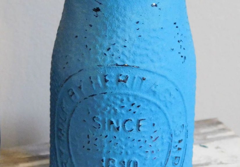
1) Faux Stone Vase (Baking Soda + Coffee Grounds)
This is the “Why does this look like a $60 vase?” project. Baking soda builds a plastery texture; coffee adds natural speckle.
- Prime: If the vase is glass or glossy, use a bonding primer and let it dry.
- Mix texture: Start with 1 cup paint + 2–4 tablespoons baking soda. Stir. You want “pancake batter,” not “cement block.”
- Apply: Dab on with a brush using a stippling motion. Don’t over-smoothtexture is the point.
- Add speckle: While wet, lightly press dried coffee grounds into a few areas, or sprinkle sparingly for an aged look.
- Dry + seal: Let dry fully, then seal (especially if coffee grounds are on top).
Pro move: Dry brush a slightly lighter shade over raised texture once dry for depth.
2) “Ceramic” Planters from Plastic Pots (Baking Soda Texture Coat)
Plastic planters can look… aggressively plastic. A textured paint finish fixes that fast.
- Wash the pot with soap and water; let dry.
- Prime if needed (especially shiny plastic).
- Apply a baking-soda paint mix in two thin coats.
- Seal the exterior only. Keep paint out of the soil area.
Style idea: Use warm whites, clay tones, and muted blacks for that “minimalist garden store” look.
3) Textured Picture Frames That Look Custom
Turn boring frames into boutique-looking pieces with a sand or baking soda finishperfect for gallery walls.
- Remove glass/backing. Clean the frame.
- For subtle texture: add 1 tablespoon baking soda per 1/2 cup paint.
- For rougher texture: add a small amount of clean sand (start with 1–2 teaspoons per 1/2 cup paint).
- Brush on, let dry, then lightly sand edges for a “worn” look.
- Seal if the frame will be handled often.
4) Mini “Plaster” Accent on a Small Wall Zone
Want the texture trend without committing to an entire room? Do a small zone: behind shelves, inside a niche,
or on a single panel of wall.
- Mask edges with painter’s tape.
- Mix paint + baking soda (more baking soda = more texture).
- Apply with a brush or foam roller, then go back with a stipple motion.
- Peel tape before it fully cures for crisp edges.
Note: If you’re working in older homes, avoid sanding unknown painted surfaces.
5) “Stonewashed” Candle Holders (Eggshell Speckle Trick)
Crushed eggshells can create that speckled stoneware lookespecially on small decor pieces.
- Wash eggshells thoroughly; dry completely; crush finely.
- Paint the item with a base coat; let it get tacky.
- Sprinkle a tiny amount of eggshell “freckles.” Press lightly.
- Topcoat with a clear sealer once fully dry.
6) Thrifted Lamp Base Glow-Up (Sand Texture + Matte Paint)
A textured lamp base looks expensive because it plays with light. Texture catches shadows; shadows look fancy.
- Unplug lamp, remove shade and hardware if possible.
- Clean well; prime if glossy.
- Mix a pinch of sand into paint for subtle grit (don’t go overboard).
- Apply in thin coats; rotate as you paint to avoid drips.
- Seal if it will be dusted often.
7) High-End Tray or Catchall (Texture Outside Only)
A “stone” catchall tray for keys and jewelry looks great on an entry table. Just keep the texture decorative and sealed.
- Prime the tray (especially if metal or glossy).
- Texture coat on the outside surfaces only.
- Let fully cure; seal to prevent grit shedding.
8) Abstract Textured Canvas Art (Because Art Is Expensive)
Make oversized textured wall art with leftover paint and baking soda. It’s minimal, modern, and strangely calming.
- Use a blank canvas or cardboard panel.
- Mix paint + baking soda for a thick texture paste.
- Apply with a brush, old gift card, or plastic spatula in sweeping patterns.
- Let dry overnight; optionally add a second tone for depth.
9) “Designer” Built-In Look on Shelves (Back Panel Pop)
A little leftover paint goes a long way on the back of bookshelves. Add a subtle gritty texture and it reads as custom.
- Empty shelves (yes, you have to).
- Paint the back panel with a lightly textured mix.
- Keep texture subtle so it doesn’t compete with decor.
- Style shelves with fewer, larger objects for an elevated look.
Make It Look Expensive: Finishing Tricks That Change Everything
- Stick to a palette: Warm whites, clay, charcoal, and muted greens look “designer” fast.
- Layer tones: A base color + a lighter dry brush on raised texture adds depth.
- Embrace imperfection: Texture looks best when it’s not perfectly uniform.
- Seal smart: Seal anything with loose grit (coffee/eggshell/sand) to prevent shedding.
- Matte = modern: A matte finish reads more “ceramic” and less “plastic craft paint.”
Clean-Up, Storage, and What to Do with the Leftovers You Still Have
If you’ve still got paint left after your glow-up spree, don’t pour it down drains or into the yard. Store it properly
for touch-ups, donate if it’s usable, or recycle through local programs when available.
Smart options
- Save for touch-ups: Label the can with room name, date, and finish (flat/eggshell/satin).
- Donate: Schools, theaters, community groups, and makers may use small amounts (call first).
- Recycle: Many areas have drop-off programs for leftover paint.
- Dispose correctly: Rules vary by location and by paint type (latex vs. oil-based), so follow local guidance.
Tip: Even a tiny jar of paint can be useful laterespecially if it matches trim, a door, or a wall that loves to scuff itself for attention.
Real-World “Experience” Notes: What Usually Happens When You Try This (500+ Words)
Let’s talk about the part nobody puts in the pretty before-and-after photos: the learning curve. Not a scary learning
curvemore like a “Why is my vase suddenly sandy oatmeal?” curve. If you’ve never mixed grit into paint before, here
are the most common real-world outcomes and how people adjust on the fly.
First, most DIYers underestimate how much texture changes a color. Add baking soda and suddenly your paint looks lighter
and more mattealmost like it got a soft filter. That can be a win (hello, faux ceramic), but it can also surprise you
if you were aiming for a deeper tone. The fix is easy: test a small swatch, let it fully dry, and decide if you want a
second coat or a slightly darker base color. Dry time is also a little longer with thicker texture, so the classic “I’ll
do one more coat before dinner” plan may turn into “I’ll do one more coat tomorrow.”
Second, the “right” grit-to-paint ratio is rarely achieved on the first try. A common pattern is going too gritty too fast.
When texture is extreme, it can crack, shed, or look chunky in a way that reads accidental instead of artisanal. Most
people get better results when they build texture gradually: start with a modest amount of baking soda, apply a coat,
let it dry, and then decide if you want more texture on coat two. Think of it like seasoning: you can add more, but it’s
hard to un-salt the soup.
Coffee grounds are where enthusiasm can get… ambitious. The earthy speckle looks amazing, but if you dump grounds into wet
paint like you’re breading chicken cutlets, you’ll get a rough surface that may flake later. The real-world sweet spot is
“selective speckle”: press a small amount onto a few areas (usually around the base or in random clusters), then seal once
fully dry. Also: coffee grounds must be truly dry. Damp grounds can create uneven patches and a funky smell that no one wants
in the living room. If in doubt, spread used grounds on a tray and let them dry fully before using.
Another surprisingly common experience: texture looks messy up close but amazing from normal viewing distance. When you’re
standing six inches away, you’ll see every bump. Step back across the room and suddenly it looks like a boutique piece with
depth and character. This is why people who do a quick “distance check” mid-project tend to be happier with the final look.
It’s also why unevenness can be a feature, not a flawespecially with stone or plaster-inspired styles.
Finally, sealing is where many first-timers either level up or learn the hard way. Unsealed grit can shed when you dust it,
and you’ll wonder why your console table is sparkling with mystery crumbs. A light, appropriate sealer coat locks everything in.
The other “experience” lesson: matte sealers keep the ceramic/plaster look, while glossy sealers can make it look more like
a craft coating. People often prefer a matte or satin protective finish for “expensive” vibes.
Bottom line: the most realistic DIY outcome isn’t perfectionit’s progress. Your first textured piece teaches you what your
brush marks do, how your paint behaves, and how to control grit like a pro. By the second project, you’ll be making “custom”
decor so convincing that guests will ask where you bought it… and you’ll get to say, “Oh this? It was basically kitchen trash.”