Table of Contents >> Show >> Hide
- Why Yellow Works So Well in Interiors Right Now
- 16 Yellow Paint Colors Worth Bringing Home
- 1. Goldfield by Benjamin Moore
- 2. Funky Yellow by Sherwin-Williams
- 3. Beeswax by Domingue Finishes
- 4. French Quarter Gold by Benjamin Moore
- 5. India Yellow by Farrow & Ball
- 6. Babouche by Farrow & Ball
- 7. You Are My Sunshine by Benjamin Moore
- 8. Hay No. 37 by Farrow & Ball
- 9. Goldenrod by Sherwin-Williams
- 10. Chestertown Buff by Benjamin Moore
- 11. Gambol Gold by Sherwin-Williams
- 12. Lenox Tan by Benjamin Moore
- 13. Buttercup Yellow by Benjamin Moore
- 14. Chartreuse by Benjamin Moore
- 15. Summerdale Gold by Benjamin Moore
- 16. Philadelphia Cream by Benjamin Moore
- How to Choose the Right Yellow Without Regret
- Where Yellow Looks Best in a Home
- What It’s Actually Like to Live With Yellow Paint
- Conclusion
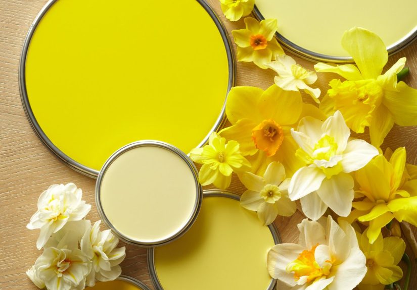
Yellow has officially re-entered the design chat, and this time it is not here to behave like a crayon. Interior designers are using yellow in smarter, softer, and far more sophisticated ways than the banana-bright walls many homeowners still fear. Today’s best yellow paint colors range from whisper-light butter shades to earthy ochres, mellow golds, and punchy marigolds that can completely change the mood of a room.
That is exactly why yellow keeps showing up in kitchens, entryways, breakfast nooks, powder rooms, ceilings, and even the occasional brave little bedroom. When it is chosen with care, yellow can make a dark space feel sunnier, help wood tones look richer, flatter antiques, and add warmth without dragging a room into beige boredom. When it is chosen badly, though, it can look chalky, cartoonish, or one espresso shot away from chaos. In other words: yellow is fabulous, but yellow is picky.
The good news is that designers have already done a lot of the trial-and-error work. Below are 16 yellow paint colors that professionals, editors, and color experts keep reaching for, along with practical guidance on where each one shines and how to keep it from turning your home into a giant lemon meringue pie.
Why Yellow Works So Well in Interiors Right Now
Part of yellow’s appeal is emotional. It reads as optimistic, warm, and welcoming without automatically feeling rustic or traditional. A pale butter yellow can behave almost like a neutral, while a deeper mustard or gold can add personality without screaming for attention. Yellow also plays surprisingly well with natural wood, creamy whites, slate blues, olive greens, terracotta, black accents, and aged brass.
Another reason designers love yellow is that it is deeply responsive to light. In east-facing rooms, many yellows glow beautifully in the morning. In south-facing rooms, they can feel cheerful and sunlit all day. In darker rooms, the right yellow can bring warmth that crisp white often fails to deliver. The wrong yellow, however, may turn dingy or too acidic. That is why testing swatches is non-negotiable. Yellow is not a “close enough” kind of color. It is a “sample it at 8 a.m., noon, and 7 p.m.” kind of color.
16 Yellow Paint Colors Worth Bringing Home
1. Goldfield by Benjamin Moore
Goldfield is a designer favorite for a reason: it lands in that sweet spot between sunny and refined. It feels soft enough for an entry or ceiling but saturated enough to hold its own in a kitchen or dining room. If you want a yellow that says, “I am cheerful, but I also own linen napkins,” this is your shade. Pair it with creamy whites, denim blue, walnut, or deep green for a polished look.
2. Funky Yellow by Sherwin-Williams
Despite the playful name, Funky Yellow is not a gimmick color. Designers like it because it has depth and a slight green undertone, which keeps it interesting as the light changes. It works especially well in kids’ rooms, creative spaces, and rooms that need a little spark without going full neon. This is the yellow equivalent of someone with great eyebrows: memorable, balanced, and oddly powerful.
3. Beeswax by Domingue Finishes
Beeswax brings a softer, more artisanal quality to yellow. Because it is often associated with limewash finishes, it has a glowing, lived-in character rather than a flat, factory-perfect look. This is the kind of yellow that looks wonderful in small bedrooms, historic homes, or cozy spaces where you want warmth with texture. It feels relaxed, natural, and quietly luxurious.
4. French Quarter Gold by Benjamin Moore
French Quarter Gold is rich, glowing, and a little moodier than many classic yellows. Its earthy undertones give it a more layered look, which is why it can work in unexpected places like bedrooms or intimate sitting rooms. If you are tired of safe neutrals and want a room that feels warm from the first glance, this is an excellent candidate. It looks especially handsome with darker woods, olive accents, and woven textures.
5. India Yellow by Farrow & Ball
India Yellow has the mustardy depth designers adore when they want yellow to feel grounded instead of sugary. It is punchy, yes, but it also has real earthiness, which makes it equally fitting in a city house or a country retreat. Use it in a small room, on millwork, below a chair rail, or even on a ceiling if you are feeling brave. It is dramatic without becoming harsh.
6. Babouche by Farrow & Ball
Babouche is one of those yellows that refuses to apologize. It is bright, joyful, and confident, yet designers repeatedly note that it can behave almost like a neutral when paired correctly. That sounds outrageous until you see it with blues, grays, browns, black accents, or even pastels. It is perfect for laundry rooms, mudrooms, kitchens, or anywhere you want instant energy without relying on clutter to create personality.
7. You Are My Sunshine by Benjamin Moore
This creamy butter yellow has charm written all over it. It works beautifully in entryways, nurseries, breakfast corners, and rooms where you want the walls to glow rather than shout. Because it is soft and light, it tends to flatter oak, terracotta, and other warm materials. In the right southeast-facing space, it can make a room feel like it woke up in a very good mood.
8. Hay No. 37 by Farrow & Ball
Hay No. 37 is proof that yellow can be gentle and sunny at the same time. It reads as happy without becoming hyper, which makes it especially appealing for cottages, classic kitchens, and homes that lean traditional. This is a great option if you want warmth but fear that stronger yellows will overwhelm your furniture. Hay brings brightness while still behaving like an adult.
9. Goldenrod by Sherwin-Williams
Goldenrod is richer than a pale butter yellow but less aggressive than a sharp school-bus hue. Designers like it because the golden tint adds warmth while staying bright and cheerful. It works well in laundry rooms, breakfast nooks, and secondary spaces that benefit from a little enthusiasm. If your home has lots of white trim and neutral flooring, Goldenrod can provide exactly the kind of happy contrast that keeps things from feeling bland.
10. Chestertown Buff by Benjamin Moore
Chestertown Buff is a gentle yellow with a hint of orange, which makes it especially welcoming. It feels warmer and slightly deeper than many butter shades, so it can handle larger wall areas without washing out. This is a good choice if you love yellow but want something with more body. It pairs well with whites, muted blues, rich browns, and natural fiber rugs.
11. Gambol Gold by Sherwin-Williams
Gambol Gold is for people who do not believe paint should whisper. It is bold, cozy, and wonderfully inviting, which is why designers use it in breakfast nooks and spaces meant to start the day with some actual personality. Still, it is not a reckless yellow. It has enough warmth to feel intentional and enough softness to work with both traditional and modern decor. Think charm, not chaos.
12. Lenox Tan by Benjamin Moore
Lenox Tan leans gold, which makes it ideal for anyone who wants yellow’s warmth without yellow’s reputation for being “a bit much.” It has a wrapped-in-cashmere quality that works especially well in offices, libraries, dining rooms, and layered traditional interiors. This is the yellow for people who say they do not like yellow and then mysteriously fall in love with this one.
13. Buttercup Yellow by Benjamin Moore
Buttercup Yellow has an ochre vibe that feels cheerful but grounded. It is not babyish, not sugary, and not trying too hard. Designers love that it brings warmth while still reading as distinctive. Use it where you want a room to feel sunny and energetic, but not juvenile. It is particularly pretty with blue-gray textiles, antique wood, and matte black details.
14. Chartreuse by Benjamin Moore
Chartreuse is the wild card of the bunch, and that is precisely why some designers love it. It is acidic, warm, and full of life, making it a brilliant choice for dark corners, powder rooms, creative studios, or anywhere natural light is limited. This is not your safest option, but it can be magical in the right place. Used thoughtfully, it acts almost like built-in sunshine.
15. Summerdale Gold by Benjamin Moore
Summerdale Gold has a historical, architectural richness that makes it especially appealing for cabinetry, trim, and older homes. It is sophisticated rather than sugary, and it looks handsome against plaster walls, white moldings, and traditional millwork. If your taste runs classic, layered, and quietly dramatic, this shade has serious appeal.
16. Philadelphia Cream by Benjamin Moore
Philadelphia Cream is one of the easiest ways to bring yellow into a home without making a big theatrical announcement about it. It is warm, soft, and highly livable, which makes it ideal for bathrooms, hallways, and rooms where you want subtle brightness. It behaves more like a creamy neutral than a loud statement color, and that versatility is exactly why shades like this keep showing up in designer spaces.
How to Choose the Right Yellow Without Regret
The first rule is to stop thinking of yellow as one single mood. Some yellows are fresh and almost creamy-white. Some are earthy and antique-friendly. Some are crisp and citrusy. Some are full-on “look at me, I have opinions.” Your job is not to ask whether yellow works. Your job is to ask which yellow works in your room.
Start with your light. Bright south-facing rooms can handle more muted or earthy yellows beautifully. Darker rooms often benefit from warm, buttery shades that keep the space from feeling flat. Next, consider your fixed finishes. Yellow loves warm wood, brass, terracotta, and natural fibers. It can also look stunning with navy, forest green, charcoal, and creamy white. Finally, think about the job of the room. A lively kitchen can take more saturation. A bedroom usually benefits from a quieter, softer yellow rather than something loud and buzzy.
And please, for the love of your future self, sample first. Yellow can change dramatically over the course of a day. What looks like civilized butter at 10 a.m. may become suspiciously highlighter-adjacent by sunset.
Where Yellow Looks Best in a Home
Kitchens: Yellow feels naturally welcoming in kitchens, especially warm butter, straw, and gold tones. It plays well with white cabinetry, wood islands, brass hardware, and blue accents.
Entryways: A soft yellow entry is one of the easiest ways to make a house feel friendly from the second the door opens. It gives that “come in, stay awhile” effect without trying too hard.
Breakfast nooks: This is where richer yellows like Gambol Gold or cheerful marigolds really earn their keep. Morning light plus yellow walls is basically interior design coffee.
Bathrooms: Creamy yellows can soften bright bathroom light and keep white tile from feeling sterile. Philadelphia Cream is particularly good at this.
Cabinetry and ceilings: If full yellow walls feel like too much commitment, try using yellow on lower cabinets, pantry doors, a single vanity, or even the ceiling. It is a smart way to get personality without repainting your whole life.
What It’s Actually Like to Live With Yellow Paint
Here is the part paint chips never tell you: living with yellow is less about color theory and more about atmosphere. The right yellow does not just change the wall. It changes how the room behaves. Morning coffee feels brighter in a buttery kitchen. A narrow hallway suddenly feels less like a passageway and more like part of the home. Even an ordinary entry can start looking like it has better manners.
One of the most common experiences homeowners report after choosing yellow well is surprise. People expect yellow to be loud, but many of the designer-loved versions are not loud at all. They are warm. They are flattering. They make wood furniture look richer and white trim look softer. A pale yellow in a room with morning light can feel almost candlelit before breakfast. That is a neat trick for a paint can.
Another real-life advantage is that yellow often makes a space feel used in the best possible way. Some colors are gorgeous in photos but a little cold in daily life. Yellow tends to do the opposite. It is not always the most dramatic color in a magazine spread, but it can make a room feel more human, more casual, and more lived-in. Families gather longer in yellow kitchens. Guests linger in yellow breakfast rooms. Laundry somehow feels a tiny bit less tragic in a cheerful yellow mudroom. No paint can fold socks for you, but some shades do make the whole situation less offensive.
That said, yellow also teaches humility. Put the wrong bright yellow in a bedroom, and the room may feel more caffeinated than calming. Choose a chalky yellow in a dim room, and it can look tired by late afternoon. Ignore undertones, and your lovely “soft butter” can suddenly read greenish, orange, or oddly fluorescent depending on the lamp you forgot to replace three years ago. Yellow rewards attention. It does not reward guesswork.
People who end up happiest with yellow usually do three things. First, they test large swatches instead of trusting a tiny chip. Second, they pay attention to what is already in the room, especially floors, countertops, trim, and textiles. Third, they decide whether they want the yellow to behave like a neutral or act like the star. That single decision changes everything. A quiet shade like Philadelphia Cream or Hay can support the room. A stronger shade like Babouche or Chartreuse will absolutely become part of the conversation.
The most memorable yellow rooms are rarely the ones trying to be trendy. They are the ones that feel personal. A butter-yellow entry that glows in the morning. A rich gold office that makes work feel less bleak. A cheerful breakfast nook where everyone somehow ends up talking longer than planned. That is the magic of yellow at its best. It is not just a color choice. It is a mood decision.
Conclusion
If you have been avoiding yellow because you associate it with harsh primaries or outdated sponge-painted kitchens, it may be time for a respectful repaint of your imagination. Today’s best yellow paint colors are more nuanced, more livable, and far more elegant than their reputation suggests. Whether you want a gentle buttercream, a classic sunshine tone, an earthy mustard, or a bold gold, there is a designer-approved yellow that can make your home feel warmer, brighter, and a lot more memorable.
The secret is not choosing the loudest yellow. It is choosing the right one for your light, your finishes, and the mood you want to create. Do that, and yellow stops being scary. It starts being genius.