Table of Contents >> Show >> Hide
- Why WWI in Color Hits Different
- How Those Colors Get There: Autochrome vs. Modern Colorization
- 18 Haunting Colorized WWI Photos (and the Stories Behind Them)
- 1) The “New Uniform” Portrait: Young Recruits Before the Reality Sets In
- 2) Trench Life: Sandbags, Duckboards, and the Color of Mud That Never Leaves
- 3) The No-Man’s-Land Landscape: Craters, Wire, and a Sky That Doesn’t Care
- 4) Gas Masks: When the War Started to Look Like Science Fiction
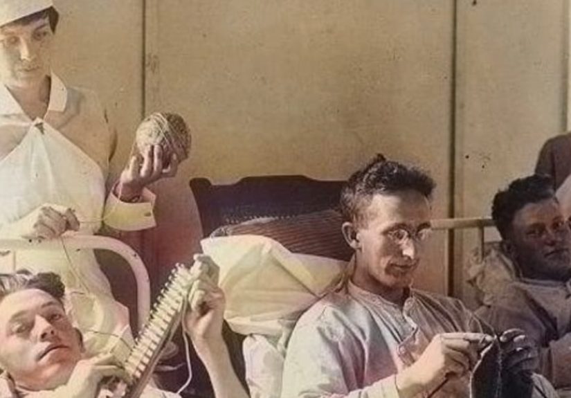
- 5) Medics and Stretcher Bearers: The Quiet Heroism Between the Noise
- 6) Nurses in Field Hospitals: Courage in White (and Sometimes Khaki)
- 7) Artillery Crews: The Industrial Scale of Destruction
- 8) Tanks Enter the Chat: Early Armor That Looks Both Clumsy and Terrifying
- 9) Biplanes and Pilots: The War Goes Vertical
- 10) Observation Balloons: Giant Targets That Helped Aim the War
- 11) The Harlem Hellfighters and Other Black Soldiers: Service and Segregation Side by Side
- 12) Prisoners of War: The Face of “Enemy” Looks Uncomfortably Familiar
- 13) Home Front Factory Workers: War as a Shift Schedule
- 14) Liberty Loan Rallies and Posters: Persuasion in Bright Ink
- 15) Ruined Villages: When “Somewhere” Becomes “Nowhere”
- 16) Refugees and Civilians: The War That Followed People Home
- 17) Armistice Celebrations: Relief in Color, Grief in the Background
- 18) Cemeteries and Crosses: The Quiet Geometry of Sacrifice
- How to “Read” a Colorized WWI Photo Like a Historian (Without Losing the Emotion)
- Conclusion: The Past Was in ColorAnd That Changes Us
- Extra: of “Experience”What It Feels Like to Encounter WWI in Color
Black-and-white photos of World War I can feel like they belong to a distant planet: all shadow, smoke, and stiff uniforms, as if the past were a silent movie that never learned to speak. Then you see WWI in colorwhether from early color processes or careful modern colorizationand something snaps into place. The war stops being “history.” It becomes people. People with pink ears in the cold. People with mud on their boots, not “mud-colored boots.” People whose world wasn’t grayscale any more than yours is.
This is why colorized WWI photos can feel so haunting: they shrink the distance between “then” and “now.” The Great War is still the Great Warmass mobilization, trench warfare, a new scale of industrial conflictbut color adds an uncomfortable intimacy. It’s harder to hide behind sepia when the uniforms are olive drab, the stretchers are canvas, and the sky is a real, bruised blue.
Why WWI in Color Hits Different
Color does two things at once. First, it clarifies details your brain usually ignores in black-and-white: insignia, unit colors, medical armbands, warning flags, even the difference between fresh earth and churned mud. Second, it rewires empathy. A colorized portrait doesn’t look like an “old-timey person.” It looks like someone who could have a phone case and a group chatexcept their group chat was probably called “platoon” and their notifications were… loud.
But color also comes with responsibility. Modern photo colorization is a blend of research and interpretation. Done carefully, it’s a bridge to the past. Done lazily, it’s historical fan fiction with good lighting. The best work is transparent about uncertainty, cross-checks uniforms and equipment, and treats color as a tool for understandingnot a costume for clicks.
How Those Colors Get There: Autochrome vs. Modern Colorization
Early color photography (yes, it existed during WWI)
WWI wasn’t born in black-and-white. Early color photography processes existed, including autochromean early method that produced soft, painterly color with long exposure times. That meant fewer action shots and more carefully composed scenes, but the results can be startlingly alive: faces warm-toned, uniforms recognizable, landscapes oddly calm against the knowledge of what’s happening around them.
Modern colorized photos (the digital “second life”)
Most WWI photos were taken in black-and-white, and many of the color images you see today are modern restorations and colorizations based on research. Skilled colorists consult period artifacts, uniform regulations, dye and fabric behavior, contemporary written descriptions, and museum collections. Even then, some colors remain educated guessesespecially when lighting, film limitations, or damage hide details.
The goal of this article is to help you read colorized World War I photos with both wonder and critical thinking. You can be emotionally moved and historically careful. (In fact, that’s the sweet spot. Like peanut butter and jellyexcept the peanut butter is “context” and the jelly is “feelings,” and the sandwich is “learning.”)
18 Haunting Colorized WWI Photos (and the Stories Behind Them)
Below are 18 iconic types of WWI images you’ll commonly encounter in major collections and archivesscenes frequently colorized because color helps explain what the camera captured. Think of this as a guided gallery: what you’re seeing, what it meant then, and what color reveals now.
1) The “New Uniform” Portrait: Young Recruits Before the Reality Sets In
A classic early-war image: a young soldier posed stiffly, uniform freshly issued, boots still pretending they’ll stay clean. In color, the “official” look becomes more humanskin tones, lip color, the faint red around tired eyes. The haunting part isn’t gore or drama; it’s the innocence of someone who hasn’t learned yet that a uniform doesn’t make you invincible. It just makes you visible.
2) Trench Life: Sandbags, Duckboards, and the Color of Mud That Never Leaves
Trench photos can look almost abstract in black-and-white: a maze of shadows and boards. In color, the environment becomes a character. Mud isn’t one colorit’s a sticky spectrum of brown, gray, and sickly green. Sandbags read as rough canvas rather than “bright blobs.” The men look less like statues and more like people trying to stay warm, dry, and awake in a world built from dirt and patience.
3) The No-Man’s-Land Landscape: Craters, Wire, and a Sky That Doesn’t Care
Some of the most haunting WWI photos are simply landscapes after bombardment: shattered trees, broken ground, and barbed wire stretching like a metallic thorn patch. Color adds a cruel normalcythe sky can be bright, the grass stubbornly green in patches, the dirt freshly raw. Nature doesn’t provide a “dramatic filter” for tragedy. It just keeps being nature, and that contrast is unsettling.
4) Gas Masks: When the War Started to Look Like Science Fiction
A row of soldiers wearing gas masks can feel eerie even today. In color, it’s worse (and better): the rubberized material, fogged lenses, and pale straps become tangible. You can almost feel the claustrophobia. These images matter because they show how WWI accelerated protective gear, logistics, and medical responseswhile also reminding us that technology doesn’t erase fear. It just changes its shape.
5) Medics and Stretcher Bearers: The Quiet Heroism Between the Noise
Photos of medical teams often look calm at first glance: men carrying a stretcher, a first-aid station, a nurse pausing mid-task. Color reveals the medical reality without needing graphic detailwhite bandages, red cross markings, the dull beige of canvas. The haunting element is the focus: everyone is doing a job that shouldn’t exist at this scale, and yet it’s done with routine competence because routine was the only way to survive.
6) Nurses in Field Hospitals: Courage in White (and Sometimes Khaki)
Nursing photos become more powerful in color because you see how “clean” was a moving target. Whites aren’t perfectly white; fabrics are worn; environments are dusty. Many nurses served near the front in difficult conditions, and color helps you read details like insignia, armbands, and uniformssmall visual cues that carry huge meaning. These images also highlight how wartime service reshaped women’s roles and public perceptions.
7) Artillery Crews: The Industrial Scale of Destruction
Big guns in black-and-white look like metal sculptures. In color, you notice grease stains, chipped paint, wooden wheels, and the earth kicked up around the gun pit. The scene stops being “a cannon photo” and becomes a workplacean exhausting, dangerous job site run by teams who learned to operate machines that could change a map in minutes. Color makes the machinery feel real, which makes the consequences feel real, too.
8) Tanks Enter the Chat: Early Armor That Looks Both Clumsy and Terrifying
Early tanks were not sleek. They were riveted, boxy, and experimentallike someone tried to build a moving fortress using 1916 tools and pure determination. In colorized images, you can read the camouflage tones, the dust, the scuffed metal. What’s haunting is how new this was: a shift in warfare that hinted at the mechanized future. The tank looks awkward, but the idea behind it is brutally efficient.
9) Biplanes and Pilots: The War Goes Vertical
WWI aviation photos often capture pilots posed with their aircraftpride, nerves, bravado, and exhaustion all in one frame. Color adds vivid identity: the paint on the fuselage, the fabric wings, the leather of flight gear. It also reveals how exposed early pilots were. There’s no cozy cockpit vibe herejust wind, cold, and the knowledge that the sky is not automatically safer than the trenches.
10) Observation Balloons: Giant Targets That Helped Aim the War
Observation balloons look almost peaceful until you remember why they existed: to see enemy positions and direct artillery. In color, the balloon’s pale surface stands out against the sky like a “please notice me” signbecause that’s exactly what it was. The haunting part is strategic: war is often decided by who sees first, measures better, and communicates faster. Balloons were slow, vulnerable, and incredibly important.
11) The Harlem Hellfighters and Other Black Soldiers: Service and Segregation Side by Side
Colorized portraits of African American soldiers can be especially moving because color refuses to let the viewer flatten identity into a single historical blur. These images open conversations about bravery, discrimination, and the complicated reality of serving a country that still enforced segregation. The uniforms might look crisp; the expressions might look proudbut the story includes both battlefield service and the fight for dignity back home.
12) Prisoners of War: The Face of “Enemy” Looks Uncomfortably Familiar
POW images can be quietly devastating. In color, you notice uniforms in differing shadesfeldgrau, khaki, bluesturning abstract “sides” into individual people. The haunting lesson here isn’t moral grandstanding; it’s humanity. Many prisoners were young, tired, and hungry. Color makes them harder to dehumanize, and that’s exactly why these images still matter.
13) Home Front Factory Workers: War as a Shift Schedule
Not every WWI photo is from the front. Colorized images of factory floorsespecially munitions workshow a different battlefield: industrial production. You see the oily sheen of machinery, the drab walls, the varied clothing and uniforms, and the sheer scale of the effort. It’s haunting because it shows how war can reorganize an entire society around output and deadlines, turning everyday labor into national survival.
14) Liberty Loan Rallies and Posters: Persuasion in Bright Ink
WWI-era posters were designed to grab attention fast, and color matters. Red, white, and blue aren’t just colors; they’re emotional buttons. Colorized scenes of rallies and recruiting drives help you understand how governments communicated urgency: flags everywhere, bold typography, crisp uniforms in a sea of civilian clothing. The haunting part is how familiar it feelspublic messaging, social pressure, and “do your part” energy that can inspire and intimidate at the same time.
15) Ruined Villages: When “Somewhere” Becomes “Nowhere”
Photos of destroyed towns can look like rubble studies in black-and-white. In color, the loss becomes specific: brick reds, scorched timbers, pale plaster, the dull shine of broken roof tiles. It’s haunting because it’s not only military infrastructurethese were homes, churches, shops, streets with routines. Color makes the “before” easier to imagine, which makes the “after” harder to ignore.
16) Refugees and Civilians: The War That Followed People Home
WWI displaced civilians across multiple regions. Colorized images of families carrying bundles or waiting in lines bring out clothing textures and the vulnerability of ordinary life under pressure. The haunting element is the simplicity: a coat, a suitcase, a child’s hand held too tightly. War isn’t only a front line; it’s a force that changes where people sleep, what they eat, and what they can safely hope for.
17) Armistice Celebrations: Relief in Color, Grief in the Background
Photos taken around the Armistice (November 11, 1918) can look like pure joycrowds, flags, smiling faces. Color amplifies the celebration: bright banners, uniforms mixed with civilian outfits, a city’s palette returning to itself. But the haunting part is what color can’t hide: relief doesn’t erase loss. Many celebrants were also mourners, and the end of fighting didn’t instantly repair bodies, economies, or minds.
18) Cemeteries and Crosses: The Quiet Geometry of Sacrifice
Rows of graves are among the most haunting WWI images because they’re orderly in a way war never is. In color, the grass is vivid, the stone or wooden markers stand out, and the scene feels painfully present. These photos connect to how nations chose to rememberthrough cemeteries, memorials, and rituals. Color doesn’t dramatize this; it humanizes it. The stillness is the point.
How to “Read” a Colorized WWI Photo Like a Historian (Without Losing the Emotion)
Look for clues, not just vibes
Uniform color can suggest country and era; insignia can hint at unit role; equipment can indicate a front or campaign. Even the landscape matters: chalky soil, dense forest, or a flat horizon can narrow possibilities. Color helps, but context confirms.
Ask what might be uncertain
Was the original photo tinted? Was it shot on an early color process? Is the colorization modern? If modern, some elements (like exact fabric shade) may be interpretive. A trustworthy caption admits uncertainty rather than pretending it has a time machine.
Notice the ordinary details
Haunting doesn’t always mean shocking. It can be a wool scarf, a chipped mug, or a muddy cuff. Color pulls everyday life forwardexactly the part history textbooks often flatten into bullet points.
Conclusion: The Past Was in ColorAnd That Changes Us
Colorized photos of World War I don’t replace traditional archives; they add another layer of understanding. At their best, they offer a respectful, research-informed way to connect modern eyes to historical reality. They remind us that “1914–1918” wasn’t a chapter title. It was a lived experienceworn fabrics, cold mornings, nervous smiles, heavy equipment, and endless waiting broken by moments that changed lives.
If you want to explore WWI in color responsibly, seek captions with clear context, compare multiple sources, and remember that color is a toolnot a verdict. Let it bring you closer to the people in the frame, and let the history behind the frame keep you honest. That combinationempathy plus accuracyis the opposite of forgetting.
Extra: of “Experience”What It Feels Like to Encounter WWI in Color
Seeing World War I in color is a strange emotional trickin a good way. Many people describe the first moment as a double take: you expect “old,” and your brain is prepared to keep the past behind glass. Then the color breaks the seal. A soldier’s cheeks look wind-chapped, not “vintage.” A nurse’s uniform looks like fabric you could touch. A muddy trench looks like something you could smell. The distance collapses, and you realize that the people in these images weren’t born historicalthey were born ordinary.
The most powerful “experience” is often the quietest: noticing details you’d normally skip. In black-and-white, a crowded street scene can feel like visual noise. In color, you start tracking individuals. You notice the different browns in coats, the faded blues, the bright red of a poster, the pale green of military paint. Suddenly, it’s not a single “crowd.” It’s a thousand separate lives overlapping for one reason: war has rearranged their calendar.
There’s also a surprising kind of tension that comes with colorized WWI photos: you can’t hide behind aesthetics. Black-and-white can feel artistic, even when the subject is grim. Color makes the subject feel closer to your world, which makes it harder to romanticize. The war doesn’t become glamorous just because it becomes vivid. If anything, vividness makes the war feel more exhausting. The mud looks heavier. The uniforms look scratchier. The faces look younger.
If you’ve ever stood in front of a memorial wall or rows of headstones, you know how silence can be loud. Colorized cemetery images can trigger that same feeling. Green grass and pale stone aren’t dramatic, but they are intensely real. People sometimes walk away from these photos with a new appreciation for remembrance traditions: poppies, moments of silence, names read aloud. Those rituals exist because numbers are too big to feelso we make remembrance personal on purpose.
One of the healthiest ways to sit with these images is to slow down. Pick one colorized photo and spend two full minutes noticing details: what season might it be, what the uniforms suggest, what the background says about place, what emotions you read in posture. Then read context from a credible collection or museum. The emotional punch is still there, but now it has structure. It’s not just “wow.” It’s “wow… and I understand why.”
And yessometimes the experience includes an awkward laugh. Not at suffering, but at the startling normalcy of humanity. Someone’s hat sits crooked. Someone looks bored. Someone has the expression of a person who absolutely did not sign up for this group project. Those flashes of personality are exactly why color matters: it restores individuality. It reminds you that history was lived by people who had jokes, bad days, and favorite foodsright up until the war demanded everything else.