Table of Contents >> Show >> Hide
- How to Design With a White Backsplash (So It Doesn’t Look Flat)
- 35 White Kitchen Backsplash Ideas
- 1) Classic white subway tile (3×6) in a running bond
- 2) Oversized subway tile (4×12 or 4×16)
- 3) Vertical-stacked subway
- 4) Horizontal-stacked subway
- 5) Herringbone white tile
- 6) Chevron white tile
- 7) White zellige (handmade-look) tile
- 8) Zellige in a vertical stack
- 9) Beveled white subway
- 10) Crackle-glazed white tile
- 11) Matte white tile
- 12) Glossy white tile
- 13) White penny rounds
- 14) White hex tile (small)
- 15) Large-format white hex
- 16) White fish scale (mermaid) tile
- 17) White arabesque tile
- 18) White scallop tile
- 19) White “kit-kat” or finger tile (vertical)
- 20) Fluted/reeded white tile
- 21) 3D geometric white tile (cubes/waves)
- 22) White square tile (4×4) for a “classic café” look
- 23) White brick tile
- 24) Painted white brick
- 25) White marble tile (subway or larger rectangles)
- 26) Full slab marble backsplash
- 27) Quartz slab backsplash (matching countertop)
- 28) Porcelain marble-look large-format tile
- 29) White terrazzo-look tile
- 30) White glass tile
- 31) Antique/patinated mirror backsplash
- 32) White beadboard backsplash
- 33) White shiplap-style paneling
- 34) White tile “frame” with a thin trim border
- 35) Two-tone white-on-white mix (matte field + glossy accent)
- Easy Pairings: Cabinets, Counters, Hardware
- Maintenance & Cleaning (Real Life Happens Here)
- Experience Notes: What People Wish They Knew (Add-On Section)
- Wrap-Up
White backsplashes are the little black dress of kitchens: they go with everything, they never fully leave the group chat, and they can look wildly different depending on the accessories.
The trick is this“white” isn’t a single decision. It’s a whole menu: warm vs. cool, glossy vs. matte, smooth vs. textured, tiny grout grid vs. nearly seamless slab.
Pick the right version and your kitchen looks intentional. Pick the wrong one and it looks like you stopped halfway through a Pinterest board.
This guide gives you 35 white kitchen backsplash ideas and a designer-style game plan for choosing materials, patterns, grout, height, and lighting so your backsplash looks expensive
(even if your budget is more “weeknight tacos” than “celebrity chef”).
How to Design With a White Backsplash (So It Doesn’t Look Flat)
1) Choose your “white” like you choose a paint color
- Warm whites (creamy, ivory) love brass, oak, and beige/taupe stone.
- Cool whites (crisp, bright) pair well with chrome, black hardware, and gray-veined surfaces.
- When in doubt: match the backsplash undertone to the countertop undertone, not the cabinet label that says “white.”
2) Decide what you want the backsplash to do
- Blend in (quiet luxury): big tiles, minimal grout, slab looks, or matching grout.
- Add texture (cozy + layered): handmade tile, fluted tile, beadboard, or subtle 3D shapes.
- Bring pattern (statement zone): herringbone, chevron, hex, penny rounds, or geometric mosaics.
3) Pick a layout that matches your kitchen’s vibe
- Traditional: classic subway in a running bond.
- Modern: stacked (vertical or horizontal), large-format rectangles, or slab.
- Old-house charm: beadboard, brick, handmade zellige, or mixed textures.
4) Treat grout like a design material
- Matching grout softens the grid and feels calm.
- Light gray grout adds definition while hiding everyday smudges better than bright white.
- High-contrast grout turns the pattern into the main characterfun, but visually loud (and very honest about crooked lines).
5) Get the height right (and make it look intentional)
- Classic: backsplash to the bottom of upper cabinets.
- Full-height: counter to ceiling (or to the hood) for a more custom look.
- Mini backsplash: just behind the sink or rangebudget-friendly, but it needs a clean ending detail.
6) Let lighting make the final call
Undercabinet lighting is basically the world’s most judgmental spotlight. It will exaggerate texture, shine, grout lines, and any uneven tile edges.
If you love that drama, go for it. If you want “smooth and serene,” choose flatter tile, tighter grout lines, and a softer sheen.
35 White Kitchen Backsplash Ideas
Each idea below includes a quick “how to design with it” tip so you can actually use itnot just admire it.
1) Classic white subway tile (3×6) in a running bond
Timeless, affordable, and flexible. Pair with marble-look quartz counters for the “always stylish” combo.
2) Oversized subway tile (4×12 or 4×16)
Fewer grout lines, more modern. Great for busy countertops because it doesn’t compete.
3) Vertical-stacked subway
Makes ceilings feel taller. Looks sharp with flat-panel cabinets and minimal hardware.
4) Horizontal-stacked subway
Clean and contemporary. Use matching grout to keep it sleek, not “grid-heavy.”
5) Herringbone white tile
Instant movement and polish. Keep everything else simplelet the pattern do the talking.
6) Chevron white tile
More graphic than herringbone. Works especially well as a focal area behind the range.
7) White zellige (handmade-look) tile
Glowy, imperfect, and full of texture. Pair with warm woods and unlacquered brass for a soft, lived-in look.
8) Zellige in a vertical stack
The handmade texture meets modern layout. Great compromise if you want “warm modern,” not sterile.
9) Beveled white subway
Subtle shadow lines add dimension. Looks especially good in traditional or transitional kitchens.
10) Crackle-glazed white tile
Glossy, vintage charm. Best in lower-splatter zones or with a commitment to gentle cleaning.
11) Matte white tile
Soft, modern, and less reflective. Pair with black hardware for crisp contrast.
12) Glossy white tile
Brightens darker kitchens and bounces light around. Choose a grout that won’t yellow over time.
13) White penny rounds
Playful and classic. Use a slightly darker grout to keep it from turning into a maintenance hobby.
14) White hex tile (small)
Vintage-meets-modern. Looks great with Shaker cabinets and polished nickel hardware.
15) Large-format white hex
Less busy, more contemporary. A nice “pattern without the chaos” option.
16) White fish scale (mermaid) tile
Curvy and fun. Keep cabinet style simple so the backsplash doesn’t feel like a costume party.
17) White arabesque tile
Soft curves with a Moroccan-inspired vibe. Works beautifully with warm white cabinets and brass pulls.
18) White scallop tile
Similar to fish scale but often cleaner-lined. Great for adding personality in a mostly neutral kitchen.
19) White “kit-kat” or finger tile (vertical)
Trendy in a good way: texture + rhythm. Looks amazing with minimalist slab cabinets.
20) Fluted/reeded white tile
Architectural texture that feels high-end. Use it behind the hood for a designer focal point.
21) 3D geometric white tile (cubes/waves)
Built-in interest without adding color. Keep counters quiet and lighting warm to soften shadows.
22) White square tile (4×4) for a “classic café” look
Works well with vintage-inspired lighting and traditional cabinetry profiles.
23) White brick tile
Rustic texture with a cleaner feel than exposed brick. Pair with wood shelves for warmth.
24) Painted white brick
Bright and airy, especially in older homes. Seal properly so it’s wipeable, not crumbly.
25) White marble tile (subway or larger rectangles)
Elegant and classic. Use it if you’re okay with “real stone behavior” (sealing, etching awareness).
26) Full slab marble backsplash
The “no grout line” flex. Stunning behind a range and easiest to visually simplify a busy kitchen.
27) Quartz slab backsplash (matching countertop)
Seamless, durable, and low-fuss. Great for modern kitchens that want clean lines.
28) Porcelain marble-look large-format tile
Gives the veined-stone vibe with less worry. Choose rectified edges for tight grout joints.
29) White terrazzo-look tile
Adds speckled interest while staying mostly neutral. Pull one terrazzo chip color into your hardware or decor.
30) White glass tile
Reflective and bright. Looks best with minimalist grout and good undercabinet lighting.
31) Antique/patinated mirror backsplash
Glam and space-expanding. Use in smaller kitchens or bar areas where splatter is lower.
32) White beadboard backsplash
Farmhouse-friendly and cozy. Seal and paint with a durable finish so it can handle real cooking life.
33) White shiplap-style paneling
Clean lines with subtle texture. Works best in kitchens that lean coastal, cottage, or modern farmhouse.
34) White tile “frame” with a thin trim border
Makes basic tile look more custom. Think of it like a backsplash picture framesimple, but intentional.
35) Two-tone white-on-white mix (matte field + glossy accent)
Same color family, different finishes. It’s the easiest way to add depth without adding “busy.”
Easy Pairings: Cabinets, Counters, Hardware
White cabinets
- Keep it layered: choose texture (zellige, fluted, beadboard) or a different sheen so white-on-white looks rich, not blank.
- Countertop tip: if counters are heavily veined, pick a simpler backsplash layout (stacked or larger format).
Wood cabinets (oak, walnut, maple)
- Warm whites shine here: creamy tile + wood looks inviting and timeless.
- Best bets: handmade-look tile, matte ceramic, or simple subway with a warm gray grout.
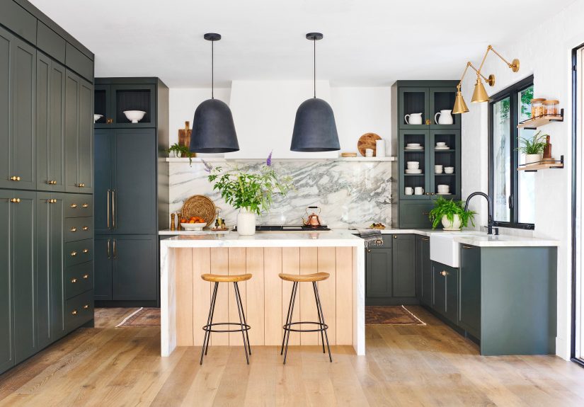
Dark cabinets (black, charcoal, navy, forest green)
- Go glossy to brighten: white glossy tile reflects light and lifts the whole room.
- Or go slab for drama: a bright slab backsplash against dark cabinets is a clean, high-contrast statement.
Hardware cheat sheet
- Brass: makes white feel warmer and more “collected.”
- Black: makes white feel graphic and modern.
- Chrome/nickel: makes white feel crisp and classic.
Maintenance & Cleaning (Real Life Happens Here)
- Less grout = less scrubbing: larger tiles, slabs, and tight joints are your friends.
- Be honest about your cooking style: lots of frying and sautéing means grease will find your backsplash. Plan for easy-wipe materials.
- Stone and handmade tiles can be higher-maintenance: sealing and gentle cleaning matter if you want them to look good long-term.
- Simple weekly habit: a quick wipe after heavy cooking prevents the “mystery film” that shows up under bright lights.
Experience Notes: What People Wish They Knew (Add-On Section)
After watching countless kitchens get built, remodeled, and “lightly refreshed,” a few patterns show up again and againespecially with white backsplashes.
Think of this section as the voice of experience from homeowners, installers, and designers who’ve learned the hard way so you don’t have to.
First: samples are not optional. White is wildly sensitive to lighting. A tile that looks “clean and modern” in a showroom can look
slightly cream (or slightly blue) once it sits next to your countertop and under your undercabinet lights. The smartest move is to bring home a few tile samples
and look at them in the morning, afternoon, and at night. Kitchens change mood faster than a group chat.
Second: grout is where good ideas go to become “why is this harder than it should be?” People often pick grout last, like it’s a footnote.
But grout is the outline on your backsplash drawing. If it’s too bright, it can stain and look uneven over time. If it’s too dark, every tile line becomes a bold
graphic statementgreat if you love that look, exhausting if you wanted “calm.” A lot of homeowners end up happiest with a soft gray or greige because it adds just enough
definition while being forgiving when life (and spaghetti sauce) happens.
Third: texture is gorgeous… and also honest. Handmade-look tiles (like zellige-style) can create that dreamy, sunlit shimmer. But they can also show
natural variation, uneven edges, and more visible shadows under direct lighting. Many people love that characterothers are surprised by it. The fix is simple:
use that texture where it performs best (behind a hood, as a feature wall, or in a kitchen with warmer, softer lighting) and choose a smoother tile in the heavy-duty splash zones.
Fourth: plan outlets and endings early. White backsplashes look their best when cuts are clean, edges align, and outlets don’t interrupt the prettiest part of the pattern.
That means thinking about where tile should start and stop (especially around windows, open shelving, and floating hoods) before the first tile goes up.
Homeowners who plan this early tend to get that “custom” look without spending custom money. People who plan it late tend to get creative… with outlet covers… and not in a fun way.
Fifth: the “perfect” white backsplash is often the one that fits your lifestyle. Some households want a showpiece and don’t mind careful cleaning.
Others want something that survives weekday chaos with a quick wipe. White backsplashes can do eitherjust choose accordingly.
If you want low stress, lean toward porcelain, ceramic, quartz, or larger-format tile with fewer grout lines. If you want maximum romance, bring on the marble and handmade texture,
but budget for sealing and gentler upkeep. Either way, the best kitchens aren’t the ones that look untouched; they’re the ones that look great while being lived in.
Wrap-Up
A white backsplash isn’t “playing it safe”it’s choosing a flexible foundation. The magic comes from the details: scale, layout, finish, grout, and where you carry the material.
Want timeless? Go classic subway, large-format porcelain, or a simple slab. Want personality without color overload? Choose texturezellige, fluted, beadboard, or a subtle 3D pattern.
When you treat “white” as a design decision (not a default), your kitchen ends up looking polished, layered, and totally yours.