Table of Contents >> Show >> Hide
- Why image optimization matters more than most people think
- Step 1: Choose the right image format before you upload anything
- Step 2: Compress images so they stay pretty without acting expensive
- Step 3: Name images properly and write alt text like a human
- Step 4: Serve responsive images and prevent layout shifts
- Step 5: Load images strategically, not all at once like a yard sale
- The easiest image optimization workflow for busy website owners
- Common image optimization mistakes to avoid
- Final thoughts
- Practical experience: what actually happens when you optimize website images
- SEO Tags
If your website feels slow, there is a decent chance your images are the ones eating all the snacks in the break room. Big, uncompressed, poorly named images can quietly wreck page speed, hurt user experience, and make search engines work harder than they should. The good news is that image optimization does not have to feel like a graduate-level computer science exam.
This guide breaks the process into five simple steps you can actually use. No fluff, no robotic filler, and no advice that assumes you run a team of twelve developers and a wizard. Whether you manage a blog, an online store, a service website, or a portfolio, these steps will help you improve image SEO, boost website speed, and make your pages look sharp without weighing them down like a bowling ball in a backpack.
Why image optimization matters more than most people think
Images do a lot of heavy lifting on a website. They grab attention, explain products, break up text, support branding, and often become the biggest visual element on the page. That also means they frequently influence how fast the page appears to load. On many sites, the largest image above the fold becomes the element that shapes perceived speed and user satisfaction.
Optimized images help in three major ways. First, they improve page speed, especially on mobile devices and slower connections. Second, they support SEO by giving search engines useful context through file names, alt text, page relevance, and structured content relationships. Third, they improve accessibility because users who rely on screen readers or have images disabled still need to understand what the page is communicating.
In plain English: image optimization helps your website load faster, rank better, and feel less annoying. That is a pretty strong return for a task that often takes just a few extra minutes per page.
Step 1: Choose the right image format before you upload anything
The easiest image optimization win is choosing the right format. This sounds almost too basic, but it matters a lot. Using the wrong file type is like mailing a feather with a cinder block attached.
Use the format that matches the job
- JPEG or JPG: Best for photographs and complex images with lots of colors and gradients.
- PNG: Best for graphics that need transparency, screenshots, or simple visuals where crisp edges matter.
- WebP: A strong modern choice for most web images because it usually provides better compression than older formats.
- AVIF: Often even smaller than WebP at similar visual quality, though workflows and compatibility should still be tested.
- SVG: Best for logos, icons, and simple illustrations that need to stay sharp at any size.
If your CMS or image pipeline supports modern formats, WebP is usually the safest easy win. AVIF can be even more efficient, but it is smart to test it in your workflow rather than assuming every tool in your stack will behave nicely. Your logo should not become an abstract painting because a plugin had a bad day.
Resize before upload
Do not upload a 4000-pixel-wide image if it will only display at 900 pixels. That is not “future-proofing.” That is just making everyone download extra bytes for no reason. Resize images to the largest realistic display size your layout actually uses. If your blog content area is 800 pixels wide, you probably do not need a giant billboard-sized file.
Easy rule: start with the smallest dimensions that still look crisp on modern screens, then generate additional versions only when needed for responsive design.
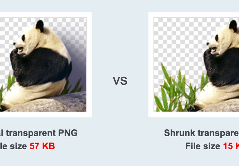
Step 2: Compress images so they stay pretty without acting expensive
Compression is where image optimization starts paying rent. The goal is simple: reduce file size without making the image look like it survived three fax machines and a thunderstorm.
Lossy vs. lossless compression
Lossy compression removes some data to create much smaller files. It is usually perfect for photos if handled carefully. Lossless compression keeps all image data but still reduces size, which can be useful for logos, interface graphics, or screenshots where sharp detail matters.
For most websites, a slight quality reduction is worth it because users care more about speed and clarity than the ability to zoom into a pillow and inspect its emotional texture.
How to compress the easy way
Use an image optimization tool before uploading, or use a platform that automates the process. A practical workflow looks like this:
- Resize the image to the largest display size you actually need.
- Export in WebP or AVIF when possible.
- If using JPEG, lower quality gradually until you notice a visible drop, then go one step higher.
- Keep testing on desktop and mobile.
For blog images, marketing graphics, and product photos, the “best” file is usually not the prettiest original. It is the smallest version that still looks professional in context. On a real webpage, an image rarely needs perfection. It needs to be fast, clear, and useful.
Step 3: Name images properly and write alt text like a human
This is where image SEO becomes wonderfully unglamorous. Search engines cannot admire your artistic instincts. They rely on signals. Two of the most important are descriptive file names and meaningful alt text.
Write file names that explain the image
Before uploading, rename your image file so it describes what the image actually shows. Use lowercase letters, hyphens, and plain language.
Bad: IMG_4472-final-final-REAL.png
Better: optimize-images-for-website-checklist.webp
A descriptive file name gives search engines more context and makes your media library easier to manage. It also helps future-you, who will one day search for an image and wonder why past-you named everything “new-banner-2-revised-final.”
Write alt text for users first, SEO second
Alt text should describe the image clearly and naturally. It exists mainly for accessibility and fallback situations, but it also helps search engines understand image content in context.
Weak alt text: image
Spammy alt text: optimize images for website image optimization website speed image SEO
Good alt text: marketer compressing a product photo before uploading it to a website
Use your main keyword only when it fits naturally. If the image genuinely relates to image optimization, say so. If it shows a blue sneaker on a white background, describe the sneaker, not your hopes and dreams for ranking on page one.
Keep image context relevant
Search engines also learn from surrounding text, captions, headings, and page topic. That means an image placed near relevant content tends to make more sense than a random stock photo dropped into a paragraph like an uninvited relative at Thanksgiving.
Step 4: Serve responsive images and prevent layout shifts
If one huge image gets sent to every screen size, your small-screen users are paying for pixels they will never enjoy. Responsive images solve that problem by letting the browser choose the most appropriate image size for the device.
Use srcset and sizes
This tells the browser which versions are available and how much space the image is expected to take.
This is one of the easiest ways to improve image performance without sacrificing quality. The browser gets options instead of a one-size-fits-none mess.
Always set width and height
Specifying width and height helps the browser reserve the correct space before the image loads. That reduces layout shifts, which means your page stops jumping around like it just heard unexpected fireworks. Stable layouts improve user experience and support better performance signals.
Use <picture> when art direction matters
If mobile users need a different crop than desktop users, the <picture> element gives you more control.
Use this only when different crops or visual compositions are necessary. Otherwise, keep life simple with srcset.
Step 5: Load images strategically, not all at once like a yard sale
Image loading strategy is the final piece of the puzzle. Even optimized images can cause problems if they are all requested immediately.
Lazy-load images below the fold
Lazy loading delays offscreen images until the user is about to see them. That reduces the amount of work the browser has to do during the initial load.
This is a simple, effective improvement for article images, galleries, and long pages. But do not lazy-load your main hero image or the image most likely to become the Largest Contentful Paint element. That can slow down the content users want first.
Prioritize important images
Your above-the-fold hero image, featured product image, or key banner may need priority treatment. In some cases, using eager loading, preload, or fetch priority makes sense.
The idea is simple: lazy-load the images users do not need yet, and prioritize the one they do. You are not just making the page lighter. You are arranging traffic so the important stuff gets through first.
The easiest image optimization workflow for busy website owners
If you want the quick version, use this checklist every time:
- Resize the image to its realistic display dimensions.
- Export in WebP when possible, or AVIF if your workflow supports it well.
- Compress the file until it looks good and loads fast.
- Rename the file with descriptive words before uploading.
- Add natural alt text that describes the image in context.
- Use responsive image markup for important templates.
- Set width and height attributes.
- Lazy-load offscreen images, but not your main hero image.
That is the easiest method because it avoids overthinking. You do not need to memorize every performance metric in existence. You just need a repeatable system.
Common image optimization mistakes to avoid
- Uploading huge original files straight from a camera or design tool
- Using PNG for every image even when a photo would be better as WebP or JPEG
- Writing alt text stuffed with keywords instead of clear descriptions
- Forgetting to add width and height, which can cause layout shifts
- Sending the same oversized image to every device
- Lazy-loading the hero image and accidentally slowing the page’s main visual
- Treating image SEO as separate from user experience when it is really both
Final thoughts
Image optimization is one of those rare website improvements that benefits almost everyone. Search engines get clearer signals. Users get faster pages. Mobile visitors use less data. Screen reader users get better accessibility. And you get a site that feels more polished without needing a massive redesign.
The easiest method is not a hack. It is a habit. Choose the right format, compress smartly, describe images well, serve the right size, and load them at the right time. Do that consistently, and your website will feel faster, rank more intelligently, and stop carrying around bloated image files like emotional baggage.
Practical experience: what actually happens when you optimize website images
In real projects, image optimization usually starts the same way: someone says the website feels slow, but no one wants to believe the problem is “just images.” Then you open the page, inspect the network requests, and there it is, a homepage loading a 3 MB banner to display in a space barely larger than a postcard. Suddenly the mystery is less mysterious.
One of the most common lessons from hands-on work is that small image decisions stack up fast. A single oversized hero image might be annoying, but ten oversized blog images on the same page can quietly wreck the experience. Once those files are resized, compressed, and converted to modern formats, pages often feel faster immediately, even before deeper technical improvements are made. That matters because users notice speed emotionally before they ever measure it technically.
Another practical lesson is that “good-looking” is contextual. Designers sometimes worry that compression will ruin visual quality, but on live websites the difference is often invisible at normal viewing sizes. What users do notice is when the page stalls, jumps around, or loads image placeholders like it is buffering from outer space. In many cases, a slightly compressed image that appears quickly performs better for the business than a pristine image that arrives late to the party.
There is also a strong workflow lesson here: the easiest method wins because teams actually use it. Complicated optimization rules sound impressive, but simple systems get repeated. When content creators know they should resize before upload, use descriptive file names, write honest alt text, and let the platform generate responsive versions, quality improves across the whole site. Good performance becomes a habit rather than a rescue mission.
Experience also shows that the biggest mistakes usually come from templates, not one-off pages. A blog template that omits width and height can create layout shifts across hundreds of posts. An ecommerce template that lazy-loads the main product image can slow the exact image people came to see. Fixing one template can improve thousands of pages at once, which is why image optimization is not just a content task. It is also a systems task.
Finally, the most useful mindset is to stop thinking of image optimization as a cosmetic chore. It is part of technical SEO, part of UX, part of accessibility, and part of conversion optimization. Fast, well-labeled, responsive images help real people do real things more easily. That is the kind of optimization that tends to age well.