Table of Contents >> Show >> Hide
Interior design is supposed to make your home feel effortless. You know: the kind of space where people say,
“Wow, this is so you,” and not, “Wait… why is the light switch behind the bookshelf?”
But every so often, a room shows up that feels like it was designed during a power outage,
with a tape measure that had trust issues, and a firm belief that physics is just a suggestion.
Before we start roasting (gently!), a quick reality check: most designers are talented pros juggling budgets,
odd floor plans, timelines, client requests, and the occasional “I saw it on social media, so it must be right.”
Still… when function gets ignored, even a pretty room can become a daily obstacle course.
And that’s how we end up with the glorious category known as interior design fails.
Why Design Fails Happen (Even When Everyone Means Well)
Most “what were they thinking?” moments come from a few predictable problems:
bad measurements, poor traffic flow, lighting that looks nice but works badly,
and trend-chasing without real-life testing. A room can photograph beautifully and still be miserable to live in.
The difference is usually the un-sexy stuff: clearances, ergonomics, glare control, storage, and cleanup.
The funniest part? Many disasters are preventable with one simple habit:
pause the mood board for five minutes and do a “real life walkthrough.”
If you can’t open a door fully, carry laundry without bumping corners, or cook without shadowboxing your own countertop,
the design isn’t finishedit’s just wearing fancy shoes.
The 50 “Wait…Why?” Moments
Here are 50 classic home decor disasters and layout mistakes that make you wonder if the designer
briefly left the planet and came back with creative confidence instead of a plan.
- The floating rug island. A tiny rug sits alone, bravely anchoring absolutely nothing.
- The “push everything to the walls” special. The room has square footage, but no conversation zone.
- A sofa that blocks the doorway. The entry path is now a side quest.
- Chairs you can’t pull out. The table is fineyour knees just aren’t invited.
- The coffee table that’s basically a boulder. You navigate it like it’s a museum exhibit.
- Art hung at “giraffe height.” Great for tall guests. Confusing for everyone else.
- A gallery wall that looks like a nervous tic. Frames scattered like they fled a measuring tape.
- The TV mounted into the stratosphere. Congrats: your neck now has a full-time job.
- Glare: the unofficial decorator. A shiny surface reflects the sun like it’s signaling aircraft.
- One lonely ceiling light. The room is “lit,” technicallylike a parking lot.
- Pendants hung at forehead level. Stylish. Also: a daily near-miss.
- Recessed lights arranged like random sprinkles. Bright spots everywhere except where you need them.
- “Statement” bulbs that blind you. The fixture is cute, but your retinas are filing complaints.
- All-cool lighting in a cozy room. The vibe is “dentist office at midnight.”
- Mirrors placed to reflect… the trash can. Bold choice. Not the flex you think it is.
- Open shelving everywhere. Beautiful in photos, exhausting in real life (hello, dust).
- Decor on every flat surface. There’s no “resting place” for the eyesor your keys.
- Throw pillows in a hostile takeover. You remove seven pillows just to sit down.
- A headboard that blocks outlets. Charging your phone becomes a strategic operation.
- Nightstands too small for real life. Where do you put water, glasses, and dignity?
- Closet rods hung too high. Daily cardio, courtesy of “storage design.”
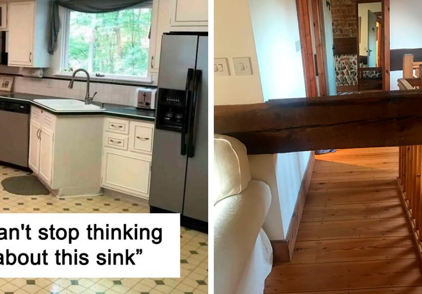
- Kitchen counters with zero landing space. You set hot pans wherever fate allows.
- The sink… miles from everything. Cooking turns into a marathon of dripping hands.
- An island that traps you. Great for aesthetics. Terrible for moving your body.
- Stools that block the walkway. Seating is nice until it creates a hallway traffic jam.
- Cabinet doors that collide. Open one thing, and three other things start a fight.
- The dishwasher that blocks the whole kitchen. Loading dishes becomes a household shutdown.
- A fridge door that hits a wall. Your produce is safe, but your sanity isn’t.
- Backsplash tile with “high-maintenance grout.” You’re now in a long-term relationship with a toothbrush.
- Flooring that shows every footprint. It’s gorgeous for six minutes after cleaning.
- Slippery tile in a wet area. The look is luxe; the traction is a rumor.
- A shower with no shelf. Shampoo lives on the floor like it’s paying rent.
- The shower door that hits the toilet. The bathroom is officially too small for its own decisions.
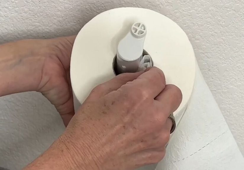
- A toilet paper holder placed “emotionally nearby.” Physically? Not so much.
- A vanity with no storage. Everything you own now lives on the counterforever.
- One towel hook for a whole household. You fight for fabric like it’s a sport.
- Paint chosen without testing. Daylight says “cheerful.” Night says “why is it green?”
- Too many patterns, no anchor. The room feels like a playlist of 30 songs at once.
- All-white everything with no contrast. It’s clean… and also visually slippery.
- Bold wallpaper in the wrong place. The room isn’t “dramatic”it’s just tired.
- Accent wall that fights the furniture. The wall wins. The room loses.
- Furniture scaled for a different planet. Either dollhouse tiny or cruise-ship huge.
- Storage that requires a ladder. “Accessible” is not the word.
- Beautiful chairs nobody can sit in. Comfort was apparently removed for “clean lines.”
- A desk facing the wall in a gloomy corner. Productivity dies slowly in low light.
- Entryway with nowhere for shoes. Welcome hometrip hazard included.
- Decorative bowls that collect clutter. It’s not styling; it’s a junk drawer with confidence.
- Plants placed where they can’t live. No light, no plan, just vibes and heartbreak.
- Function sacrificed for “the look.” Gorgeous room, daily inconveniencean expensive combo.
How to Avoid Interior Design Mistakes Before They Move In With You
1) Do the “walkway test”
Walk the paths you use every dayfront door to kitchen, kitchen to couch, bedroom to bathroom.
If you have to sidestep, squeeze, or pivot like a ballet dancer, you’ve found a layout mistake.
A room should have clear, natural circulationnot surprise bottlenecks.
2) Measure like you mean it
Measure the room. Measure the furniture. Measure door swings and drawer pulls.
Don’t trust your eyes or a showroom setup. The room you saw online probably has different proportions,
lighting, and camera angles doing the heavy lifting.
3) Layer your lighting
Relying on one overhead fixture is a fast track to “meh.” Aim for a mix of ambient, task,
and accent lightingthen add dimmers so you can adjust the mood and function without rewriting your life.
4) Choose materials for real life, not just photos
A high-gloss surface looks fancy until it shows fingerprints. White grout looks crisp until it meets coffee,
muddy paws, or, honestly, Tuesday. Pick finishes that match your cleaning tolerance and household habits.
5) Respect clearance and access
Spaces need breathing room. Bathrooms need usable space in front of fixtures. Kitchens need functional distances.
If something feels tight on paper, it will feel tighter with a laundry basket in your arms.
6) Give your eyes a “resting place”
Visual clutter is real fatigue. Balance bold moments with calm ones: solids, negative space, and a consistent palette.
Let one or two elements be the starseverything else can be the supporting cast.
7) Test before you commit
Paint a sample. Bring a swatch home. Look at it in morning light, afternoon light, and night light.
The fastest way to regret color is to decide under store lighting while hungry.
Quick Fixes If the “Oops” Is Already Installed
- Rug too small? Size up or layer with a larger neutral rug underneath.
- Bad lighting? Add lamps, swap bulbs for warmer tones, and use plug-in dimmers.
- Awkward layout? Float furniture inward, create zones, and keep pathways clear.
- Cluttered shelves? Reduce items by a third, then group what remains in simple clusters.
- Too much pattern? Introduce solids (pillows, curtains, throws) to calm the visual noise.
- No storage? Add closed storage pieces (console, cabinet, ottoman) to hide the everyday mess.
Real-World Experiences: Living With Design Fails (500+ Words)
People don’t usually realize a design is “wrong” the day it’s finished. On reveal day, everything is clean, staged,
and glowing with optimism. The problems show up laterwhen you’re rushing out the door, carrying groceries,
trying to make coffee, or stumbling toward the bathroom half-asleep. That’s when the home starts giving feedback.
One of the most common experiences is the daily detour. A room can look amazing and still force you to walk around furniture
in a way that never feels natural. Over time, those little detours add friction: you bump your hip on the same corner,
you apologize to guests for the “tight squeeze,” and you silently rearrange the same chair because it blocks the flow.
It’s not dramaticit’s just annoying enough to matter.
Then there’s the lighting regret. Homeowners often describe a space that feels fine during the day but turns gloomy at night.
You sit down to read and realize the lamp is decorative, not functional. You cook dinner and your shadow lands directly on the cutting board.
You try to relax in a living room that’s either too bright or weirdly dimno middle ground. The fix usually isn’t complicated,
but the frustration is real: lighting affects mood, comfort, and even how clean a room feels.
Kitchens and bathrooms produce a special category of “how did this get approved?” moments because they’re high-use zones.
A kitchen with tight clearances can turn cooking into a choreography routine, especially with two people.
You open the dishwasher and suddenly nobody can pass. You reach for a drawer and it collides with an appliance handle.
You set a hot pan down and realize there’s no safe landing space. In bathrooms, the pain is often about space in front of fixtures,
door swings, and storage. If the towel hook is too far away or there’s nowhere to place toiletries, the room never feels finished.
It feels like you’re borrowing someone else’s bathroom and trying not to touch anything.
Another lived experience is maintenance burnout. Certain materials and layouts look stunning but demand constant upkeep.
Open shelves collect dust. Shiny finishes show every fingerprint. Complex tile patterns can mean more grout lines and more cleaning.
Over time, people begin avoiding the spacenot because it’s ugly, but because it’s work. That’s when the design stops serving you.
A home should support your life, not assign you extra chores for the privilege of existing.
Finally, many homeowners talk about the emotional side: the awkwardness of spending money and still feeling unsettled.
You can’t always name what’s offyou just feel it. The room might be out of scale, too busy, too cold, or too sparse.
The best “fix” stories usually start small: replacing a rug with the right size, warming up the bulbs, pulling furniture into a better layout,
adding closed storage, and editing decor. Once function improves, the style suddenly makes more sense, too.
The lesson is comforting: most design fails aren’t permanent. They’re just a reminder that homes are for living,
and good design is the kind you barely noticebecause it quietly works.
Conclusion
If you recognized your home in any of these interior design fails, congratulations: you’re not alone, and you’re not doomed.
The difference between a “designer oops” and a truly great space usually comes down to practical detailsflow, lighting,
scale, and everyday function. Make the room work first, then make it pretty. Your future self (and your shins) will thank you.