Table of Contents >> Show >> Hide
- The Designer Rule: “Seasonal, Not Costume”
- 1) Shiny Faux Leaf Wreaths That Look Like They Were Vacuum-Sealed
- 2) The “Mums in a Row + Pumpkin Army” Copy-and-Paste Porch
- 3) The Matchy-Matchy “Fall Catalog Starter Pack”
- 4) Giant Inflatables (and Random Yard Props with No Plot)
- 5) Slogan Signs, Punny Doormats, and Rugs That “Scream Fall”
- 6) Hay Bales and Cornstalks That Turn Into a Mess (or a Hazard)
- Designer-Approved Fall Front Entrance Decor Ideas (That Never Look Like Eyesores)
- Conclusion: Make It Look Like You Live There (Stylishly)
- Real-World Experiences: What Actually Happens on Fall Porches (And How to Avoid Regret)
Fall is the season of sweaters, cinnamon, and the irresistible urge to turn your front entrance into a “welcome to my personality” billboard. A little autumn charm? Lovely. A full-on craft-store cosplay? That’s where designers start quietly backing away while whispering, “Please… step away from the glitter leaves.”
To write this, I pulled together designer advice and curb-appeal guidance from well-known U.S. home and lifestyle outlets (think: national shelter magazines, design sites, and seasonal decorating roundups). The consensus is refreshingly simple: your fall front entrance decor ideas should feel seasonal, not like your porch got trapped inside a pumpkin spice aisle.
Below are six fall front entrance decor “ideas” that routinely become eyesoresplus designer-approved ways to keep your fall front porch decor warm, stylish, and actually inviting (instead of looking like it’s trying too hard).
The Designer Rule: “Seasonal, Not Costume”
Before we get into the list, here’s the unspoken designer math behind curb appeal:
- Edit ruthlessly. If your porch looks crowded, nothing reads “cozy.” It reads “yard sale, but make it autumn.”
- Pick a palette, then commit (gently). Fall doesn’t mean you must use every shade between traffic cone orange and nuclear pumpkin.
- Mix textures over motifs. Natural fibers, wood, ceramic, metal lanterns, dried botanicalsthese age better than giant cartoon graphics.
- Remember the “five-foot test.” Most people see your entry from the sidewalk. If it looks chaotic from five feet away, it’s not going to magically improve up close.
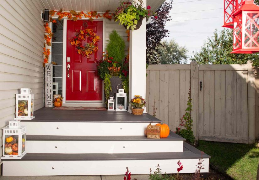
1) Shiny Faux Leaf Wreaths That Look Like They Were Vacuum-Sealed
Why designers call it an eyesore: Plastic leaf wreaths in bright orange-red-yellow often look “cookie-cutter” against a real home exterior. They can be oddly shiny, overly saturated, and visually flatespecially in daylight. The effect is less “cozy autumn” and more “I bought this in a hurry and it shows.”
What to do instead
Go for organic-looking materials and let texture do the heavy lifting. Better options include:
- Dried eucalyptus, olive branches, magnolia leaves, or wheat for a natural silhouette.
- Muted berries or grasses as accents (think: deep plum, dusty burgundy, or dried neutrals).
- A single ribbon in a matte fabric (linen or velvet) if you want softnessskip the neon satin bow energy.
Designer trick: If your door color is bold, keep the wreath neutral. If your door is neutral, the wreath can bring contrastjust don’t make it fluorescent.
2) The “Mums in a Row + Pumpkin Army” Copy-and-Paste Porch
Why designers call it an eyesore: Chrysanthemums and pumpkins are classic, but when every porch has the same lineupbright orange mums lined up like soldiers with identical pumpkinsyour entry can feel mass-produced. It’s not that mums are bad. It’s that monotony is bad.
What to do instead
Keep the charm, lose the repetition. Try these upgrades:
- Mix plant shapes: pair mums with ornamental grasses, kale, heuchera, or small evergreen accents for depth.
- Vary pumpkin types: use heirloom pumpkins, pale gourds, and different sizes so the display looks collected, not cloned.
- Use orange as an accent, not a takeover: balance with mossy greens, ochre, deep plum, and warm neutrals.
Specific example: Two large planters flanking the door with grasses + muted blooms, plus a small cluster of three heirloom pumpkins on one side of the steps. That’s it. Your porch can still breathe.
3) The Matchy-Matchy “Fall Catalog Starter Pack”
Why designers call it an eyesore: When your porch rug, pillows, wreath, and lanterns all match the exact same fall plaid or pumpkin motif, the entry starts to feel stagedlike a seasonal display in a store window. Designers tend to prefer a space that looks personal and layered, not perfectly coordinated to the point of being predictable.
What to do instead
Think “capsule wardrobe,” not “full costume.”
- Choose one hero seasonal element (a wreath or pillows or a pumpkin cluster).
- Keep the rest year-round friendly: a neutral outdoor rug, classic planters, simple lanterns.
- Mix textures: chunky knit pillow + matte ceramic planter + woven basket beats “everything is the same print.”
Bonus: Your porch will transition into winter without requiring a full decorative “reset” every three weeks.
4) Giant Inflatables (and Random Yard Props with No Plot)
Why designers call it an eyesore: Oversized inflatables, towering skeletons, and scattered lawn props can look less “curated fall” and more “county fair parking lot.” The bigger issue isn’t funit’s visual chaos. Without a cohesive theme or placement, your yard becomes a cluttered stage with no script.
What to do instead
If you love playful seasonal decor, give it structure:
- Pick a storyline: “classic harvest,” “moody autumn,” or “subtle spooky,” then decorate accordingly.
- Use lighting for drama: warm lanterns, soft pathway lights, or tasteful uplighting can feel high-end fast.
- Keep Halloween-specific items as an October add-in, not an all-season takeover.
Specific example: Swap the inflatable for two lanterns with battery candles, a simple magnolia wreath, and a few darker-toned pumpkins in October. You’ll still get the seasonal moodwithout the squeaky vinyl vibe.
5) Slogan Signs, Punny Doormats, and Rugs That “Scream Fall”
Why designers call it an eyesore: Big porch signs with seasonal slogans (“Hello Fall,” “Gather,” “Welcome Y’all,” etc.) and heavily themed mats (“Give Thanks” in giant letters, cartoon turkeys, loud pumpkin graphics) can read cliché and datedfast. Designers often say the architecture and landscaping should speak louder than a catchphrase.
What to do instead
Go understated and let materials feel intentional:
- Choose a simple coir or jute mat in a natural tone, or a muted stripe.
- If layering, put a subtle outdoor rug underneath (neutral pattern, low contrast).
- Replace the sign with something that adds height and elegance: a sculptural lantern, a bench, or an oversized ceramic vessel.
Quick curb-appeal win: If your mat is faded, curled, or pun-heavy, swapping it out is one of the cheapest ways to make your entry look instantly more polished.
6) Hay Bales and Cornstalks That Turn Into a Mess (or a Hazard)
Why designers call it an eyesore: A rustic harvest moment can be charminguntil it looks dusty, sheds everywhere, attracts pests, or collapses into a soggy pile after rain. Plus, dried materials are flammable and don’t mix well with real flames, hot bulbs, or anything that generates heat. A porch should be welcoming, not a “fall-themed fire drill.”
What to do instead
- If you love the look, use cornstalks sparingly and secure them neatly away from walkways.
- Skip real candles near dried decoruse battery-operated candles inside lanterns.
- Replace hay bales with woven baskets, wood crates, or sturdy stools that won’t shed, rot, or slump.
A practical pumpkin note (because rotting gourds are the real eyesore)
Even a beautiful pumpkin display can go sideways if pumpkins are placed in harsh conditions. To keep them looking fresh longer:
- Avoid direct sun for long stretches (heat speeds breakdown).
- Don’t press pumpkins right up against the house (rotting pumpkins can attract pests uncomfortably close to your entry).
- Don’t set pumpkins directly on wood or concrete without a barriertrapped moisture can encourage mold and stains.
- Give pumpkins airflowtight clustering can shorten their lifespan.
Designer-Approved Fall Front Entrance Decor Ideas (That Never Look Like Eyesores)
If you want the “pretty porch” effect without the cringe factor, here are a few combinations designers tend to love because they’re simple, textured, and timeless:
- The Natural Neutral: magnolia or eucalyptus wreath + neutral mat + two planters with grasses and muted blooms.
- The Moody Autumn: deep plum accents + pale pumpkins + warm lantern lighting + a single textured throw pillow on a bench.
- The Harvest Minimalist: three heirloom pumpkins + one statement urn planter + understated house numbers/hardware that look intentional.
Conclusion: Make It Look Like You Live There (Stylishly)
Great fall front porch decor isn’t about buying moreit’s about choosing better. Designers consistently push for restraint, texture, and a palette that complements your home rather than fighting it. If you ditch the shiny faux leaves, the wordy signage, and the overstuffed “seasonal explosion,” your front entrance will look more elevated, more welcoming, and (most importantly) like it has a confident sense of self.
And if you’re wondering whether you’ve crossed the line into eyesore territory, here’s a final litmus test: if your entry looks like it requires instructions to understand the theme, it’s probably time to edit.
Real-World Experiences: What Actually Happens on Fall Porches (And How to Avoid Regret)
Here’s the part nobody tells you in the dreamy porch photos: real life has weather, pets, kids, delivery drivers, and that one gust of wind that shows up like it pays rent. If you want your fall front entrance decor ideas to survive beyond a single Instagram moment, it helps to plan like a person who uses the front door daily (revolutionary concept, I know).
Experience #1: Pumpkins don’t “sit pretty” forever. Many homeowners build a gorgeous pumpkin cluster, then watch it turn into a soft, spotted science project because it’s roasting in afternoon sun or sweating against concrete. The fix is boring but effective: shade + airflow + a simple barrier under the pumpkin (like a small tray, riser, or even a piece of cardboard you can’t see from the street). The pumpkin still looks cute. It just doesn’t melt into your porch.
Experience #2: Over-decorating makes your entry feel smaller. People often add “just one more thing” until the steps become an obstacle course. Then guests hesitate, delivery drivers can’t find a safe place to set packages, and you’re stepping over decor like you’re training for a tiny porch triathlon. Designers are right about breathing room: one strong vignette beats six small cluttered ones every time.
Experience #3: Lightweight decor becomes airborne decor. Those little foam pumpkins, cheap garlands, and flimsy signs can shift, flip, and tumble. Even if they don’t blow away, they end up crookedcreating that “I gave up halfway” look. A sturdier base (heavier planters, ceramic vessels, lanterns with real weight) keeps your fall front porch decor looking intentional instead of constantly mid-chaos.
Experience #4: “Wordy” pieces age faster than everything else. A punny doormat or a giant “HELLO FALL” sign might feel adorable for a week, then starts to feel like it belongs in storage… forever. Homeowners often report that the joke wears out before the season does. Meanwhile, timeless pieceslike a natural mat, a textured pillow, or a neutral wreathcan stay out longer without feeling stale.
Experience #5: Dried materials can turn gross fast. Hay bales and cornstalks look charming on day one and suspicious on day tenespecially after rain. They shed, slump, and sometimes attract unwanted critters. If you love a rustic vibe, many people have better luck with wood crates, baskets, and dried grasses in planters. You get the farmhouse warmth without the “what is that smell?” mystery.
Experience #6: Halloween creepiness works best as a layered add-on. A common regret is going full Halloween too earlythen feeling stuck with it. Lots of homeowners find the sweet spot is building a fall base (wreath, planters, pumpkins), then adding a small October-only layer (a darker ribbon, a few moody gourds, subtle lighting). You still get the seasonal fun, but the porch doesn’t feel like it time-traveled straight to October 31 and forgot how calendars work.
Bottom line from real porches: The best-looking entrances aren’t the ones with the most stuff. They’re the ones where the decor survives real lifestays tidy, stays safe, and still feels welcoming when you’re carrying groceries in the rain.