Table of Contents >> Show >> Hide
- What “Turning Photos Into Art” Actually Means
- Start With a Photo That Wants to Be Art
- Quick Prep: The 3 Edits That Make Everything Look More “Artful”
- 7 Photo-to-Art Styles You Can Create (With Specific Examples)
- Tools That Make Photo-to-Art Ridiculously Accessible
- A Simple Workflow That Looks Pro (Even If You’re Not)
- Printing Your Photo Art So It Actually Looks Like Art
- The “Is This Allowed?” Section (Copyright, Credits, and AI Labels)
- Common Mistakes (And How To Fix Them Fast)
- Experiences From the Photo-to-Art Rabbit Hole (About )
- Conclusion
Confession: I can’t leave a perfectly normal photo alone. A simple snapshot of a latte? I want it to look like a moody oil painting. A picture of my dog? Suddenly it’s a pop-art poster worthy of a gallery wall (or at least my hallway, which is basically a gallery if you squint).
If you’ve ever thought, “This photo is nice… but it could be extra,” you’re in the right place. Turning regular photos into art isn’t about pretending you painted the Mona Lisa during lunch. It’s about using creative choicescomposition, color, texture, and styleto transform everyday images into something that feels intentional, expressive, and display-worthy.
What “Turning Photos Into Art” Actually Means
“Photo art” sits on a spectrum. On one end, you’ve got subtle edits: cleaner lighting, richer color, a crop that makes the subject feel cinematic. On the other end? Full transformation: sketch effects, watercolor washes, cartoon outlines, collage layers, surreal scenes, or painterly textures that make people ask, “Wait… did you draw that?”
The goal isn’t to hide the photoit’s to reinterpret it. You’re taking the raw ingredients (light, subject, setting) and cooking them into a new dish. Same base. Different flavor. Less “I snapped this in a parking lot,” more “This belongs in a frame.”
Start With a Photo That Wants to Be Art
Not every image is destined for greatness. Some photos are meant to remain humble. (I’m looking at you, blurry thumb in the corner.) But you can dramatically improve your odds by choosing photos with one or more of these qualities:
1) Strong light (or at least interesting light)
Art loves lighting drama. Backlighting, golden hour, window light, street lamps at nightthese create contrast and mood. Even a flat photo can work, but it often needs more “help” later.
2) A clear subject
Pick one main thing: a face, a pet, a building, a flower, a silhouette, a rainy street. If your photo has five competing subjects, your “art” may end up looking like a scrapbook exploded.
3) Simple backgrounds
Busy backgrounds can be tamed, blurred, or removed, but simpler is easier. If the background is chaos, your effect has to work harder to feel intentional.
4) Decent sharpness where it counts
You don’t need razor-sharp everything. You just need enough detail in the focal area (eyes, edges, textures) so your artistic effects have something to “grab.”
Quick Prep: The 3 Edits That Make Everything Look More “Artful”
Before you apply any sketch filter or painterly magic, do a quick “make it behave” pass. These small edits are the difference between “cool concept” and “why does this feel off?”
- Crop with purpose: Tighten the frame. Remove distractions. Try placing your subject slightly off-center for more energy.
- Fix exposure and contrast: Bring back highlights, lift shadows, and add contrast until the subject reads clearly.
- Adjust color temperature: Warmer can feel nostalgic; cooler can feel modern or cinematic. Don’t aim for “accurate.” Aim for “intentional.”
7 Photo-to-Art Styles You Can Create (With Specific Examples)
Here’s the fun part: choosing the “art direction.” If you’re stuck, pick a style that matches the emotion of the photo. Cozy scene? Try watercolor. Bold portrait? Pop art. Misty landscape? Oil-paint drama.
1) Watercolor Wash
Best for: flowers, travel scenes, pets, soft portraits, nature textures.
How it looks: gentle edges, paper texture, dreamy color bleeding.
Example: A photo of hydrangeas becomes a pastel watercolor print with softened edges and a subtle paper grain background.
2) Oil Painting Drama
Best for: portraits, architecture, landscapes with strong light.
How it looks: brush texture, deeper contrast, painterly strokes.
Example: A sunset city skyline becomes a bold, high-contrast “painted” scene with visible brush-like texture in the sky.
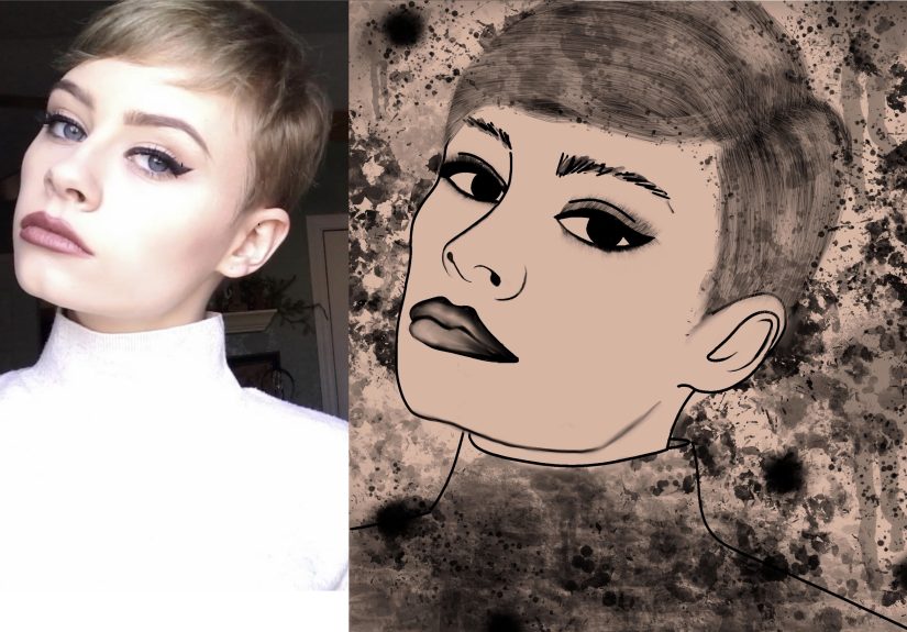
3) Pencil Sketch / Ink Drawing
Best for: faces, pets, buildings, cars, high-contrast photos.
How it looks: line work, shading, hand-drawn vibe.
Example: A candid portrait becomes a black-and-white pencil drawing with crisp edges and gentle shading on the cheekbones.
4) Pop Art Poster
Best for: expressive faces, pets, fashion shots, anything with attitude.
How it looks: simplified colors, bold outlines, graphic impact.
Example: Your dog’s headshot becomes a four-panel pop-art grid with punchy color blocks and clean contour lines.
5) Minimalist Duotone
Best for: portraits, silhouettes, product shots, street photos.
How it looks: two dominant colors, sleek and modern.
Example: A street portrait becomes a navy-and-cream duotone with a magazine-cover aesthetic.
6) Surreal Double Exposure
Best for: silhouettes, profiles, landscapes, “concept” shots.
How it looks: layered images with soft blending and symbolism.
Example: A side-profile silhouette contains a forest scene inside the facevery “album cover,” very “I have feelings.”
7) Vintage Film / Noir
Best for: rainy streets, night scenes, cafes, old buildings.
How it looks: grain, muted tones, strong contrast, nostalgic mood.
Example: A rainy street photo becomes a cinematic noir frame with deep blacks, glowing highlights, and tasteful grain.
Tools That Make Photo-to-Art Ridiculously Accessible
You don’t need a studio. You need a plan and the right level of tool for your patience.
Option A: Built-in editors (fast, surprisingly good)
Modern phone and desktop photo apps let you crop, adjust light and color, and apply filters quickly. This is the “I have 90 seconds” approachand honestly, it can still look great if your composition is strong.
Option B: “Make it art” features (filters, stylize effects, AI looks)
Stylizing tools can generate sketch, cartoon, or painterly effects in seconds. These are perfect for experimentation: try five different looks, pick the one that feels right, then refine it so it doesn’t scream “default filter.”
Option C: Pro workflow (layers, masks, and controlled chaos)
If you want results that look less “app effect” and more “artist made a decision,” use tools that support layers and masking. That’s where the magic happens: you can keep the face detailed while stylizing the background, or add texture without destroying the original image.
A Simple Workflow That Looks Pro (Even If You’re Not)
If you want repeatable resultsso you’re not randomly tapping sliders like you’re defusing a bombuse this workflow:
Step 1: Prep the image
- Crop for storytelling (tighten the frame, remove distractions).
- Balance exposure (don’t lose important details).
- Set your mood (warm/neutral/cool, depending on the style).
Step 2: Apply your art style
Choose one dominant style: sketch, watercolor, oil paint, pop art, etc. If you stack ten styles, your image will look like it fell into a craft store.
Step 3: Refine with selective edits
This is the step most people skipand it’s why their results look “filter-y.” Fix it by selectively adjusting:
- Faces and eyes: keep detail, avoid over-smoothing.
- Edges: reduce crunchy halos around hair and shoulders.
- Background: soften, simplify, or add texture so it supports the subject.
Step 4: Add finishing touches
- Texture: subtle paper grain or canvas texture can instantly feel “art.”
- Vignette: gentle darkening at edges can pull attention inward.
- Color grading: unify tones so the whole piece feels cohesive.
Step 5: Export for the destination
Export settings matter. A piece meant for Instagram can be smaller and compressed. A piece meant for printing needs enough pixels to stay sharp at the final size.
Printing Your Photo Art So It Actually Looks Like Art
Nothing is more heartbreaking than creating a gorgeous “painting effect” and then printing it only to discover it looks like a screenshot from 2009. Printing is where “art” becomes realand where the details matter.
Pixels, PPI, and the “Why is this blurry?” problem
For high-quality prints, a common target is around 300 pixels per inch (PPI) at the final print size. Here’s the easiest way to think about it:
Print size in inches = pixel dimension ÷ desired PPI
Example: If you want an 8×10 print at 300 PPI, you’ll want roughly 2400×3000 pixels. If your file is smaller, you can still print itbut you may see softness, especially up close.
Also: big wall art can often get away with lower PPI because people view it from farther away. So don’t panic if your poster-size print isn’t a perfect 300 PPI. Just know that sharpness expectations change with viewing distance.
Check your file at 100% before you print
A practical trick: zoom to 100% on your screen to inspect detail, noise, and weird artifacts. If hair looks crunchy or edges look jagged at 100%, those issues may show up in printespecially on glossy paper.
File format and color space (keep it clean)
Most photo labs accept common formats like JPEG, TIFF, and PNG. JPEG is usually fine if you export at high quality. For color, sRGB is the safest option for consistent results across labs and screens, while wider color spaces can be useful in advanced workflows if you know your lab supports them.
Choose a finish that matches the vibe
- Matte paper: soft, classic, hides minor imperfections.
- Glossy paper: punchy color, sharp detail, reveals everything (including mistakes).
- Canvas: forgiving texture, great for painterly styles.
- Metal/acrylic: modern, vibrant, and dramatic for bold images.
The “Is This Allowed?” Section (Copyright, Credits, and AI Labels)
Turning your own photos into art? Generally straightforward. Using someone else’s photo or closely reproducing copyrighted artwork? That’s where you need to slow down and do the boring-but-important part.
1) Don’t remix what you don’t have rights to
If you start with a copyrighted image you don’t own (someone else’s photo, a protected illustration, a movie still), transforming it can create what’s often considered a “derivative work.” In plain terms: you may still need permission from the copyright owner, even if you’ve changed the style.
2) Use public-domain and open-access art as style inspiration
Want to blend a portrait with “museum energy” without legal headaches? Look for public-domain or CC0 images. Several major institutions offer open-access artworks you can download, remix, and reuse freely. That’s a goldmine for textures, backgrounds, and reference vibes.
3) Be transparent when AI plays a role
More platforms are adding ways to show whether an image was edited or generated using AI. Some tools also support “content credentials” or similar metadata that can travel with your file and help viewers understand how it was made. You don’t have to write a novel in the captionjust don’t pretend something is purely hand-painted if a tool did heavy lifting.
Common Mistakes (And How To Fix Them Fast)
Mistake: Everything is over-sharpened
Fix: Reduce sharpening, especially on skin. Add texture instead of edge crunch.
Mistake: The filter flattened the image
Fix: Bring back contrast with curves or a gentle “S” contrast adjustment. Add localized light (dodge/burn) to restore depth.
Mistake: Colors look “radioactive” in print
Fix: Lower saturation slightly, avoid neon highlights, export in a standard color space, and consider a test print.
Mistake: Hair looks weird (the eternal struggle)
Fix: Use selective edits: keep hair detail more photographic while stylizing the background more heavily.
Experiences From the Photo-to-Art Rabbit Hole (About )
Here’s what usually happens when someone “just tries one little art effect” on a regular photo.
First, you pick an innocent image. Something casual. A coffee cup. A sunset. A pet who is sitting still for once, which means you should probably buy a lottery ticket. You apply a painterly style andwowinstant dopamine. It looks like something you’d see on a postcard rack near the beach, and you start mentally redecorating your entire home around this new “aesthetic era.”
Then you notice it: the background. There’s a random trash can. A power line. A stranger’s elbow. And now that you’ve turned your photo into “art,” those distractions feel ten times louder. So you crop. You clean. You remove. You blur. You spend fifteen minutes eliminating a single object that you didn’t even notice when you took the photo. This is normal. Welcome.
Next comes the style identity crisis. Watercolor looks soft and dreamy… but the oil-paint effect feels bold. The sketch effect is classy. The pop-art version is hilarious. Suddenly you have five versions of the same photo and you love all of them, like a proud parent who refuses to choose a favorite child. The solution is to pick the version that matches the story you want to tell. Cozy memory? Watercolor. Strong personality? Pop art. Cinematic vibe? Noir. “I’m mysterious and probably own a turtleneck”? Black-and-white sketch.
Eventually you try printing. The first print teaches you humility. Maybe it’s slightly darker than your screen. Maybe the reds are louder than you expected. Maybe the image is a tiny bit soft because you exported the “social media” version instead of the “print” version. You learn two powerful lessons: (1) screens lie a little, and (2) exporting with enough pixels is not optional when you want wall-worthy results.
Then something awesome happens: you start seeing the world differently. You don’t just take photosyou collect raw material. A cracked sidewalk becomes texture. Window light becomes drama. Shadows become composition. Even your “boring” photos start to feel like potential art pieces because you’re training your eye to notice shape, color, and mood.
And finally, the best experience of all: someone walks into your space, points at a framed print, and says, “Where did you get that?” You get to grin and say, “Oh, that? I made it.” You don’t have to add, “with some help from tools and a suspicious amount of zooming to 100%.” That part is between you and your editor panel.
Conclusion
Turning regular photos into art is part creativity, part technique, and part willingness to experiment until something clicks. Start with a photo that has a clear subject and good light, do a quick prep pass, choose one strong style, refine it with selective edits, and export with the final destination in mindespecially if you plan to print.
Most importantly: have fun with it. Your camera roll is already full of raw material. All you’re doing now is giving those images a second lifewith a little more mood, a little more intention, and a lot more “wait, you made that?!” energy.