Table of Contents >> Show >> Hide
- Why This London Kitchen Feels So Memorable
- The Signature Design Elements That Make It Work
- How Jersey Ice Cream Co. Balanced Beauty and Practicality
- What This Kitchen Gets Right About Modern Cottage Style
- Design Lessons You Can Steal for Your Own Kitchen
- Why This Kitchen Still Resonates
- Experiences Inspired by This Kitchen: What a Space Like This Feels Like in Real Life
- Final Thoughts
If most city kitchens are trying very hard to look polished, Skye McAlpine’s London flat goes in another direction entirely. It looks lived in, loved, and ready for a roast chicken at five minutes’ notice. That is exactly why it is so compelling. Designed with Jersey Ice Cream Co., this kitchen does not chase perfection with a ruler and a showroom smile. Instead, it leans into warmth, personality, and the sort of beauty that gets better when someone actually cooks in it.
That balance matters. A lot of kitchens today are either aggressively practical or aggressively photogenic. One feels like a workstation with nice hardware. The other feels like a museum where the olive oil is scared to come out. Skye McAlpine’s kitchen lands in the sweet spot between the two. It is pretty enough to star in a design feature, but grounded enough to survive dinner prep, guests lingering with wine, and the daily mess that comes with a life built around food.
And that makes sense for McAlpine, whose work is deeply tied to cooking, gathering, and storytelling around the table. Her London flat kitchen was shaped to feel Italian in spirit while still respecting the historic character of the Victorian home. Jersey Ice Cream Co. responded with a room that feels romantic without being fussy, practical without being cold, and layered without tipping into clutter. In other words, it has charm, and not the fake kind that arrives in a box labeled “farmhouse accessories.”
Why This London Kitchen Feels So Memorable
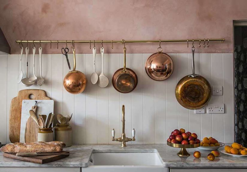
The first thing that makes this space stand out is its mood. Rather than defaulting to safe white walls and standard cabinetry, the kitchen introduces soft pink plaster walls, warm metal details, reclaimed wood, marble, and generous natural light. It is a palette that whispers instead of shouting, but it still has enough visual character to stop you mid-scroll.
That pink is doing heavy lifting. In lesser hands, a rosy kitchen could feel trendy, sugary, or suspiciously close to cupcake territory. Here, it reads as sun-washed and grown-up. The plaster finish gives the walls depth, so the color does not sit flat. It shifts with the light and makes the whole room feel gently aged, as if it has already lived a good life. The effect is less “pink kitchen” and more “kitchen with a memory.”
The room also succeeds because it is not designed around a single flashy trick. Instead, each element supports the next. The warm plaster softens the marble. The marble sharpens the wood. The brass and copper add glow. The open shelves lighten the composition. The large window keeps the entire scheme from feeling overly precious. It is layered design, but it still breathes.
The Signature Design Elements That Make It Work
1. Pink plaster walls with actual soul
Let us begin with the walls, because they are the room’s headline act. The soft pink plaster gives the kitchen its emotional temperature. It nods to Italian warmth and old-world texture without turning the space into a themed movie set. This is one of the biggest lessons from the room: color works best when it behaves like atmosphere, not decoration.
Plaster also matters because texture is often what separates a beautiful kitchen from a bland one. Smooth drywall can make even an expensive room feel flat. By contrast, plaster catches light, creates movement, and delivers that quietly imperfect finish that makes a home feel human. In a kitchen filled with hard surfaces, that softness is pure magic.
2. A movable island that acts like furniture
The custom island-table may be the smartest move in the whole room. Made from reclaimed wood and set on casters, it is not just a prep surface. It is a workhorse, a gathering point, and a flexible piece of furniture. Better still, it flips open to accommodate a larger dinner party. That is not just design flair; that is lifestyle intelligence.
This idea is especially strong for city homes, where every square foot needs to earn its keep. A fixed island can sometimes dominate a room like an overconfident guest who will not leave. A movable island, on the other hand, keeps the layout adaptable. It can help with prep, serve as a casual dining spot, or make more space when entertaining. The fact that it looks beautiful while doing all this is almost rude.
3. Open shelving that earns its place
Open shelving is one of the most debated choices in kitchen design. Some people see airy elegance. Others see dust with a branding strategy. In this kitchen, open shelves work because they are used with discipline. They hold ingredients and everyday items that deserve to be visible and accessible, rather than random decorative objects pretending to be useful.
That is the real secret. Open shelving fails when it becomes a stage for clutter or a graveyard for items nobody touches. It succeeds when it supports how a person actually cooks. For someone like McAlpine, whose kitchen life centers on ingredients, serving pieces, and visual storytelling, the shelves make total sense. They look lovely, yes, but more importantly, they support rhythm and reach.
4. Brass and copper accents that warm everything up
The metal details in this kitchen are a master class in restraint. Brass and copper appear as accents rather than declarations. They warm the blush walls, complement the reclaimed wood, and soften the crispness of stone and tile. The result is a kitchen that glows instead of gleams.
One especially charming detail is the hanging pot rack made from copper pipe and brass pipe hangers. It is practical, sculptural, and slightly cheeky in the best way. It says, “Yes, we cook here,” but it also says, “We know a functional object can still be handsome.” That is the kind of multitasking every kitchen should aspire to.
5. A Venetian glass chandelier that refuses to be ordinary
Under the sunlit window sits the island-table, and above it hangs a Venetian glass chandelier. This pairing is part of what elevates the kitchen from nice to unforgettable. A utility-centered room gets a dose of romance through lighting that feels collected rather than catalog-ordered.
Lighting in kitchens is often treated like an obligation. People think about brightness, maybe pendants, and then move on with their lives. But great kitchens need layered lighting and a focal point. The chandelier here does more than illuminate. It frames the dining-prep zone, reflects McAlpine’s connection to Venice, and reminds us that kitchens are social rooms, not just vegetable-processing centers.
How Jersey Ice Cream Co. Balanced Beauty and Practicality
One of the smartest design choices was broadening the opening between the kitchen and the living room. That simple move improved flow and made entertaining easier, which is crucial in a home where food and hospitality are central. You can imagine someone at the stove, someone else setting plates, and guests hovering nearby under the false impression that they are helping. The layout invites interaction instead of isolating the cook.
This sense of connection is one reason the project feels modern even though its materials are classic. The kitchen respects the historic feel of the flat, but it does not trap the room in nostalgia. It opens up the social experience. That is a big reason the design still feels relevant. Homeowners increasingly want kitchens that function as living spaces, not sealed-off back-of-house zones.
There is also an important lesson in scale here. Nothing feels oversized or performative. The room is not trying to prove it has enough marble or enough custom work to impress strangers on the internet. Instead, the design focuses on proportion, mood, and usefulness. That restraint is what makes the space feel elegant rather than overproduced.
What This Kitchen Gets Right About Modern Cottage Style
If you had to label the room, modern cottage is probably the closest fit, though even that feels a little too tidy for a space with this much personality. Still, the hallmarks are there: soft color, warm metals, open shelving, furniture-style elements, and a collected mix of materials that feel both inviting and storied.
What keeps it from drifting into cliché is the editing. The kitchen does not pile on rustic signals like a theme park gift shop. There are no forced signs, no fake distressing, no decorative chickens bravely doing their best. Instead, the character comes from authentic materials, real texture, and a sense of use. Reclaimed wood has meaning here. Marble has presence. The plaster has mood. Even the hardware feels chosen, not merely installed.
That is why the room works as inspiration for readers who want charm without chaos. It shows that cottage-style warmth does not require a giant farmhouse in the countryside. You can achieve a similar emotional effect in a city flat by focusing on texture, softness, and pieces that behave like furniture instead of generic built-ins.
Design Lessons You Can Steal for Your Own Kitchen
Choose one material with texture
If your kitchen feels flat, start with texture before you start with trend. Plaster walls, a reclaimed wood piece, tumbled stone, unlacquered brass, or handmade tile can completely change the mood of a room. Texture creates depth even when the color palette is quiet.
Use open shelving for things you actually touch
The best open shelves are not display shelves in disguise. Store dishes, oils, glassware, spices, and serving pieces you use regularly. When the shelf reflects your daily habits, it looks natural. When it holds dusty props, it looks like you are auditioning for a catalog.
Think of the island as furniture, not just cabinetry
A freestanding or movable island can make a kitchen feel less rigid and more welcoming. It introduces flexibility, softens the visual mass of the room, and can help a kitchen connect more naturally to adjacent living spaces.
Mix warmth into hard-working surfaces
Kitchens need stone, metal, and wipeable surfaces. Fine. But they also need warmth. Introduce it through wood, warm-toned metals, layered lighting, and colors with a little dustiness or age to them. That is how you keep function from turning sterile.
Let one poetic detail lead the room
In this kitchen, that detail is arguably the pink plaster, though the chandelier makes a strong case for itself. Every memorable room has one element that lifts it above competence. Choose yours carefully. Then let the rest of the room support it rather than compete with it.
Why This Kitchen Still Resonates
Years after it first made the rounds, Skye McAlpine’s London flat still feels fresh because it was never chasing a short-term trend cycle. It was designed around atmosphere, cooking, and hospitality. Those priorities age well. The room does not rely on novelty; it relies on feeling.
It also reminds us that the most successful kitchens usually say something about the people who use them. This one speaks clearly. It reflects McAlpine’s connection to Venice, her life around food, and her love of rooms that invite people to gather. Jersey Ice Cream Co. translated that identity into material choices and spatial decisions that feel intimate rather than generic.
In a sea of kitchens that are technically impressive but emotionally forgettable, this one has the advantage of being unmistakably personal. It is graceful, yes. It is practical, yes. But most of all, it feels like someone lives there on purpose. That may be the highest compliment any kitchen can earn.
Experiences Inspired by This Kitchen: What a Space Like This Feels Like in Real Life
One reason this kitchen lingers in the imagination is that it sparks a very specific fantasy: not the fantasy of owning expensive finishes, but the fantasy of living better inside an ordinary day. A room like this makes you picture the small rituals. Morning light sliding across the plaster walls. Coffee brewing while yesterday’s dishes dry on a shelf that somehow still looks charming. A cutting board coming out without a dramatic search mission because everything you need is visible and within reach.
That is the real luxury here. It is not just visual beauty. It is the feeling that cooking might become less of a task and more of a rhythm. In many homes, the kitchen is where people rush. In a space like this, you can imagine lingering. Chopping herbs becomes pleasant. Setting out lunch becomes a tiny act of styling. Even standing at the counter buttering toast feels slightly cinematic, which is honestly more than toast has any right to expect.
There is also something deeply social about a kitchen designed this way. The movable island-table suggests a room that changes with the moment. On a quiet weekday, it can be a prep station covered in produce, recipe notes, and one bowl that somehow multiplies into four. On the weekend, it becomes a place to gather, lean, pour wine, talk too much, and promise to help while never quite committing to the onions. That flexibility makes the room feel generous.
The open connection to the living space adds to that experience. You do not have to disappear into the kitchen and miss the conversation. You can stir, plate, and still be part of the evening. For anyone who loves hosting, that matters. It changes the energy of entertaining from performance to participation. The cook remains in the story instead of serving from backstage.
Emotionally, the room also offers something many high-design kitchens forget: comfort. The pink plaster, reclaimed wood, soft metals, and collected lighting make the space feel forgiving. It is polished, but not brittle. You could imagine flour on the counter, children stealing berries, a cookbook left open, and friends arriving early to “see if you need anything,” which usually means “sample the focaccia.” A kitchen like this does not punish life for happening. It looks better because life is happening.
There is another experience tied to this style of room, and it has to do with memory. Kitchens with texture and warmth tend to hold onto moments more vividly than sleek, anonymous spaces. You remember the dinner party where everyone crowded around the island. You remember the winter afternoon when the room went golden near sunset. You remember the sound of pans hanging on the rack, the window cracked open, the smell of garlic and butter doing heroic work. Design cannot create those memories on its own, of course. But it can create the stage on which they become more likely.
That may be why this kitchen continues to resonate. It is aspirational without being unreachable in spirit. You may not install Venetian glass tomorrow. Fair enough. But you can borrow the principle behind the room: make the kitchen personal, warm, and genuinely useful. Let beauty live alongside utility. Put daily objects within reach. Choose materials that age with grace. Leave space for people to gather. The result may not be a copy of Skye McAlpine’s London flat, and it should not be. The goal is not imitation. The goal is to create a kitchen that feels like the best version of your own life, preferably with something delicious in the oven.
Final Thoughts
Skye McAlpine’s London flat by Jersey Ice Cream Co. is a standout not because it is the flashiest kitchen in recent memory, but because it is one of the most persuasive. It makes a strong argument for warmth over perfection, texture over sterility, and personality over showroom sameness. If your dream kitchen is one that supports cooking, gathering, and living beautifully all at once, this one is still worth studying closely.