Table of Contents >> Show >> Hide
Some style ideas whisper. Shiro Kuro walks in, says almost nothing, and still owns the room.
At its simplest, shiro means white and kuro means black in Japanese. Put them together, and you get more than a color pairing. You get contrast. Clarity. Drama without glitter. Restraint without boredom. The whole thing feels a bit like a perfectly timed side-eye: subtle, sharp, and impossible to ignore.
That is why Shiro Kuro keeps showing up everywhere people care about beauty and intention. It appears in Japanese art, fashion, interiors, tableware, photography, branding, and everyday styling. It can feel spiritual, modern, traditional, rebellious, or calm depending on how it is used. Black and white may sound simple, but they are sneaky. They carry mood. They shape space. They tell your eye where to rest and where to pay attention.
And no, this is not just about decorating your apartment like a chessboard or dressing like you lost a bet with a minimalist. Shiro Kuro works because it is built on balance. White opens a space. Black anchors it. White breathes. Black defines. Together, they create a visual language that feels clean, timeless, and surprisingly emotional.
So if you have ever looked at a black ceramic bowl on a pale linen tablecloth and thought, “Why does this feel so expensive even though it is just two colors?” welcome. You are already in the Shiro Kuro club.
What Shiro Kuro Really Means
In the most direct sense, Shiro Kuro refers to the interaction between white and black. But culturally and aesthetically, it suggests something larger: the beauty of contrast. In Japanese visual culture, color has never been random decoration. White and black have long carried symbolic weight, and that gives the pairing far more depth than a basic monochrome trend.
White often suggests purity, openness, ritual, and sacred space. Black, on the other hand, can signal dignity, formality, gravity, and discipline. That does not mean the colors are locked into one meaning forever. Context matters. In some settings, white is celebratory. In others, black and white together can carry a mournful tone. That tension is exactly what makes Shiro Kuro so interesting. It is not cheerful in a loud, confetti-cannon way. It is expressive in a quieter, more layered way.
That also helps explain why black and white remain so powerful in Japanese-inspired style. The palette asks you to notice shape, texture, spacing, and material. When color steps back, everything else has to work harder. Suddenly the grain of wood matters. The edge of a sleeve matters. The silence around an object matters. Shiro Kuro is less about adding more and more, and more about making every choice count.
Why Black and White Matter in Japanese Aesthetics
1. Negative space does real work
One of the most useful ideas for understanding Shiro Kuro is ma, often described as pause, interval, or negative space. In Japanese design, emptiness is not an accident and it is definitely not a decorating failure. It is part of the composition. The blank area around an object can be as meaningful as the object itself.
This is where white becomes more than “the light color.” White can function like breathing room. It gives forms space to exist. It lets black lines, dark surfaces, or bold silhouettes land with more impact. A white wall behind a dark wood chair is not empty. It is active. It frames the chair. It slows the eye. It creates calm.
That is why Shiro Kuro works so well in interiors, editorial layouts, ceramics, and packaging. The look feels tidy, but the deeper appeal is rhythm. There is a place for the eye to pause. There is a place for one strong shape to stand on its own. In a world where everything seems to be screaming for attention, that kind of restraint feels oddly luxurious.
2. Ink painting taught the art of saying more with less
Japanese monochrome ink painting, often associated with Zen traditions, is one of the clearest ancestors of the Shiro Kuro sensibility. In this visual world, black ink does not simply fill a page. It breathes across it. One brushstroke can suggest a mountain ridge, a tree branch, mist, weather, and mood all at once.
That matters because Shiro Kuro is not only about contrast. It is about nuance inside contrast. Black is not just black. It can be glossy, matte, soft, diluted, layered, or smoky. White is not just white. It can feel crisp like paper, warm like plaster, soft like cotton, or luminous like porcelain. Monochrome, when handled well, is never flat. It is full of tiny emotional shifts.
In other words, Shiro Kuro is minimalism with a pulse.
Shiro Kuro in Art, Fashion, and Interiors
Art and photography
Black-and-white photography and ink-based art share a useful lesson: remove excess color, and meaning gets sharper. Composition becomes the star. Texture becomes louder. Light becomes dramatic. A shadow is no longer background decoration; it becomes part of the story.
That is why black-and-white imagery often feels timeless. It strips away the noise of trend-driven color palettes and asks viewers to focus on line, gesture, weather, expression, and space. Japanese visual traditions have long embraced that kind of discipline. The result is art that feels both spare and rich at the same time, which is honestly a very unfair trick and one reason people keep falling for it.
Fashion
If Shiro Kuro had a fashion résumé, it would be annoyingly strong. Japanese fashion has repeatedly shown how black and white can be intellectual, poetic, severe, playful, and theatrical all in the same closet. Designers such as Rei Kawakubo proved that monochrome does not have to mean safe. Black can distort shape, challenge ideas of beauty, and create authority. White can feel ceremonial, ghostly, sculptural, or startlingly pure.
Traditional dress offers another layer of meaning. In kimono culture, color combinations carry emotional and symbolic associations. A white garment against a dark sash can feel elegant, but depending on context it can also hold deeper ritual meaning. This is one reason the Shiro Kuro palette never feels random in Japanese-inspired fashion. It carries memory.
On a practical level, black and white are also wonderfully adaptable. A white shirt and black trousers can look crisp and professional. A black coat over an off-white knit feels polished without trying too hard. A fully monochrome outfit can look artistic, especially when the textures vary. The trick is simple: if every piece is flat, the outfit feels flat. If wool meets cotton, leather meets linen, and structure meets softness, Shiro Kuro suddenly feels alive.
Interiors
In home design, Shiro Kuro shows up in Japanese minimalism, Japandi interiors, and wabi-sabi inspired spaces. But here is the important part: the best rooms are not merely black and white. They are black, white, and texture. Think pale walls, dark metal accents, soft wood, handmade ceramics, natural fiber rugs, and light that changes throughout the day.
A good Shiro Kuro room feels calm, not sterile. It should feel edited, not empty. The danger is going too hard on sharp contrast and ending up with a space that looks less “Japanese-inspired sanctuary” and more “fancy barcode.” Warm materials solve that problem. So do imperfect objects. A cracked glaze bowl, a woven lamp, a brushed black frame, or an off-white curtain with visible texture can keep the room human.
How to Use Shiro Kuro Without Making Everything Look Too Severe
Start with one dominant mood
Decide whether your version of Shiro Kuro is airy or dramatic. If you want calm, let white or soft ivory lead and use black as punctuation. If you want mood, let charcoal, ink black, or deep espresso take the lead and use white to carve out light. Both work. The mistake is splitting everything into equal halves and ending up with a visual tennis match.
Let texture do the talking
When the palette is limited, texture becomes the headliner. Matte black feels different from lacquer black. Chalky white feels different from glossy white. Washed cotton, raw wood, smooth stone, ceramic glaze, and brushed metal all create depth without requiring a rainbow.
This rule works in fashion too. A black sweater, black trousers, and black loafers can either look chic or look like you dressed during a power outage. Texture is the difference.
Use imperfection to soften the contrast
Perfect black and perfect white can feel intense. That is why soft whites, ash tones, weathered woods, handmade ceramics, and slightly irregular forms work so well. They keep the palette grounded. Shiro Kuro does not need to be icy. It can be warm, quiet, and lived-in.
Why Shiro Kuro Still Feels Modern
Trends come and go faster than a viral skin-care routine, but black and white keep surviving because they solve problems. They clarify visual clutter. They travel well across fashion, interiors, branding, packaging, art, and digital design. They make small spaces feel calmer and strong shapes feel stronger. They also age well. A thoughtfully designed black-and-white room or wardrobe rarely screams a specific year.
More importantly, Shiro Kuro aligns with how many people want to live now: with less visual chaos, better materials, and more intentional choices. It suits people who are tired of disposable trends and want a look that feels deliberate. It can be luxurious, but it does not require luxury. Even a simple black notebook on a white desk can capture the mood.
That is part of the magic. Shiro Kuro can be high design, but it can also be daily life. A rice bowl, a café menu, a linen shirt, a tiled bathroom, a logo, a gallery wall, a tea cup. Same two colors. Different stories.
Conclusion
Shiro Kuro is not just “black and white” translated into Japanese. It is a way of seeing contrast as meaning. It turns color into structure, silence into style, and restraint into personality. In art, it sharpens attention. In fashion, it creates presence. In interiors, it brings calm without becoming dull. And in everyday life, it reminds us that simplicity does not have to be plain.
That may be the real reason this aesthetic lasts. Shiro Kuro is simple enough to understand in a second, but deep enough to keep revealing new layers. It is elegant without trying too hard, expressive without shouting, and timeless without feeling frozen in the past. Not bad for two colors that technically do not even agree on being colors in the first place.
Experiences Related to Shiro Kuro
The easiest way to understand Shiro Kuro is to stop thinking about it as a theory and start noticing how it feels in real life. Walk into a small café with white plaster walls, dark wood stools, black ceramic cups, and a menu printed in simple black type. Nothing is flashy. Nothing is begging for your attention. Yet the whole place feels considered. Your coffee looks better. The croissant suddenly seems more photogenic than it has any right to be. Even the silence feels expensive. That is Shiro Kuro doing what it does best: making ordinary things feel intentional.
The same thing happens in clothing. A person wearing a soft white shirt, black wide-leg pants, and plain leather shoes often looks more put together than someone wearing six trending colors and a jacket that seems to be having its own emotional crisis. The outfit works not because it is loud, but because it is clear. You notice the cut of the fabric, the drape, the posture, the confidence. Shiro Kuro has a funny way of making style look effortless while secretly rewarding people who care about detail.
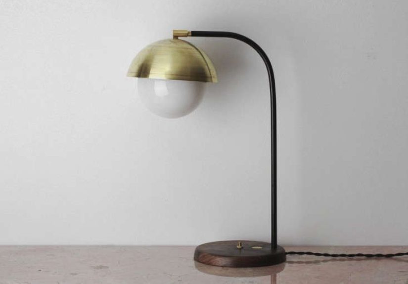
It can also change how a home feels. Imagine a bedroom with white bedding, a black reading lamp, pale oak floors, a charcoal throw, and one handmade ceramic vase on a shelf. The room is not empty. It is edited. At the end of a chaotic day, that kind of space does not just look good; it calms your nervous system a little. It tells your brain that not everything needs to compete for attention. In that sense, Shiro Kuro is not only visual. It is emotional housekeeping.
There is also a creative side to the experience. Writers, designers, and photographers often love black and white because it removes distraction. When color is reduced, choices become clearer. Composition matters more. Mood becomes easier to control. A black notebook on a white desk can feel strangely motivating, as if the setup itself is saying, “Okay, enough nonsense. Make something good.” It is a palette that invites focus.
And then there is the social experience. Shiro Kuro tends to age well in public spaces. Restaurants, boutiques, hotel lobbies, galleries, and product packaging often rely on some version of black-and-white contrast because it reads as clean, elevated, and confident. It photographs beautifully. It communicates taste without too much explanation. Of course, it can go wrong. Too much contrast without warmth can feel cold. Too much perfection can feel intimidating. But when natural materials, soft light, and a bit of imperfection are added, the mood shifts from strict to welcoming.
That is probably why so many people return to this aesthetic again and again. Shiro Kuro feels balanced. It leaves room to think. It gives shape to quiet. It proves that style does not always need more color, more decoration, or more noise. Sometimes it just needs a strong line, an open space, and the confidence to let black and white handle the conversation.