Table of Contents >> Show >> Hide
- What Rolling Index Returns Actually Mean
- The Big Scoreboard: Best And Worst Rolling Returns
- The Best Rolling Periods: When The Market Brought Its A-Game
- The Worst Rolling Periods: Where Patience Earned Overtime
- Why 1973-1974 Still Matters More Than People Remember
- What The Data Says About Time Horizon
- Five Practical Lessons From The Best And Worst Rolling Index Returns
- Experiences From Real-World Market Cycles: What These Rolling Returns Feel Like In Practice
- Final Thoughts
Ask most investors how the market did, and they’ll usually give you a point-to-point answer. “It returned about 10% a year.” “It crashed in 2008.” “The 1990s were amazing.” All true, all incomplete. That is exactly why rolling index returns matter. They show what happened if you started investing in many different years and then held for a fixed period. In other words, rolling returns are the market’s way of saying, “Nice story, but let’s look at the full movie.”
For this analysis, the “index” is the S&P 500 total return index, using calendar-year returns from 1973 through 2016 with dividends reinvested. That matters because dividends are not decorative parsley on the investing plate. Over long stretches, they are part of the meal. Using rolling returns also matters because a single start date can flatter or punish the market unfairly. Start in 1982 and you feel like a genius. Start in 1999 and suddenly the market looks like it borrowed your wallet and forgot to give it back.
What Rolling Index Returns Actually Mean
Rolling returns measure the annualized return over overlapping periods. A 5-year rolling return for 1999 means the annualized result from 1995 through 1999. The next 5-year rolling return shifts forward one year, from 1996 through 2000, and so on. This method gives a much clearer view of performance across market cycles than one cherry-picked start and end date.
That makes rolling return analysis especially useful for understanding long-term stock market returns, sequence risk, and the emotional difference between a strong decade and a terrible one. It also answers a practical question: How much did timing really matter? The answer, in a word, is “a lot.” In two words, “more than.”
Method Used in This Article
This article uses annual S&P 500 total returns, not monthly data. So the rolling windows are calendar-year based. That means the figures are excellent for comparing broad historical periods, though small differences can appear if another dataset uses monthly start dates, different rounding, or alternate reinvestment conventions. The goal here is not fake precision. The goal is a realistic, apples-to-apples view of the best and worst rolling index returns from 1973 to 2016.
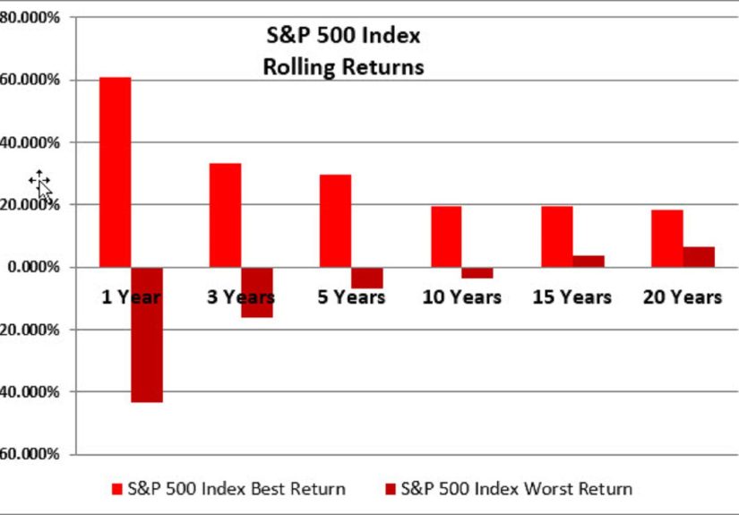
The Big Scoreboard: Best And Worst Rolling Returns
| Rolling Window | Best Period | Best Annualized Return | Worst Period | Worst Annualized Return | Share of Positive Rolling Periods |
|---|---|---|---|---|---|
| 1 Year | 1995 | 37.2% | 2008 | -36.6% | 80% |
| 3 Years | 1995-1997 | 30.8% | 2000-2002 | -14.5% | 83% |
| 5 Years | 1995-1999 | 28.3% | 2000-2004 | -2.3% | 88% |
| 10 Years | 1989-1998 | 19.0% | 1999-2008 | -1.4% | 94% |
| 15 Years | 1985-1999 | 18.8% | 2000-2014 | 4.2% | 100% |
| 20 Years | 1980-1999 | 17.7% | 1997-2016 | 7.6% | 100% |
Those numbers tell a surprisingly human story. The market can be dazzling over short and medium stretches, but it can also serve up years of frustration, especially when investors begin at expensive valuations. The good news is that the probability of positive outcomes improved as the holding period lengthened. The bad news is that “improved” does not mean “instant.” A bad starting point can turn a decade into a waiting room.
The Best Rolling Periods: When The Market Brought Its A-Game
Best 1-Year Return: 1995
The strongest single year in this 1973-2016 sample was 1995, with a total return of 37.2%. That year sat in the middle of a long expansion, falling inflation pressures compared with the 1970s and early 1980s, and strong optimism around corporate profitability and technology. Investors were not just buying stocks. They were buying the future, then throwing in extra enthusiasm for free.
Importantly, 1995 was not an isolated fireworks show. It was part of a broader run that made several of the best rolling windows cluster in the 1990s. When multiple overlapping periods all look great, that usually means you are seeing more than luck. You are seeing a powerful combination of earnings growth, investor confidence, expanding valuations, and the magic trick known as dividend reinvestment.
Best 3-Year and 5-Year Runs: 1995-1997 and 1995-1999
The best 3-year rolling period, 1995-1997, annualized at 30.8%. The best 5-year rolling period, 1995-1999, annualized at 28.3%. That is the kind of run that makes investing look easy, which is usually when it becomes dangerous. Extraordinary returns can train investors to believe the market owes them similar results forever. Spoiler alert: it does not.
Still, the late 1990s deserve respect. It was one of the most powerful bull markets in modern U.S. equity history. Productivity gains, booming corporate profits, and a wave of enthusiasm around the internet economy pushed returns higher and higher. Even conservative investors started sounding like motivational speakers. Then 2000 arrived and reminded everybody that gravity still exists.
Best 10-Year and Longer Runs: 1989-1998, 1985-1999, and 1980-1999
The best 10-year rolling period in this sample was 1989-1998 at 19.0% annualized. The best 15-year period was 1985-1999 at 18.8%, and the best 20-year period was 1980-1999 at 17.7%. That is not a typo. A 20-year annualized return of 17.7% is the investing equivalent of a cheat code.
Why was that era so strong? First, investors were coming out of the inflation-heavy 1970s and the high-rate early 1980s. Second, the economy experienced long expansions, healthier corporate fundamentals, and a friendlier backdrop for equity valuations. Third, the 1987 crash, while brutal in the moment, did not permanently derail the broader upward trend. That period is a perfect example of why investors who survive the scary headlines can sometimes be rewarded by the long arc of compounding.
The Worst Rolling Periods: Where Patience Earned Overtime
Worst 1-Year Return: 2008
No surprise here. The worst 1-year return in the sample was 2008, at -36.6%. The financial crisis was not a normal correction with a fancy haircut. It was a systemic shock that shredded confidence, liquidity, balance sheets, and sleep schedules. If 1995 was the market wearing a superhero cape, 2008 was the cape on fire.
This period matters because it showed that even after decades of historical gains, the S&P 500 could still experience a brutal collapse in a single calendar year. Investors who thought diversification inside U.S. large-cap stocks meant smooth sailing learned that equity risk does not disappear just because the companies are big, famous, and have nice logos.
Worst 3-Year Return: 2000-2002
The worst 3-year rolling return came in 2000-2002, which annualized at -14.5%. This was the dot-com bust, when the market went from “the internet changes everything” to “okay, but maybe not at 200 times earnings.” Overvaluation, euphoric expectations, and then a hard reset produced one of the ugliest short rolling periods in the whole study.
What makes this stretch especially instructive is that the broader economy and the stock market were not marching in perfect lockstep. Markets can crash before economic reality looks awful, and they can keep suffering even after the initial story is obvious. Rolling returns expose that lag beautifully. Or cruelly. Depends on whether you owned the index.
Worst 5-Year Return: 2000-2004
The worst 5-year rolling return, in nominal terms, was 2000-2004 at -2.3% annualized. That is rough because five years feels like enough time for markets to “surely bounce back.” Sometimes they do. Sometimes they decide to take the scenic route through disappointment.
This five-year window teaches one of the most important lessons in rolling return analysis: starting valuation matters. Investors who began near the peak of the late-1990s bubble were basically asked to fund the market’s hangover. The result was a long stretch where patience was not exciting, but it was still necessary.
Worst 10-Year Return: 1999-2008
The worst 10-year rolling return was 1999-2008, at -1.4% annualized. A full decade, negative. That single figure destroys the lazy myth that stocks always deliver strong returns over any 10-year period. Usually? Often. Always? Absolutely not.
This decade was hit by the bursting of the dot-com bubble and then the global financial crisis. Two major market disasters in one 10-year span is the kind of thing that makes investors question everything, including their strategy, their advisor, and occasionally the concept of time itself. Yet this is exactly why long-run market analysis has to include rolling returns. Otherwise, investors get sold a fairy tale instead of a range of outcomes.
Why 1973-1974 Still Matters More Than People Remember
Even though 2000-2008 produced the worst nominal 10-year rolling return, the 1970s still deserve a big, flashing warning sign. The 1973-1974 market collapse happened during a nasty mix of recession, inflation pressure, and the oil shock. That combination created an ugly backdrop for stocks and an even uglier one for real, inflation-adjusted wealth.
In fact, while 2000-2004 was the worst nominal 5-year rolling period in this sample, the worst real 5-year rolling return was 1973-1977, at -7.3% annualized after inflation. That is the key lesson: investors do not spend nominal returns. They spend real purchasing power. If inflation is hot enough, even a market that looks like it is merely limping can feel like it is stealing furniture from your house.
The 1970s also explain why older investors sometimes sound different from investors shaped by the 2010s. If your market memory starts with cheap index funds, low inflation, and giant tech winners, you have one personality. If your memory starts with stagflation and energy shocks, you have another. Neither is irrational. They were trained by different markets.
What The Data Says About Time Horizon
The rolling data gets friendlier as the holding period increases. About 80% of the 1-year windows were positive. That rises to 83% for 3-year windows, 88% for 5-year windows, and 94% for 10-year windows. Even more striking, every 15-year and 20-year rolling period in this 1973-2016 sample was positive in nominal terms.
That does not mean long-term investing is easy. It means it is more forgiving. The market does not remove risk for patient investors, but it has historically rewarded patience more often than impatience. That is an important distinction. A longer holding period is not armor. It is better odds.
Five Practical Lessons From The Best And Worst Rolling Index Returns
1. Start Dates Can Make You Look Brilliant Or Unlucky
One investor who started in 1989 enjoyed the best 10-year window in the sample. Another who started in 1999 got the worst. Same index. Same country. Very different dinner conversations.
2. Dividends Matter More Than They Get Credit For
Total return data includes reinvested dividends, and over long periods those dividends materially improve outcomes. Ignoring them makes the market history look thinner than it really was.
3. Ten Years Is Long, But Not Magically Safe
The negative 1999-2008 rolling decade proves that “stocks always win over 10 years” is a slogan, not a law of nature.
4. Inflation Is The Quiet Villain
The 1973-1977 real return numbers show that inflation can turn a bad period into a much worse one. Investors who only watch nominal returns are reading the scoreboard with one eye closed.
5. Staying Invested Is Emotionally Hard Because It Actually Matters
If staying invested were easy, it would not be an advantage. The hardest periods are usually the ones where long-term discipline does the most work.
Experiences From Real-World Market Cycles: What These Rolling Returns Feel Like In Practice
Looking at a table of rolling returns is useful, but it can also feel suspiciously tidy. Real investor experience is not tidy. It is messy, emotional, and usually accompanied by headlines that sound like the financial world is three minutes away from becoming a documentary narrated in a very serious voice.
Think about the investor living through 1973-1974. On paper, it was a bear market. In real life, it was inflation, recession anxiety, oil shocks, and the sensation that both stocks and purchasing power were moving in the wrong direction at the same time. That experience leaves a mark. An investor who lived through that period often learned that market returns are only half the story. The other half is whether those returns can still buy groceries, gas, and a vacation that does not involve sleeping in the car.
Now jump forward to the late 1990s. This was the opposite emotional climate. Optimism was everywhere. The market seemed fast, modern, exciting, and almost suspiciously cooperative. Investors who checked balances regularly were rewarded like lab mice with a dividend habit. In those environments, risk does not feel like risk. It feels like being left out. That is often how the best rolling return periods trick people into taking on more exposure right before conditions turn.
Then came the 2000-2002 collapse. Investors who had never seen a major drawdown learned the difference between believing in long-term investing and needing to practice it. Many people discovered that their risk tolerance was not a number on a questionnaire. It was whatever survived after three ugly years in a row. A lot of investors did the perfectly human thing: they got more cautious after prices fell. Unfortunately, markets often recover when people are least emotionally prepared to trust them again.
The 2008 crisis intensified that feeling. This was not just a bad market year. It was a confidence crisis. Investors were not merely asking whether stocks were cheap. They were wondering whether the financial system itself was built out of cardboard and optimism. Watching a portfolio fall more than 30% in a year is one thing. Watching that happen while the news cycle screams about banks, bailouts, and collapsing credit markets is something else entirely.
That is why the lessons from rolling return analysis are so valuable. They are not abstract. They match how people actually experience markets. Good periods feel permanent. Bad periods feel personal. Long stretches of mediocre performance feel like betrayal. And yet, over time, the investors who kept contributing, rebalancing, and refusing to turn a temporary panic into a permanent decision were usually the ones who benefited most when recoveries arrived.
In practice, the best investors were not always the ones with the best forecasts. Very often, they were the ones with the strongest process. They understood that a terrible 1-year return does not automatically ruin a 20-year plan, and a spectacular 5-year return does not guarantee the next 5 will be equally charming. They respected valuations, kept expectations reasonable, and treated discipline like part of the strategy rather than a motivational poster.
That may be the most practical takeaway from the period between 1973 and 2016. Markets changed. Inflation changed. policy regimes changed. Investor favorites changed. But one thing stayed stubbornly true: the market rewarded endurance more consistently than brilliance. And yes, that is less glamorous. It is also more useful.
Final Thoughts
The best and worst rolling index returns from 1973 to 2016 tell a story far richer than a simple average ever could. The best windows were fueled by long expansions, falling inflation, compounding, and strong sentiment. The worst windows were driven by bubbles, crashes, recession shocks, and in some cases inflation that quietly chewed through real wealth. Most important, the study shows that time horizon, starting valuation, and investor behavior all shape outcomes.
If you want one clean takeaway, here it is: the market has historically been generous, but not polite. It does not deliver gains on demand, it does not smooth the ride for your convenience, and it does not care that you prefer your returns without emotional damage. But for investors who understand rolling returns, that truth is not depressing. It is useful. It replaces myth with range, averages with context, and wishful thinking with history.