Table of Contents >> Show >> Hide
- What Exactly Is “La Fonda Ortiz Gold”?
- Satin Finish: The “Jeans and a Blazer” of Sheens
- The Paint Sample: Small Jar, Big Decisions
- Where La Fonda Ortiz Gold Looks Best
- Color Pairings That Make Gold Look Expensive
- Prep, Coverage, and the “Why Do Warm Colors Need Extra Coats?” Problem
- Low-Odor, Low-VOC, and “Please Don’t Paint With the Windows Closed”
- Picking a Valspar Line for the Full Room (Not Just the Sample)
- Common Mistakes (and How to Fix Them Without Crying)
- of Real-World Experiences With La Fonda Ortiz Gold (What People Learn Fast)
- Conclusion
Some paint colors whisper. Some paint colors shout. Valspar La Fonda Ortiz Gold?
It’s the one that slides into the room wearing a vintage leather jacket, orders something mysterious,
and somehow makes your sad beige sofa look like it has a personal stylist.
If you’ve been hunting for a gold that feels earthy (not “Vegas hotel lobby”), warm (not “school bus”),
and grown-up (not “I just discovered glitter”), this shade has a lot going for itespecially in a
satin interior finish, where color depth meets real-life durability.
What Exactly Is “La Fonda Ortiz Gold”?
A color description in normal-human terms
La Fonda Ortiz Gold reads like a sun-baked, spiced honey tonethink turmeric latte, aged brass,
or the warm glow of late-afternoon light on a clay wall. It sits comfortably in the
yellow/gold paint color family, but it leans more “golden ochre” than “banana.”
There’s a subtle red-brown undertone that keeps it grounded and makes it play surprisingly well with wood,
leather, and natural textiles.
Design-wise, it’s the kind of color that can look cozy and collected in a living room,
luxe in a powder room, and oddly confidence-boosting in a home office (your email replies may not get nicer,
but they’ll feel more intentional).
The numbers (for people who enjoy labels on spice jars)
If you like to quantify vibes: digital references for La Fonda Ortiz Gold are commonly listed around
HEX #D19243 with a Light Reflectance Value (LRV) around 34.5.
Translation: it reflects a moderate amount of lightdeep enough to feel rich, light enough to avoid turning your room into a cave.
You may also see it associated with different Valspar identifiers depending on the color library or catalog version.
Important reality check: screens lie, lighting lies, and your neighbor’s “same color” is usually a different base,
a different sheen, or a different decade of sun exposure. Always test in your own space before committing.
Satin Finish: The “Jeans and a Blazer” of Sheens
Satin is that sweet-spot sheen: more lustrous than eggshell, less shiny than semi-gloss.
It’s designed to be stain-resistant, scrub-friendly, and practicalaka, it understands that humans live here.
Satin also gives gold tones a little extra glow, which is exactly what you want from a color named “Gold” that’s trying to be classy about it.
Where satin works best
Satin is a strong choice for busy rooms and places that get touched, splashed, bumped, or judged:
hallways, family rooms, kitchens, laundry rooms, bathrooms, and kids’ spaces. If you want La Fonda Ortiz Gold to look
rich and survive everyday life, satin is a smart pick.
One satin warning (it will tell on your walls)
Higher sheen = more light bounce = more visibility. Satin can highlight surface texture and imperfections,
especially under strong directional light. If your wall has a “handmade” vibe (read: patchwork, dents, or old roller marks),
plan on a little prep so the finish looks intentionally smooth instead of accidentally dramatic.
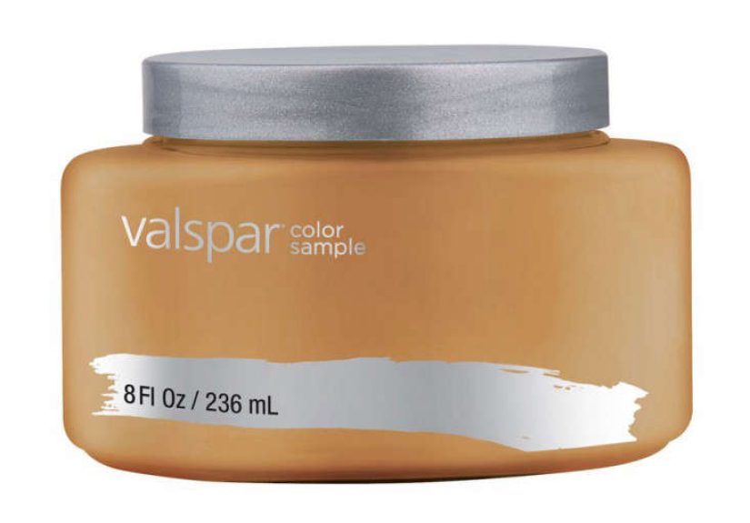
The Paint Sample: Small Jar, Big Decisions
The Valspar La Fonda Ortiz Gold interior satin paint sample is typically sold as an
8 fl oz container intended to cover about a 4 ft x 4 ft area (roughly 16 sq ft).
It’s made for trying the color in your home’s actual lighting and next to your actual stuffbecause your couch has opinions.
Pro move: don’t paint a tiny square directly on the wall and call it a day. Paint a larger test area (or two),
and try at least three moments: morning, afternoon, and evening. Golds can shift from “warm glow” to “mustard mood”
depending on whether you’re in bright sun, cool shade, or warm bulbs.
How to test La Fonda Ortiz Gold like you mean it
- Go bigger: aim for at least 2 ft x 2 ft, ideally larger.
- Move it: test on a poster board so you can reposition it around the room.
- Check next to white: bright whites reveal undertones fast (it’s like color truth serum).
- Compare to flooring + textiles: gold loves wood, but some woods pull it greener or redder.
- Test in the exact sheen: satin can read different than eggshell or matte.
Where La Fonda Ortiz Gold Looks Best
1) The accent wall that doesn’t scream “theme restaurant”
Used on one wall, La Fonda Ortiz Gold can create a focal point that feels warm and intentionalespecially behind a bed,
a sofa, or built-ins. Pair it with calm neutrals and simple decor, and it reads “collected.”
Pair it with too many faux-antique accessories, and suddenly your house is asking for breadsticks.
2) A cozy library or den
Golds thrive in rooms that want to feel like a refuge. Add deep greens, tobacco leather, charcoal textiles,
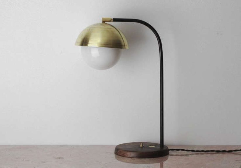
and warm metals (brass, bronze) and you get a space that feels layered without feeling dark.
3) Powder room “jewelry box” energy
Small rooms can handle bold color if you commit. Satin helps because it’s more cleanable than flatter sheens,
and the reflective quality makes the space feel polished. If the room is tiny, consider balancing with bright trim
and strong lighting so the color stays rich, not muddy.
4) Trim, doors, and cabinets (with the right product)
If you love the color and want it on higher-wear surfaces, the key is using the right formula.
Walls and ceilings can take standard interior wall paint. Cabinets and trim often do better with paints made for harder wear
and smoother leveling. Ask the paint desk to tint a cabinet/trim-friendly product to La Fonda Ortiz Gold so the finish
matches the job you’re asking it to do.
Color Pairings That Make Gold Look Expensive
Gold is at its best when it has something to contrast against. The easiest win is pairing it with warm, deep neutrals:
charcoal, chocolate brown, rich olive, and warm tans. You can also go crisp and modern with clean whites and inky accents.
Modern earthy palette
- La Fonda Ortiz Gold + rich olive green + warm cream + natural oak
- La Fonda Ortiz Gold + clay/terracotta accents + linen whites + matte black hardware
Classic contrast palette
- La Fonda Ortiz Gold + charcoal gray + bright white trim
- La Fonda Ortiz Gold + navy + brass accents (yes, gold + gold can work if textures differ)
Soft-and-sunny palette
- La Fonda Ortiz Gold + creamy beige + warm wood + woven textures
- La Fonda Ortiz Gold + muted sage + off-white (a calm, nature-inspired combo)
Prep, Coverage, and the “Why Do Warm Colors Need Extra Coats?” Problem
Here’s the deal: saturated yellows and golds can be notoriously picky about coverage, especially when you’re going from a darker wall,
a high-contrast patch job, or a very bright white base. Even great paint can need an additional coat to get truly even color,
and application technique affects the final look.
A practical prep checklist (your future self will thank you)
- Clean first: remove grease and residue so paint bonds properly.
- Patch + sand: satin will highlight bumps; smooth is your friend.
- De-gloss if needed: shiny surfaces need scuff-sanding or proper bonding primer.
- Prime smart: if you’re covering stains, changing from dark to gold, or patching a lot, use primer.
- Tape like an adult: crisp lines help bold colors look intentional.
Application tips for a clean satin finish
- Stir thoroughly (and keep stirring occasionally). Pigments settle; gold is not the time for surprises.
- Maintain a wet edge to avoid lap markssatin can show them more than flatter sheens.
- Use quality tools: a good roller cover and a solid angled brush make a visible difference.
- Let coats dry properly: rushing = texture + drag marks + regret.
Low-Odor, Low-VOC, and “Please Don’t Paint With the Windows Closed”
Indoor air matters. VOCs (volatile organic compounds) can be emitted by many household products, including some paints,
and indoor concentrations can be significantly higher than outdoors. That’s why many homeowners prefer low-VOC or zero-VOC options,
plus good ventilation during and after painting.
How to shop smarter (without becoming a chemist)
- Check the can: “low-VOC” and “zero-VOC” are useful labels, but details can vary by product and tinting.
- Look for third-party certifications if indoor air sensitivity is a priority.
- Ventilate like it’s your job: open windows, run fans, and give the room time to air out.
- Plan for cure time: “dry to touch” is not the same as fully cured and scrub-ready.
Picking a Valspar Line for the Full Room (Not Just the Sample)
A color is only half the storythe product line determines performance. Many Valspar interior options are positioned for
different needs: everyday washability, scuff resistance, premium hide, or one-coat coverage claims.
The key is choosing the formula that matches your space, then tinting it to La Fonda Ortiz Gold.
A quick (human) chooser guide
- If you have kids, pets, or hallway chaos: choose a line marketed for washable, scrub-resistant performance.
- If you want premium hide and fewer coats: look for higher-tier lines with strong coverage claims.
- If you’re painting a “pretty” room with lower traffic: you can prioritize the look and budget.
- If you’re repainting over stains or uneven walls: stain-blocking features + primer strategy matter more than hype.
Common Mistakes (and How to Fix Them Without Crying)
Mistake: Testing in the wrong light
If you only check the sample at night under warm bulbs, you may end up with a gold that looks more orange than expected in daylight.
Fix: test across the day, and compare against a true white.
Mistake: Skipping prep because “it’s just paint”
Satin doesn’t forgive like flat does. Fix: fill, sand, and prime where needed. It’s cheaper than repainting the entire room.
Mistake: Expecting perfect touch-ups
Touch-ups can flash (show differently) with satin, especially as the wall ages. Fix: keep leftover paint, use the same tools,
feather edges, and when in doubt, repaint the full section corner-to-corner.
of Real-World Experiences With La Fonda Ortiz Gold (What People Learn Fast)
Below are the kinds of experiences homeowners and DIYers commonly run into when they try a bold, earthy gold like La Fonda Ortiz Gold
in an interior satin finishaka, the stuff you’d hear if you asked three friends, one neighbor, and that one person in the paint aisle
who is somehow on their fourth renovation this year.
Experience #1: “It looked perfect… until I moved the lamp.”
In a north-facing living room, La Fonda Ortiz Gold can read deeper and slightly moodier. People often love it in the morningwarm and
sophisticatedthen notice it goes more “spiced amber” by late afternoon when shadows shift. The lesson: lighting is the co-designer.
Swapping cool bulbs for warmer ones can make the color feel richer; adding more layered lighting keeps it from turning flat at night.
Experience #2: “My wall suddenly revealed every bad patch job I’ve ever done.”
Satin is durable, but it’s also honest. More than a few DIYers discover that once the gold is up, the wall texture becomes a storyline.
The fix is usually simpleskim small areas, sand smoother, prime, and repaintbut the takeaway is bigger: if you want a color with depth,
you have to give it a surface worth showing off. Think of it as skin care for drywall. Exfoliation (sanding) works.
Experience #3: “I thought gold would feel loud, but it feels cozy.”
Earthy gold surprises people. Instead of feeling neon or flashy, it often reads warm and groundedespecially when paired with natural
materials. Homeowners report that the color looks best when the room has a little texture: linen curtains, wool rugs, oak furniture,
and woven baskets. With those elements, the gold stops being “a statement” and becomes “a vibe.” The moment it really clicks is when
you add contrast: dark art frames, charcoal pillows, or olive accents. Suddenly the gold looks intentional, not accidental.
Experience #4: “The sample was my best decision.”
People who skip sampling often end up repainting. People who sample usually end up smug (in a healthy way). The most common win is
testing the color next to trim and flooring. On some floors, the gold pulls more amber; on others, it leans slightly red. Sampling
also helps you decide how much gold is enough. Many end up using it as an accent wall or on built-ins rather than all four wallsand
they’re thrilled because they get the warmth without feeling wrapped in mustard.
Experience #5: “Cleaning matters, and satin earns its keep.”
In homes with kids or high-traffic areas, satin finishes tend to feel like the practical win: easier wipe-downs, better resistance to
daily scuffs, and fewer “why is that handprint still there” moments. The key is letting the paint cure before aggressive cleaning and
using gentle soap-and-water rather than harsh scrubbing on day two.
Conclusion
If you want a gold that feels warm, earthy, and design-forwardwithout turning your room into a medieval banquet hallValspar La Fonda Ortiz Gold
is a strong contender. In a satin interior finish, it offers that sweet combination of depth, glow, and real-life cleanability.
Sample it, watch it in your lighting, pair it with deep neutrals or natural textures, and give your walls the prep they deserve.
Do that, and this shade doesn’t just “look good.” It makes the whole room feel better dressed.