Table of Contents >> Show >> Hide
- How Poketo Became a Design Favorite in Los Angeles
- Why “Color Pop” Describes Poketo So Well
- Inside the Store Experience
- Poketo’s Founders and the Human Side of the Brand
- Why Poketo Fits Los Angeles So Perfectly
- Design Lessons from Poketo’s LA Color Story
- What “Color Pop at Poketo in LA” Really Means
- Extended Experience: What It Feels Like to Spend Time Around Poketo in LA
- Conclusion
If Los Angeles had a visual love language, it would probably be color. Not timid color, either. We are talking about the kind that strolls into a room wearing geometric socks, carrying a striped planner, and somehow makes a bamboo dinner plate feel like modern art. That is the energy Poketo brought to LA. More than a shop, more than a brand, and definitely more than a place to “just pick up a notebook,” Poketo became one of those rare retail spaces that made everyday life look a little smarter, brighter, and way more fun.
Founded by Angie Myung and Ted Vadakan, Poketo started in 2003 with a simple but powerful idea: art should not live only in galleries, whispered about by people holding warm white wine. It should live in your pocket, on your desk, by your front door, and maybe next to your coffee mug. The brand’s first hit was the artist wallet, a small object with a big mission. From there, Poketo evolved into a design-forward lifestyle label known for stationery, home goods, apparel, accessories, and curated finds that made good design feel approachable rather than intimidating.
And in LA, that philosophy found its perfect stage. Poketo’s spaces, especially its celebrated Los Angeles stores, turned color into a lifestyle. Not a loud, chaotic rainbow explosion, but a disciplined kind of joy: clean lines, playful shapes, modern graphics, soft plywood, clever displays, and objects that managed to be both beautiful and genuinely useful. In a city obsessed with image, Poketo pulled off something more interesting. It made visual pleasure feel practical.
How Poketo Became a Design Favorite in Los Angeles
Poketo’s LA story is tied closely to the city’s creative growth. After the founders moved to Los Angeles, the brand planted itself in the downtown Arts District before that neighborhood became the polished magnet it is known as today. That early setting mattered. The Arts District had room for experimentation, and Poketo fit right in with its mix of design thinking, artistic collaboration, and independent spirit.
When Poketo opened its first brick-and-mortar store in the Arts District in 2012, it was not just another boutique with pretty shelves and a good angle for Instagram. It was part gallery, part headquarters, part community hub. The store was large, flexible, and intentionally designed to change. Tables could move. Displays could shift. Workshops and exhibitions could happen without the whole place throwing a dramatic retail tantrum. In classic LA fashion, the space was laid-back and ambitious at the same time.
Later, Poketo’s flagship presence in Little Tokyo reinforced the brand’s place in downtown LA’s design culture. That move felt fitting. Little Tokyo is one of those neighborhoods where heritage, creativity, food, and retail meet in a way that feels layered rather than manufactured. Poketo’s aesthetic, with its appreciation for Japanese stationery, modern design, and thoughtful objects, made it feel less like an outsider and more like a natural part of the neighborhood’s rhythm.
Why “Color Pop” Describes Poketo So Well
The phrase “color pop” gets tossed around a lot in design writing, sometimes so casually that it starts to mean “we found one yellow pillow.” Poketo deserves the phrase more than most. Color at Poketo was never random decoration. It was part of the brand’s logic.
The company’s collections often centered on themes and palettes, which helped create consistency across product categories. That meant a planner, a tray, a pen set, and a tea towel could all feel related without looking like they came from a clone machine. The result was visual harmony with personality. Poketo loved bold graphics, but it also knew when to let white space breathe. It embraced cheerful tones, but paired them with modern restraint. Think less sugar rush, more controlled delight.
This is what made the stores so memorable. A Poketo visit often felt like stepping inside a mood board that had been professionally house-trained. Bright objects sat against calm interiors. Neutral shelving and plywood surfaces gave colorful goods room to shine. A striped notebook could flirt with a pastel mug across the room and somehow the whole place still looked serene. Frankly, it was a little rude how easy they made it look.
The Signature Poketo Palette
Poketo became associated with bold but livable colors: cobalt, coral, mustard, blush, terracotta, teal, forest green, and graphic black-and-white patterns that grounded the brighter pieces. These colors were often arranged in blocks, lines, grids, arcs, and abstract shapes. The visual language nodded to modern art and design history while staying warm enough for everyday use.
That matters because many lifestyle brands pick a side. They are either serious-minimalist and allergic to joy, or so quirky they make your kitchen look like it lost a bet. Poketo found the middle lane. Its products had enough personality to stand out and enough discipline to stay useful long after the novelty wore off.
Inside the Store Experience
Walking into Poketo in LA was not like entering a generic gift shop where a candle, a greeting card, and an overpriced trinket are all pretending to be friends. It felt curated. Everything had a reason for being there. The mix usually included Poketo’s own products alongside items from independent designers and selected brands, creating a shopping experience that felt both local and global.
You might find planners and notebooks near sculptural desk objects, colorful dinnerware near art books, and accessories next to design-minded gifts that turned ordinary errands into tiny style upgrades. The store often balanced utility and whimsy so well that you could walk in for a single birthday card and leave wondering whether your entire home had been too emotionally beige.
Even the store fixtures told the story. Early coverage of Poketo’s interiors highlighted its use of light wood, movable furniture, and bright accents. This design approach reflected the brand’s values: flexibility, clarity, creativity, and accessibility. Nothing felt overly precious. The store invited browsing, touching, rearranging your priorities, and occasionally making dramatic eye contact with a set of color-block pens you absolutely did not need but suddenly felt spiritually connected to.
More Than Retail
One reason Poketo stood out in LA was that it never acted like retail existed in a vacuum. The brand hosted workshops, talks, exhibitions, and community-oriented events. It collaborated with artists, makers, and other brands. At various points, its LA spaces included concept-shop elements and rotating pop-ups, giving customers a reason to return beyond standard shopping.
That community dimension helped Poketo become part of LA’s broader creative ecosystem. It was not just selling design objects; it was reinforcing the idea that design is cultural, social, and participatory. In other words, you could buy a planner there, but you could also leave with a slightly upgraded worldview. Not bad for a store run.
Poketo’s Founders and the Human Side of the Brand
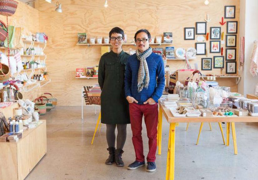
Part of Poketo’s appeal comes from the founders themselves. Angie Myung and Ted Vadakan built the company as a creative partnership, and the brand reflects that balance. Their approach combined artistic curiosity with practical design sense. Interviews and profiles over the years have described Poketo as joyful, accessible, and rooted in the belief that design should improve daily life. That ethos explains why the brand never felt cold, even when its aesthetic leaned modern and minimal.
The name itself has charm. “Poketo” comes from Angie Myung’s grandmother’s pronunciation of the word “pocket,” which links neatly back to the brand’s first product and its original mission of making art portable and personal. That story has the kind of warmth branding agencies spend seven meetings trying to fake.
What also stands out is how often Poketo has been described not just as colorful, but as joyful. That is a subtle but important difference. Plenty of brands use color to get attention. Poketo used color to create ease, optimism, and connection. It wanted a planner to feel encouraging, a tray to feel cheerful, a shop to feel welcoming. In a culture where “design” can sometimes become code for “look, but do not relax,” that approach felt refreshing.
Why Poketo Fits Los Angeles So Perfectly
Los Angeles is a city of visual identities. Every neighborhood has its own palette, pace, and personality. The beach towns lean breezy. Silver Lake has its own carefully disheveled charm. The Arts District thrives on industrial cool with a creative pulse. Little Tokyo blends culture, history, food, design, and movement in a compact urban patchwork. Poketo made sense in LA because it translated that visual richness into objects people could actually live with.
It also mirrored the city’s hybrid sensibility. Poketo was part art space, part design store, part lifestyle brand, part community platform. That layered identity is very LA. This is a city where a coffee shop might also host a ceramic pop-up, sell books, and have a tiny clothing rack in the corner like it is trying to collect side quests. Poketo understood that shoppers did not just want products. They wanted taste, atmosphere, and a story.
And unlike many trend-driven retailers, Poketo’s aesthetic had staying power. Its products and spaces felt contemporary without chasing every passing fad. The brand’s use of geometry, color blocking, modern typography, and functional design gave it longevity. It felt young without trying too hard, sophisticated without being stiff, and playful without veering into gimmick territory.
Design Lessons from Poketo’s LA Color Story
Poketo’s success offers a few useful lessons for anyone interested in retail, interiors, branding, or even just making a desk less depressing.
1. Color works best with structure
Poketo never treated color like confetti. It used repetition, contrast, and composition. Bright tones popped because neutral materials and clean layouts kept them under control.
2. Utility does not have to be boring
One of Poketo’s greatest strengths was making functional objects feel desirable. A planner, folder, plate, or tote can be practical and still feel like a tiny act of self-expression.
3. Retail should feel like an experience, not a transaction
From workshops to rotating displays to strong visual merchandising, Poketo proved that people remember how a place feels. Good stores do not just sell. They stage a mood.
4. Joy is a legitimate design strategy
There is nothing frivolous about pleasure in everyday life. Color, beauty, and thoughtful design can make routine tasks feel lighter. That is not shallow. That is survival with better stationery.
What “Color Pop at Poketo in LA” Really Means
At first glance, the title sounds like a simple visual description. But it is really about an approach to living. Poketo showed that color can be more than decoration. It can be a form of generosity. It can make a store feel friendlier, a product feel more personal, and a neighborhood experience feel more memorable. In LA, where aesthetics often carry meaning, Poketo turned brightness into something grounded and usable.
Its story is not just about selling attractive things. It is about making design democratic, bringing art into ordinary routines, and creating a retail environment where people feel inspired rather than intimidated. That is why Poketo’s color story has lasted. It was never only about what looked good on a shelf. It was about what made everyday life feel a little more awake.
Extended Experience: What It Feels Like to Spend Time Around Poketo in LA
There is also something deeply experiential about Poketo in Los Angeles that goes beyond merchandise. To understand the appeal, imagine starting your day downtown, where the city feels equal parts historic layering and creative reinvention. You pass concrete, murals, storefront glass, old signage, new energy, and the kind of foot traffic that says something interesting might happen even if you have no official plan. Then you step into a place like Poketo, and the pace shifts.
The first thing that hits is not just color, but order. The colors are crisp, arranged, almost conversational. A set of pens does not sit there like office supplies; it poses. A planner suggests that maybe your life could become organized if you just believed in yourself and bought the right grid paper. A stack of trays whispers that even your keys deserve better staging. Suddenly, the ordinary stuff of life looks strangely glamorous.
That is part of the LA magic. Poketo makes everyday objects feel cinematic without making them ridiculous. The store does not ask you to become a different person. It just nudges you toward a version of yourself who owns nicer notebooks and perhaps stops losing receipts in random jacket pockets.
There is also a tactile pleasure to the experience. You notice paper texture, matte finishes, smooth ceramics, clean edges, and graphic details that reward a second look. In a world where so much shopping happens on screens, the physicality matters. Poketo reminds you that design lives in your hands as much as in your eyes.
And because the brand grew within LA’s creative culture, the experience feels local in a meaningful way. It reflects the city’s love of independent makers, thoughtful curation, and design that can move between art, fashion, interiors, and daily ritual. Shopping there can feel like browsing the visual diary of a city that values self-expression but also appreciates a very good shelf arrangement.
For visitors, Poketo offers a polished snapshot of a certain Los Angeles sensibility: artistic but not pretentious, playful but not messy, modern but still warm. For locals, it can feel like a reliable source of visual oxygen. You walk in a little frazzled, maybe after traffic, emails, and one truly unnecessary group chat, and walk out with your mood suspiciously improved by color blocks and excellent merchandising.
That is the lasting appeal of color pop at Poketo in LA. It is not just about buying something bright. It is about encountering a space that believes beauty belongs in ordinary life. A desk can be happier. A gift can feel more thoughtful. A store can be both stylish and human. In a city full of spectacle, that quieter kind of delight may be the most impressive trick of all.
Conclusion
Poketo became a Los Angeles favorite because it made good design feel generous. Through bold color, minimal structure, useful products, and community-minded retail, it created an identity that fit LA beautifully. The brand’s shops and collections showed that art does not have to be distant or expensive to matter. Sometimes it shows up as a planner on your desk, a tray in your entryway, or a bright little object that makes your day feel less routine. That is the real color pop: not just what you see, but what shifts in the mood of everyday life.