Table of Contents >> Show >> Hide
Some design fails are so gloriously bad they deserve their own museum wing, a velvet rope, and a small plaque that reads, “We really thought this was a good idea.” From bathroom signs that create accidental existential crises to websites that hide the checkout button like it owes them money, bad design has a special talent: it confuses people instantly and memorably.
That is exactly why the phrase “Hey Panda’s Send Your Worst Design Fails” is so irresistible. People love spotting design disasters because they are funny, relatable, and weirdly educational. One crooked label, one unreadable font, one door handle that looks like it should push but definitely pulls, and suddenly everyone becomes an unpaid design critic. The internet laughs, screenshots are taken, and a legend is born.
But here is the useful part hiding under the comedy. The worst design fails are not just random accidents. They usually happen for familiar reasons: the text is impossible to read, the layout has no hierarchy, the controls do not look clickable, the message is unclear, or the design forgot that real human beings would have to use it. In other words, the joke is funny because the mistake is real.
This article looks at why terrible design spreads so fast, what the most common design failures have in common, and what designers, brands, and everyday creators can learn before their work gets roasted by the entire internet. So yes, we are here to laugh. But we are also here to learn, improve, and maybe stop putting light gray text on white backgrounds like it is some kind of artistic dare.
Why Worst Design Fails Spread So Fast Online
Bad design goes viral because it creates instant friction. You do not need a long explanation to understand why a sign with terrible spacing reads the wrong way. You do not need a master’s degree in typography to know when six different fonts are fighting each other in public. A good design often feels invisible because it quietly helps you do what you came to do. A bad design announces itself like a man playing the trumpet in a library.
There is also a deep human reason these posts perform so well. Design fails are tiny morality plays. They remind us that every product, page, package, poster, and public sign was made by someone who made a choice. When that choice goes sideways, the result feels both hilarious and avoidable. That mix is internet gold.
And let us be honest: people enjoy the democratic nature of design criticism. You do not need to be a professional designer to say, “Why is the emergency exit sign pointing at a wall?” The audience instantly understands the problem because bad design interrupts ordinary life. It makes simple things harder than they need to be, and nobody enjoys losing a wrestling match to a confusing menu or a badly labeled bottle.
The Classic Ingredients of a Design Fail
Most terrible designs are not terrible in unique, artistic ways. They fail in the same old categories, over and over, like a sitcom character who keeps walking into the same glass door. Once you know these categories, you can spot them everywhere.
1. Readability Gets Thrown Out the Window
This is the most common crime scene. If people cannot read the message quickly, the design has already lost. Designers get into trouble when they choose fonts for personality before function, shrink text until it becomes decorative dust, or use colors with such weak contrast that reading feels like decoding a secret message through fog.
Unreadable design appears everywhere: restaurant menus in tiny script, event posters packed with compressed text, packaging that hides instructions, websites with low-contrast copy, and public signage that looks dramatic but communicates nothing. These pieces may look stylish from ten feet away and become nonsense at two feet. That is not elegance. That is betrayal.
The funniest part is that readability problems often come from trying too hard. Somebody wanted the design to feel premium, edgy, minimal, artistic, or futuristic. Instead, it ended up feeling like an eye exam with emotional consequences.
2. Visual Hierarchy Goes Missing
Good design guides the eye. Great design tells the viewer what matters first, second, and third without making a big speech about it. Bad design, meanwhile, dumps every element onto the page like groceries sliding out of a broken bag.
When there is no hierarchy, everything screams at once. The headline is the same size as the disclaimer. The button looks less important than the stock photo. The sale price is hiding while the decorative swirl gets center stage. This is how viewers end up confused, annoyed, or both.
In viral design-fail photos, hierarchy problems are often obvious. Signs emphasize the wrong word. Posters bury the event name. Product labels make the brand giant and the instructions microscopic. On websites, hierarchy fails show up as cluttered homepages, wandering layouts, and pages where users cannot figure out where to click first. It is like being given a treasure map where the “X” is smaller than the compass rose.
3. Clickability and Function Have No Clear Cues
Physical and digital design both rely on signals. A button should look pressable. A link should look clickable. A handle should suggest whether you push, pull, twist, or pray. When those cues disappear, users hesitate, guess, or make mistakes.
This is why flat, vague, overly polished interfaces can backfire. If every element looks equally decorative, users have to work too hard to identify what is interactive. The same problem happens in the real world when a door has a handle that says “pull” but the sign says “push,” or when a sink has controls that seem to require a pilot’s license.
The best design explains itself visually. The worst design expects people to read its mind. Spoiler: they cannot.
4. Accessibility Is Treated Like an Optional Bonus Round
A design fail is not just something that looks goofy. Sometimes it excludes people. If color is the only way information is communicated, some users will miss it. If the form relies on placeholder text instead of clear labels, people may struggle to complete it. If an error message is vague, hidden, or punishing, users are left stuck and blamed for a system problem.
That is where bad design stops being merely funny and starts becoming expensive. Accessibility issues can hurt usability, trust, conversion, and reputation all at once. A design that ignores real user needs may still win compliments in a meeting room, but it often loses in the wild.
Designers sometimes imagine accessibility as a checklist taped to the wall by the serious people. In reality, it is just good design with empathy and discipline. It means making text readable, controls understandable, feedback clear, and tasks doable for more people in more situations. That is not a limitation. That is competence.
5. Error Messages Are Useless, Rude, or Both
Few things expose bad design faster than a form gone wrong. You type carefully, hit submit, and get rewarded with an angry red box that says something like, “Invalid entry.” Thank you, mysterious machine. Very helpful. Deeply healing.
Bad error handling creates unnecessary stress because it fails at the exact moment the user needs support. Instead of pointing to the problem clearly, preserving entered information, and explaining how to fix the issue, weak designs hand users a vague warning and a tiny emotional crisis.
This is why smart design does not just prevent errors. It also respects users when errors happen. A well-designed correction flow feels like guidance. A badly designed one feels like being scolded by a toaster.
6. Real-World Context Is Ignored
Many legendary design fails happen because the creator forgot where the design would actually live. A sign may be technically readable on a laptop screen, then fail outdoors in sunlight. Packaging may look elegant in a mockup, then become confusing on a crowded shelf. A mobile page may seem fine in a studio and become unusable on a cracked phone while someone is rushing through a train station.
Context matters. People use design while tired, distracted, rushed, multitasking, carrying groceries, squinting in glare, navigating with one hand, or trying to make a fast decision. The best design meets users where they are. The worst design assumes they are relaxed, attentive, fully sighted, highly motivated, and oddly excited to decode tiny labels.
Funny Examples of Design Fails We All Recognize
Not every bad design needs to become a famous meme to feel familiar. Some examples are practically part of modern civilization at this point.
Signs That Accidentally Say the Wrong Thing
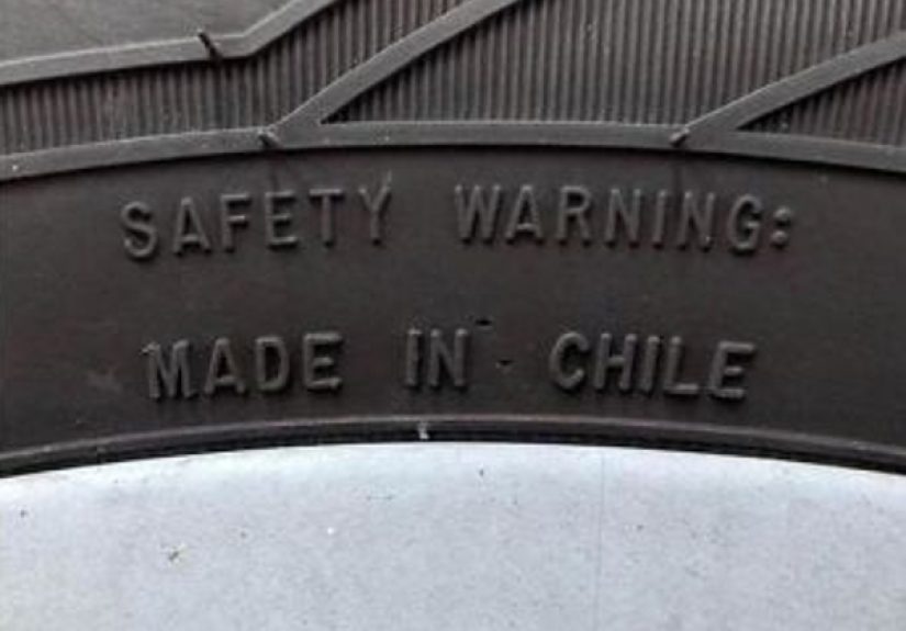
Poor spacing and line breaks have produced some of the internet’s most beloved disasters. One innocent arrangement of words can turn a harmless public sign into a completely different sentence. Suddenly a family restaurant sounds like a crime scene, or a school banner reads like it was designed during a power outage and a panic attack.
Doors With Trust Issues
The classic push-pull disaster remains undefeated. If people keep using a door the wrong way, the people are not the problem. The design is. A handle communicates one action. A plate communicates another. When those signals clash, users get that split-second confusion that makes them feel silly, even though the object set the trap.
Products With Controls From Another Dimension
Stoves, hotel showers, office printers, remote controls, and public hand dryers have all starred in the long-running series called Why Is This So Hard? Too many similar buttons, unclear icons, missing labels, and poor feedback can transform a basic task into a puzzle nobody asked to solve.
Web Pages That Bury the One Thing Users Need
You visit a site to buy a ticket, download a file, or book an appointment. Instead, you are greeted by pop-ups, sliders, competing banners, floating chat widgets, newsletter traps, and a button that might be the button you need, unless it is an ad wearing a disguise. This is not modern engagement. This is digital clutter dressed as ambition.
How to Avoid Becoming the Next Viral Design Fail
The good news is that most ugly mistakes are preventable. No crystal ball required. Just a few disciplined habits.
Start With the Task, Not the Decoration
Before choosing styles, ask what the user needs to do. Read? Compare? Click? Navigate? Buy? If the task is unclear, the design will drift toward visual noise. A pretty failure is still a failure wearing expensive shoes.
Use Fewer Fonts and Stronger Contrast
One of the easiest ways to improve a design is to calm it down. Limit the type palette, create consistent sizing, and make sure the text actually stands out from the background. You are designing communication, not camouflage.
Make Important Actions Obvious
If something is clickable, it should look clickable. If something is dangerous, it should look serious. If something is disabled, it should not feel mysteriously broken. Strong visual cues reduce hesitation and boost confidence.
Test With Real Humans Before You Publish
This is the step that saves reputations. Show the design to someone who did not make it. Ask them what they notice first, what they think they can click, and what confuses them. Watch where they hesitate. Every awkward pause is a little gift from the future.
Design Error States as Carefully as Success States
Designers love the perfect screen, the polished landing page, the completed checkout, the hero image, the clean dashboard. Real users, however, also create typos, miss steps, choose the wrong option, and forget passwords. Your design needs to work for those moments too. If the system only looks smart when everything goes right, it is not actually smart.
Why We Should Be Grateful for Bad Design Sometimes
As ridiculous as design fails can be, they are oddly useful teachers. They reveal invisible principles by breaking them in public. A good sign quietly works. A bad sign becomes a classroom. A clear form disappears into the task. A broken form becomes a cautionary tale with screenshots.
That is why collections of bad design are so compelling. They sharpen our instincts. They remind creators that users are not lab rats, and that communication is not successful just because the designer understands it. If a normal person cannot use the thing quickly and confidently, the design still needs work.
So yes, send the worst design fails. Send the cursed labels, chaotic websites, confusing products, and signs with tragic spacing. Laugh at them. Share them. Roast them gently. Then learn from them like your next project depends on it, because honestly, it probably does.
Design-Fail Experiences From Real Life
I once walked into a coffee shop with a menu board that looked like a modern art hostage situation. The drink names were in one font, the sizes in another, the prices in a third, and the descriptions were floating around like they had recently escaped supervision. I stood there pretending to study the options, but what I was really doing was trying to determine whether the iced latte belonged to the top column, the middle column, or an entirely separate spiritual category. By the time I ordered, I felt less like a customer and more like a detective.
Then there was the parking garage sign that used arrows with the confidence of a motivational speaker and the accuracy of a weather forecast from 1842. The exit arrow pointed left, except the exit was not left. Left led to a dead end and a growing sense that the building itself disliked me. A good wayfinding system should lower stress. This one added plot twists.
Digital design has given me just as many stories. I have seen checkout pages where the primary button was less noticeable than the cookie banner. I have seen mobile menus that opened half the screen, covered the content, and then refused to close unless you tapped an icon the size of an aspirin. I have seen forms that erased all the information after one tiny mistake, which is a bold strategy if your goal is to make people question every life choice that brought them there.
And somehow, the little details are often the funniest. A website that uses elegant pale gray text on a white background feels luxurious right up until you try to read it in daylight and discover that luxury apparently means invisibility. A product label that rotates the instructions vertically may look clever in a mockup, but in real life it turns every shopper into a reluctant yoga student. A “minimalist” interface can be refreshing, sure, but there is a thin line between clean and completely unhelpful, and many brands sprint across it with confidence.
These experiences stick because they are not abstract. They happen when people are hungry, late, tired, distracted, or trying to do something basic without drama. That is the true test of design. Not whether it looks impressive in a presentation, but whether it helps a real person in a real moment. The worst design fails forget that. The best designs respect it.
So when people post their funniest design disasters, they are not just collecting laughs. They are documenting friction. They are pointing out the gap between intention and reality. And in a weird way, that makes these failures useful. Every badly spaced sign, confusing app screen, impossible door, and chaotic package is a reminder that design is never just decoration. It is behavior, clarity, trust, and usability wearing visual clothes.
That is why the topic keeps resonating. We have all been there. We have all stared at a sign, a website, or a product and thought, Who approved this, and were they being chased? The humor makes the memory stick, but the lesson is serious: when design fails, people feel it immediately. And when design succeeds, life gets just a little easier. That is not flashy. It is just excellent.
Conclusion
The next time you see a hilariously bad sign, a website with trust issues, or a product label that reads like a puzzle game, enjoy the laugh. Then take the lesson. The worst design fails are rarely random. They come from ignoring readability, hierarchy, context, accessibility, feedback, and common sense. Good design is not magic. It is careful thinking made visible.