Table of Contents >> Show >> Hide
- What “Tracing” Means (and When It’s Actually a Good Idea)
- Before You Trace: A 5-Minute Prep That Saves 50 Minutes of Cleanup
- Method 1: Automatic Tracing in Inkscape (Trace Bitmap)
- Step-by-step: The quick auto-trace workflow
- Auto-trace modes that matter (and what they’re good for)
- Single Scan: Best for silhouettes and one-color art
- Multicolor / Multiple Scans: Best for stickers, flat illustrations, and posterized photos
- Pixel Art mode: Best for tiny icons and blocky sprites
- Common auto-trace problems (and the fixes that don’t require screaming)
- Problem: Double outlines or “ghost lines”
- Problem: The result has a million nodes and edits like a bowl of spaghetti
- Problem: Speckles, holes, and random blobs
- Clean Up Your Auto-Trace Like a Pro (So It Looks Intentional)
- Method 2: Manual Tracing in Inkscape (Clean, Precise, and Shockingly Satisfying)
- Automatic vs Manual Tracing: Which Should You Use?
- Exporting Your Traced Vector (So It Plays Nice with Other Apps)
- Conclusion
- Extra: Real-World Tracing “Experiences” (a.k.a. Lessons People Learn the Hard Way)
- 1) The best trace starts before Inkscape even opens
- 2) More colors isn’t “better,” it’s “more shapes to babysit”
- 3) Edge Detection has a “double-outline” phasedon’t panic
- 4) Simplify is powerful… and slightly unhinged
- 5) Lock your reference layer or accept chaos
- 6) Hybrid workflows are normal (and smart)
- 7) Export is part of the tracing process
Turning a blurry PNG into a crisp vector is a little like turning a microwave burrito into “cuisine”:
it’s possible, it’s satisfying, and sometimes it requires admitting you should’ve started with better ingredients.
The good news? Inkscape makes image tracing surprisingly approachablewhether you want a quick auto-trace for a sticker,
or a clean manual trace you’d trust with a laser cutter (and your reputation).
In this guide, you’ll learn two paths to the same destination:
automatic tracing (fast, sometimes messy) and manual tracing (slower, way cleaner).
Along the way, we’ll cover the settings that matter, the common “why does this look haunted?” problems,
and how to export an SVG that behaves nicely in the real world.
What “Tracing” Means (and When It’s Actually a Good Idea)
Most images you downloadJPGs, PNGs, screenshotsare raster graphics. They’re made of pixels.
Zoom in far enough and you’ll see the tiny squares marching in formation like an army of ants.
A vector graphic (like SVG) is different: it’s built from paths, curves, and shapes.
That means it can scale up without turning into crunchy pixel soup.
Tracing (also called vectorization) is the process of converting a raster image into vector paths.
It’s perfect for:
- Logos that need to scale cleanly
- Decals, vinyl cutting, laser cutting, CNC outlines
- Simple illustrations, icons, badges, stamps
- Turning a sketch into editable line art
It’s not magic, though. Tracing a complex photo and expecting it to become a perfect vector portrait is like asking a toaster
to do your taxes. You can do it, but you probably won’t like the outcome.
Photos with lots of gradients and tiny details often trace better as stylized art (posterized shapes, simplified lines),
not as a one-to-one replica.
Before You Trace: A 5-Minute Prep That Saves 50 Minutes of Cleanup
1) Choose the right image (future-you will be so grateful)
Automatic tracing loves images with high contrast, clean edges, and limited colors.
If your image looks like it was photographed through a foggy aquarium, consider fixing it first.
For logos: try to find a higher-resolution version or a flat-color original.
2) Clean the bitmap (yes, even a little helps)
If you can, do a quick cleanup in any raster editor (even basic tools work):
- Crop to the subject (less junk to trace)
- Increase contrast so edges are obvious
- Remove noise (speckles become extra nodes)
- Convert to grayscale or even black-and-white for line art
- Slight blur can help smooth jagged edges before tracing
Think of this as sweeping the floor before you paint. Could you paint first? Sure. Will you regret it? Also yes.
Method 1: Automatic Tracing in Inkscape (Trace Bitmap)
Inkscape’s automatic tracing feature is usually called Trace Bitmap.
It scans the pixels and generates vector paths based on brightness, edges, or color regions.
It’s fastand it’s the best choice when your image is simple and you need results yesterday.
Step-by-step: The quick auto-trace workflow
- Import your image: File > Import, pick your PNG/JPG, and place it on the canvas.
- Select the image with the Select tool (black arrow).
-
Open tracing:
Path > Trace Bitmap
(often Shift + Alt + B on Windows/Linux, or Shift + Option + B on macOS). - Choose a mode (Single scan, Multicolor/multiple scans, or Pixel Art depending on your version).
- Preview, tweak settings, then click Apply/OK.
-
The traced vector usually appears on top of the original image.
Drag it aside to compare, then delete (or hide) the original bitmap.
Auto-trace modes that matter (and what they’re good for)
Single Scan: Best for silhouettes and one-color art
Single scan creates one main path result (or a small set) from a bitmap.
Great for black-and-white logos, stamps, and bold shapes.
The three big options you’ll see most often:
-
Brightness Cutoff: Converts everything darker than a threshold into the traced shape.
Use it for silhouettes, icons, and “make this logo solid” tasks. -
Edge Detection: Traces edges instead of filled regions. Useful for line-art looks,
but it can create double lines if the source has thick strokes or shadows. -
Color Quantization (sometimes shown in single-scan contexts): Attempts a simplified color-based trace,
but for true color work you’ll usually prefer multicolor/multiple scans.
Pro tip: If your preview looks empty, your threshold is probably too low.
If it looks like a black blob, the threshold is too high. You’re hunting for “recognizable, but not melted.”
Multicolor / Multiple Scans: Best for stickers, flat illustrations, and posterized photos
Multicolor (or multiple scans) creates several pathsoften groupedbased on color regions.
This can be awesome for converting a flat illustration into editable vector layers.
It can also produce a pile of tiny shapes if your image has a lot of subtle shading.
Settings vary by Inkscape version, but the ideas are consistent:
- Number of colors/scans: Start low (like 6–10) and increase only if needed.
- Stacked scans: Helps preserve layer order so shapes overlap sensibly.
- Remove background: Useful when the background is uniform, but test itsometimes it removes things you liked.
- Smooth / Optimize: Can reduce jagged edges and excessive nodes.
Pixel Art mode: Best for tiny icons and blocky sprites
Some versions include a Pixel Art mode aimed at preserving sharp, grid-like edges.
If you’re tracing small icons or retro sprites, this mode can keep things crisp instead of “mysteriously wobbly.”
Common auto-trace problems (and the fixes that don’t require screaming)
Problem: Double outlines or “ghost lines”
This often happens with Edge Detection or when the source image has thick strokes, shadows, or compression artifacts.
Try:
- Switching from Edge Detection to Brightness Cutoff (for solid shapes)
- Cleaning the bitmap first (increase contrast, remove shadows)
- Tracing a simplified black-and-white version of the image
Problem: The result has a million nodes and edits like a bowl of spaghetti
Auto-trace can generate excessive nodes. You can reduce them, but do it carefully:
-
Use Path > Simplify once, then stop and evaluate.
Repeating it too many times can turn your logo into modern art (the bad kind). -
If Simplify is too aggressive, try adjusting the simplification threshold in preferences (version-dependent),
or simplify smaller parts individually after ungrouping. - Manual cleanup with the Node tool is often faster than fighting five rounds of Simplify.
Problem: Speckles, holes, and random blobs
Those usually come from noise in the source image.
Fix it by cleaning the bitmap (denoise, threshold, or blur slightly),
and in Trace Bitmap, look for options related to speckles, smooth, or optimize.
Then delete leftover junk paths by selecting and hitting Delete.
Clean Up Your Auto-Trace Like a Pro (So It Looks Intentional)
1) Separate the trace from the original
The traced vector is typically placed right on top of the bitmap.
Drag the top object aside. If it moves and stays sharp while zooming,
congratulationsyou’ve grabbed the vector.
Delete the bitmap (or lock it on a hidden layer if you still need a reference).
2) Ungroup and organize
Multicolor traces often come in as a group. Use Object > Ungroup
until individual shapes are selectable. Then:
- Combine related pieces into layers (outline, fills, highlights)
- Rename layers so future-you doesn’t have to guess
- Delete tiny shapes that won’t matter at final size
3) Node tool cleanup (the secret sauce)
Switch to the Node tool and click a path.
You’ll see nodes and handles that control curves.
For a cleaner result:
- Delete unnecessary nodes on long smooth curves
- Convert messy corners into cleaner corner nodes
- Adjust handles to smooth bumps without adding more points
4) Boolean operations (a.k.a. “shape surgery”)
Inkscape’s path operations are lifesavers when a trace is closebut not quite right:
- Path > Union: combine overlapping shapes into one
- Path > Difference: subtract top shape from bottom
- Path > Intersection: keep only overlap region
- Path > Division: slice shapes into parts for recoloring
If you’re prepping files for cutting or engraving, these tools can turn chaotic traces into clean, closed shapes.
Method 2: Manual Tracing in Inkscape (Clean, Precise, and Shockingly Satisfying)
Manual tracing is what you do when you want control: fewer nodes, smoother curves,
cleaner corners, and paths that don’t fall apart when exported.
It’s also the best method for:
- Lettering, logos, and brand marks
- Line art you plan to edit or animate
- Cut files where “almost” becomes “ruined material”
- Fixing auto-traces that are 80% right but 100% annoying
Set up a tracing workspace (do this once, thank yourself forever)
- Import the bitmap and place it on the canvas.
- Open the Layers panel and put the bitmap on its own layer (e.g., “Reference”).
- Lower opacity of the bitmap (so your vector stands out).
- Lock the reference layer so you don’t accidentally move it at the worst possible moment.
- Create a new layer called “Trace” above it.
-
Turn on snapping if you’re tracing geometric shapes,
and use guides for symmetry and alignment.
Manual tracing with the Bezier tool (your main character)
The Bezier (Pen) tool creates paths node-by-node. Here’s the basic rhythm:
- Click to place a straight node.
- Click-and-drag to create a curve and pull out handles.
- Keep placing nodes around your shape; close the path by clicking the first node again.
- Switch to the Node tool to refine curves and corners.
The trick is to use fewer nodes than you think you need.
Beginners often place a node at every little wobble. That’s how you get lumpy curves.
Instead, place nodes at “decision points”:
corners, curve transitions, and major direction changes.
Then shape the curve using handles.
Manual tracing with the Pencil tool (fast for organic lines)
For sketchy art, the Pencil tool can be quicker than Bezier.
Draw the line, then adjust smoothing settings (and use Simplify gently).
It’s great for:
- Hand-drawn doodles
- Loose outlines for stickers
- Organic shapes like leaves, clouds, and characters
It’s not as precise as Bezier, but it’s much faster for “human” linesespecially if you plan to clean up afterward.
Example workflow: Turn a hand-drawn logo into a clean SVG
- Import your scanned sketch and bump the contrast (either before importing or inside your process).
- Lock it on a reference layer at ~40% opacity.
- Use Bezier tool to trace the outer silhouette first (big shapes first).
- Trace internal cutouts (holes in letters, gaps) as separate paths.
- Use Node tool to smooth curves and fix corners.
- If needed, use Difference to punch holes cleanly (place hole shape above, then subtract).
- Apply fills/strokes. For cut files, prefer closed shapes and consistent path direction.
- Save as Plain SVG for maximum compatibility.
Automatic vs Manual Tracing: Which Should You Use?
| Goal | Best Method | Why |
|---|---|---|
| Quick SVG from a simple logo | Automatic (Single Scan) | Fast and usually accurate on high-contrast shapes |
| Sticker-style vector from flat illustration | Automatic (Multicolor) | Good at segmenting color regions into editable shapes |
| Professional logo cleanup | Manual (Bezier) | Fewer nodes, smoother curves, better control |
| Laser/vinyl cut file that must be perfect | Manual (or hybrid) | Auto-trace often creates messy nodes and tiny artifacts |
| Turn a photo into “vector art” | Automatic + cleanup | Works best as posterized or stylized shapes, not literal realism |
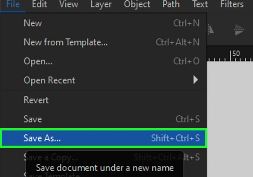
Exporting Your Traced Vector (So It Plays Nice with Other Apps)
Once you’ve traced and cleaned your artwork, export mattersbecause a perfect trace can still be ruined by a sloppy save.
Here are the safe defaults:
- SVG (Plain SVG): best for web, Cricut/Silhouette workflows, and general vector sharing.
- PDF: great for print or sharing with people who live in PDF land.
- PNG export: if you need a raster preview or web image (use File > Export).
If you’re cutting or engraving: make sure your paths are closed where needed, remove stray tiny shapes,
and consider converting strokes to paths (Path > Stroke to Path) when the target software expects geometry, not line appearance.
Conclusion
If you want speed, Inkscape’s Trace Bitmap is your go-to. It’s perfect for bold, simple images and quick conversions.
If you want qualityespecially for logos, lettering, and cut filesmanual tracing with the Bezier tool is the cleanest route.
And if you want the best of both worlds, use a hybrid approach: auto-trace to get close, then refine manually like a responsible adult.
(Or at least like someone who doesn’t want to debug 14,000 nodes at 2 a.m.)
Extra: Real-World Tracing “Experiences” (a.k.a. Lessons People Learn the Hard Way)
Below are the most common tracing lessons that show up again and again when people convert PNG to SVG in Inkscape.
Not “war stories” from a single personmore like the shared folklore of designers, makers, and anyone who has ever whispered
“why is it doing that” at their monitor.
1) The best trace starts before Inkscape even opens
People love to blame Trace Bitmap when the real villain is a low-quality source image. A compressed JPG with fuzzy edges produces fuzzy paths.
A screenshot with moiré patterns becomes a confetti cannon of tiny shapes. Even a 2-minute cleanupcropping, boosting contrast, removing noise
can turn “unusable mess” into “surprisingly decent.” If you only adopt one habit, make it this: feed the tracer clean, high-contrast input.
2) More colors isn’t “better,” it’s “more shapes to babysit”
Multicolor tracing is tempting because it feels like you’re getting a faithful reproduction.
But pushing scans/colors too high often creates dozens (or hundreds) of micro-regions that you’ll never notice at final size,
yet they’ll slow editing and complicate cutting workflows. Start with a small number of colors, preview, then increase only if you can point to
a specific detail you’re missing. If you can’t explain why you need 24 colors, you probably don’t.
3) Edge Detection has a “double-outline” phasedon’t panic
When Edge Detection outputs a double line, it’s not broken; it’s doing what it thinks you asked.
If your source line has thickness, the “edge” exists on both sides. For a single outline, many users have better luck tracing a filled silhouette
(Brightness Cutoff) or cleaning the bitmap so the edge is less ambiguous. Sometimes the simplest fix is: convert the art to solid black regions first,
then trace those.
4) Simplify is powerful… and slightly unhinged
Path > Simplify is the fastest way to reduce node count, but it’s also a “measure twice, cut once” button.
One click can be magical. Five clicks can turn a circle into a potato. The practical approach: duplicate your path first,
simplify once, compare, undo if needed, and only apply again if the shape still holds. When Simplify is too aggressive,
manual node cleanup on key curves is often saferand produces better-looking geometry.
5) Lock your reference layer or accept chaos
Manual tracing goes smoother when your reference image stays put.
Without a locked layer, you’ll eventually nudge the bitmap while adjusting nodes and spend the next five minutes trying to realign it by vibes.
Lower the opacity, lock it, and keep your trace on a separate layer. This simple setup makes the whole process feel calmerlike your file has good posture.
6) Hybrid workflows are normal (and smart)
In the real world, tracing is rarely “all automatic” or “all manual.”
A common pattern is auto-tracing to capture the rough silhouette, then manually rebuilding the important parts:
letterforms, sharp corners, symmetrical curves. This hybrid method saves time while keeping quality highespecially for logos and branding elements.
Think of auto-trace as a rough draft, not the final paper.
7) Export is part of the tracing process
Many tracing headaches show up only after export: weird fills, missing holes, unexpected outlines.
Before you call it done, zoom in, check for stray objects, confirm holes are truly cutouts, and save as Plain SVG when sharing widely.
If you’re sending to cutting software, test-import the SVG earlybecause the best time to fix a path issue is before you’ve already cut it out of expensive material.