Table of Contents >> Show >> Hide
- Quick Answer: The Best Instagram Story Size
- Why Instagram Story Dimensions Matter
- Instagram Story Aspect Ratio Explained
- Best Image Formats for Instagram Stories
- Best Video Formats for Instagram Stories
- Instagram Story Safe Zones: Where to Place Text and Logos
- Best Design Practices for Instagram Stories
- Instagram Story Examples and When to Use Them
- Common Instagram Story Size Mistakes
- Organic Stories vs. Instagram Story Ads
- How to Create Instagram Stories in Canva, Photoshop, Figma, or Video Editors
- Practical Experience: What Actually Works When Making Instagram Stories
- Final Checklist for Instagram Story Dimensions and Formats
- Conclusion
Instagram Story dimensions may sound like a tiny technical detail, but they can decide whether your content looks polished or like it was squeezed through a digital pasta maker. If you have ever uploaded a beautiful photo only to watch Instagram crop off your product, your headline, ortragicallyhalf of your face, you already know the pain.
The good news: Instagram Stories are not mysterious. They simply prefer a vertical, full-screen format. Once you understand the right Instagram Story size, aspect ratio, file types, safe zones, and export settings, your Stories will look sharper, load better, and feel more professional on mobile screens.
This guide breaks down the exact specs, best formats, design tips, video recommendations, common mistakes, and real-world production lessons so you can create Stories that look intentional instead of “posted in a hurry while holding coffee.”
Quick Answer: The Best Instagram Story Size
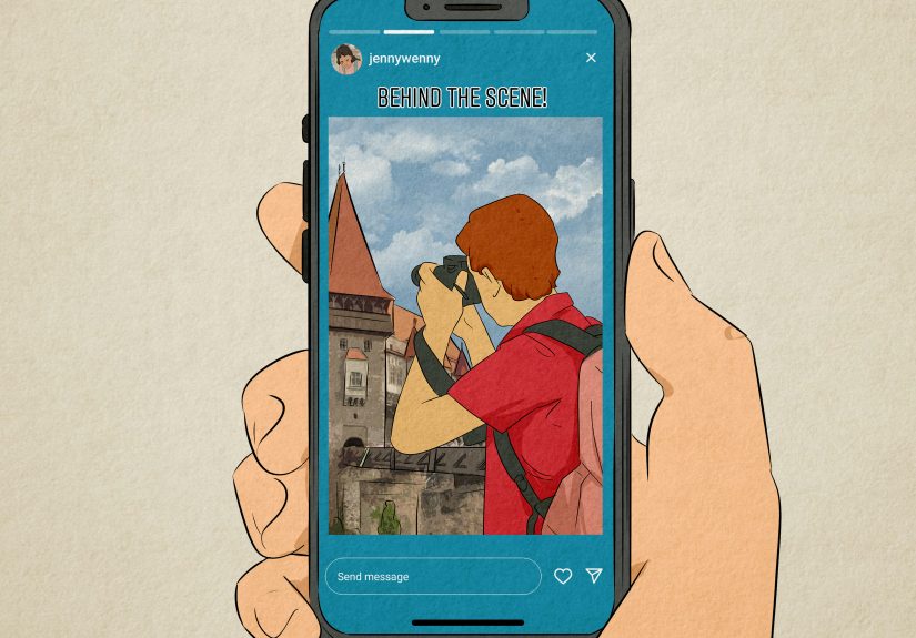
The recommended Instagram Story size is 1080 pixels wide by 1920 pixels tall. This creates a 9:16 aspect ratio, which is the vertical full-screen format used by most modern smartphones.
| Spec | Recommended Setting |
|---|---|
| Instagram Story dimensions | 1080 x 1920 pixels |
| Aspect ratio | 9:16 |
| Orientation | Vertical / portrait |
| Best image formats | JPG or PNG |
| Best video formats | MP4 or MOV |
| Recommended video codec | H.264 in MP4 for broad compatibility |
| Image file size guideline | Keep lightweight; many ad specs allow up to 30 MB |
| Video file size guideline | Keep compressed; many ad specs allow up to 4 GB |
| Safe zone | Keep key text, logos, and CTAs away from the top and bottom edges |
In plain English: build Stories in 1080 x 1920, keep them vertical, export cleanly, and do not put your most important text where Instagram’s buttons and profile information will sit. Instagram is not being rude. It simply has a user interface, and that interface loves to stand exactly where your logo wants to be.
Why Instagram Story Dimensions Matter
Instagram Stories are designed for mobile viewing. Unlike feed posts, which can appear square, portrait, or landscape, Stories fill the entire phone screen. That full-screen format is powerful because it removes distractions. The viewer is not browsing a grid or comparing posts side by side. For a few seconds, your Story owns the screen.
But full-screen placement also means the wrong dimensions become painfully obvious. A horizontal photo may appear with empty space above and below. A square graphic may look tiny unless you redesign the background. A low-resolution image may become blurry. A video exported at the wrong size may be cropped, stretched, or compressed until it looks like it was filmed on a potato with Wi-Fi.
Using the correct Instagram Story dimensions helps you:
- Fill the viewer’s screen without black bars or awkward borders.
- Protect important details from cropping.
- Make text easier to read on small screens.
- Keep brand visuals consistent across organic Stories and Story ads.
- Reduce the risk of quality loss during upload compression.
For brands, creators, agencies, and small businesses, proper sizing is not just a design preference. It affects clarity, trust, engagement, and conversions. A clean Story says, “We planned this.” A messy Story says, “The intern exported this during lunch.” Sometimes the intern is you. No judgment.
Instagram Story Aspect Ratio Explained
The ideal Instagram Story aspect ratio is 9:16. Aspect ratio describes the relationship between width and height. A 9:16 Story is tall and narrow, which matches the way people naturally hold their phones.
The most common mistake is confusing 1080 x 1920 with 1920 x 1080. They use the same numbers, but they are not the same format. 1920 x 1080 is horizontal, usually used for YouTube, TV screens, and landscape video. Instagram Stories want the opposite: 1080 x 1920.
Best Ratio for Full-Screen Stories
Use 9:16 when you want your photo, video, graphic, or ad creative to fill the entire screen. This is the safest choice for product launches, promotions, tutorials, behind-the-scenes clips, event coverage, announcements, and link sticker campaigns.
Can You Upload Other Ratios?
Yes, Instagram can accept different shapes, but the results may not be ideal. A square image may be centered with extra background space. A landscape image may need to be zoomed, cropped, or framed. That can work creatively, but it should be a design decision, not a surprise attack from the upload screen.
If you already have horizontal content, place it inside a 1080 x 1920 canvas. Add a branded background, headline, caption, sticker, or call-to-action above and below the video. This keeps the Story vertical while preserving the original footage.
Best Image Formats for Instagram Stories
For static Instagram Story images, the best file formats are usually JPG and PNG.
Use JPG for Photos
JPG is ideal for photography, lifestyle images, product shots, food photos, travel content, and behind-the-scenes pictures. It keeps file sizes smaller while preserving good visual quality. If your Story is a photo with light text or no text, JPG is often the practical choice.
Use PNG for Text-Heavy Graphics
PNG is better for graphics, logos, screenshots, illustrations, charts, and designs with sharp edges. If your Story includes a lot of text, brand icons, interface screenshots, or transparent elements, PNG can keep those details cleaner.
Image Export Tips
- Export at 1080 x 1920 pixels.
- Use RGB color mode, not CMYK.
- Keep the file size reasonable for fast loading.
- Avoid uploading tiny images and expecting Instagram to magically sharpen them.
- Check text readability on an actual phone before publishing.
A good rule: if the Story is mostly a photo, use JPG. If it is mostly a designed graphic, use PNG. If it is a screenshot of a blurry spreadsheet, maybe ask yourself whether your audience deserves better. They probably do.
Best Video Formats for Instagram Stories
For Instagram Story videos, the most reliable formats are MP4 and MOV. In most workflows, MP4 is the best everyday option because it balances quality, compression, and compatibility across devices.
Recommended Video Settings
| Video Setting | Best Practice |
|---|---|
| Dimensions | 1080 x 1920 pixels |
| Aspect ratio | 9:16 |
| Format | MP4 preferred; MOV also supported |
| Codec | H.264 is widely compatible |
| Frame rate | 30 fps is a safe standard; 60 fps can work for motion-heavy clips |
| Audio | AAC audio is a practical choice for MP4 exports |
| Length | Keep clips short, focused, and easy to understand quickly |
How Long Should an Instagram Story Video Be?
Instagram supports Story videos up to 60 seconds as a single clip in many current publishing flows. That said, shorter is often better. A crisp 7-second product tease can outperform a 48-second monologue that begins with “Hey guys, just hopping on here…” and then takes a scenic route through the creator’s entire morning.
For marketing Stories, aim to hook viewers in the first second or two. Show movement early, use captions when needed, and make the message obvious even if the sound is off. Many people watch Stories in public, at work, in bed, or while pretending to listen to someone explain a group dinner bill.
Instagram Story Safe Zones: Where to Place Text and Logos
The Instagram Story safe zone is the area where important elements are least likely to be covered by app controls. Instagram places profile information, progress bars, buttons, reply fields, stickers, and calls-to-action around the edges of the screen. If your text sits too close to the top or bottom, it may get hidden.
As a practical design rule, keep key content inside the center of the 1080 x 1920 canvas. Leave generous space at the top and bottom. Many designers use roughly 250 pixels of breathing room at the top and bottom for organic Stories. For ads, some teams use even more conservative safe-zone planning because CTA buttons and overlays can take up additional space.
Safe Zone Checklist
- Keep logos away from the very top edge.
- Place headlines in the middle third when possible.
- Avoid putting discount codes near the bottom reply area.
- Keep buttons and arrows above the bottom interface area.
- Preview your Story on a phone before posting or launching an ad.
Safe zones are especially important for ads, product launches, and sales campaigns. If your “Shop Now” message is blocked by Instagram’s own button, you have created a tiny digital traffic jam. The viewer may still understand the idea, but you have made them work harder. On social media, harder usually means “swipe away.”
Best Design Practices for Instagram Stories
Correct Instagram Story specs make your content fit. Good design makes people care. The most effective Stories combine technical accuracy with fast communication, strong visuals, and a clear next step.
Start With One Main Message
Each Story frame should have one job. Promote a sale. Announce a new video. Ask a poll question. Share a testimonial. Show a product feature. Invite people to tap a link. When one Story tries to say six things, it becomes a flyer taped to a moving bus.
Use Big, Readable Text
People watch Stories quickly. Use large type, strong contrast, and short lines. A good headline might be “New Drop Friday” or “3 Tips for Better Sleep.” A weak headline is a paragraph wearing a fake mustache and pretending to be design.
Design for Sound-Off Viewing
Videos should make sense without audio. Add captions, keywords, labels, or visual cues. If someone has to turn on sound to understand the Story, you may lose a portion of your audience before the message lands.
Use Motion With Purpose
Motion grabs attention, but too much animation can feel chaotic. Use movement to reveal a headline, highlight a product, show a transformation, or guide the eye toward a link sticker. Avoid making every object bounce unless your brand personality is “birthday invitation with caffeine.”
Keep Branding Consistent
Use a consistent color palette, typography, logo placement, and visual style. Viewers should recognize your Story before they even read the account name. That does not mean every Story must look identical. It means every Story should feel like it came from the same brand universe.
Instagram Story Examples and When to Use Them
Product Launch Story
Use a 1080 x 1920 vertical product image or video. Place the product in the center, add a short headline near the upper-middle area, and include a clear call-to-action near the lower-middle area. Keep the price, offer, or launch date away from the bottom controls.
Educational Tip Story
Create a simple graphic with one tip per slide. For example, a fitness coach might post “Tip 1: Prep protein first” on one Story and “Tip 2: Schedule workouts like meetings” on the next. This format is easy to tap through and encourages viewers to keep watching.
Behind-the-Scenes Story
Use vertical video shot directly on a phone. Keep the clip natural but steady. Add a short caption so viewers understand what is happening. Behind-the-scenes Stories do not need to look like a Hollywood trailer, but they should still be clear and intentional.
Poll or Question Story
Leave extra space for interactive stickers. Polls, quizzes, sliders, and question boxes can cover important visual areas if you design too tightly. Build the Story background first, then add the sticker where it feels natural and easy to tap.
Link Sticker Story
Use a headline, one benefit, and a visual arrow or design cue that points toward the link sticker. Do not hide the link under a pile of emojis. The goal is not to decorate the internet. The goal is to help people take action.
Common Instagram Story Size Mistakes
Using Landscape Video Without Reframing
Landscape footage can work inside Stories, but it usually needs a vertical layout. Add a headline, background, captions, or supporting graphics. Do not simply upload a horizontal video and hope viewers appreciate the cinematic black bars.
Placing Text Too Close to the Edges
Top and bottom UI elements can cover your content. Always keep important information in the safe zone. This includes prices, coupon codes, dates, usernames, and anything that would make the Story confusing if hidden.
Uploading Low-Resolution Files
A tiny image stretched to 1080 x 1920 will not become crisp. It will become larger blur. Start with high-quality assets whenever possible.
Overloading One Slide
If your Story has a headline, subheading, three paragraphs, five arrows, two stickers, a countdown, a logo, a product photo, and a GIF of a dancing raccoon, it is no longer a Story. It is a digital yard sale. Split dense information into multiple frames.
Ignoring Mobile Preview
Design tools can make everything look spacious on a desktop monitor. A phone screen is much less forgiving. Send a preview to your phone, check text size, and make sure the CTA is visible before publishing.
Organic Stories vs. Instagram Story Ads
Organic Instagram Stories and Story ads use the same vertical foundation: 1080 x 1920 pixels and a 9:16 ratio. However, ads often require more careful planning because they may include CTA buttons, sponsored labels, link destinations, and placement-specific overlays.
For organic Stories, you can be more casual. A quick behind-the-scenes clip, a reposted customer mention, or a spontaneous announcement can work well. For Story ads, every second and every pixel should earn its place. The viewer did not ask for your ad, so your creative needs to be clear, fast, and visually native to the platform.
Story Ad Best Practices
- Lead with the product, benefit, or problem immediately.
- Use vertical creative rather than repurposed horizontal ads.
- Keep copy short and readable.
- Design around CTA overlays and safe zones.
- Test multiple variations instead of betting the budget on one design.
A strong Story ad often feels like a helpful native post, not a billboard that wandered into Instagram wearing a suit. Make it visual, direct, and easy to act on.
How to Create Instagram Stories in Canva, Photoshop, Figma, or Video Editors
Most design tools include Instagram Story templates, but you can also set up the canvas manually.
Step-by-Step Setup
- Create a new document or project.
- Set the canvas size to 1080 x 1920 pixels.
- Use vertical orientation.
- Add guides near the top and bottom for safe-zone awareness.
- Place key content in the center area.
- Export images as JPG or PNG.
- Export videos as MP4 or MOV.
- Preview on a mobile device before posting.
Resizing Existing Content
If you are adapting a feed post, blog graphic, YouTube clip, webinar snippet, or product photo, do not simply stretch it. Instead, rebuild it for vertical viewing. Use the extra vertical space for captions, headlines, icons, or a CTA. A resized Story should feel designed, not dragged into a new shape against its will.
Practical Experience: What Actually Works When Making Instagram Stories
After working with Instagram Story layouts across content calendars, product promos, educational posts, and quick social updates, one lesson becomes obvious: the correct dimensions are only the starting line. The real win comes from designing for how people actually behave. People tap fast. They skim. They watch with one hand. They may be standing in line, riding in a car, half-watching TV, or checking Stories while waiting for coffee. Your Story has to make sense in that messy real-world environment.
The first practical habit is to build a reusable 1080 x 1920 template. This saves time and prevents accidental sizing errors. In that template, add invisible guides for the safe zone. Keep a top margin where profile information and the progress bar will appear. Keep a bottom margin where reply fields, link stickers, and CTA areas may compete for space. Once those guides are in place, designing becomes much easier. You stop guessing and start placing content with confidence.
The second habit is to write less than you think you need. A Story is not a blog post, a brochure, or a tiny billboard with commitment issues. If the message takes more than a few seconds to understand, split it into multiple slides. For example, instead of one crowded Story that says, “Our spring collection is now live, featuring linen shirts, relaxed trousers, weekend bags, and free shipping through Sunday,” use three frames: one for the announcement, one for the product preview, and one for the offer. The pacing feels better, and each slide gets room to breathe.
The third habit is to test Stories on a real phone. Desktop previews lie politely. A headline that looks elegant on a laptop can look like an eye exam on a smartphone. Before publishing, send the file to your phone and view it at normal brightness. Check whether the text is readable, whether faces are blocked, whether the CTA is easy to see, and whether any sticker placement feels awkward. This tiny review step prevents many embarrassing uploads.
The fourth habit is to design with motion carefully. A subtle animated arrow can help people notice a link sticker. A quick product zoom can create energy. Captions appearing line by line can improve comprehension. But if every element flies in from a different direction, viewers may remember the chaos more than the message. Motion should guide attention, not host a circus.
Finally, keep a small library of Story formats that you can reuse: announcement, testimonial, poll, link click, product feature, tip carousel, before-and-after, and behind-the-scenes. When every post starts from a blank canvas, content creation becomes slow. When you have proven layouts ready, you can focus on the message. The best Instagram Story workflow is not complicated. Use the right size, respect the safe zone, keep the message clear, preview on mobile, and give viewers one obvious action. That formula works whether you are promoting a brand, building a creator account, or simply trying to make your lunch photo look less emotionally confusing.
Final Checklist for Instagram Story Dimensions and Formats
- Use 1080 x 1920 pixels for the best Instagram Story size.
- Stick to a 9:16 aspect ratio.
- Use vertical photos and videos whenever possible.
- Export photos as JPG or PNG.
- Export videos as MP4 or MOV, with MP4 as the most practical default.
- Keep text, logos, and CTAs inside the safe zone.
- Use high contrast for readability.
- Preview on a mobile device before posting.
- Keep each Story focused on one main message.
- Design ads with extra attention to CTA overlays and interface elements.
Conclusion
Instagram Story dimensions are simple once you remember the magic numbers: 1080 x 1920 pixels, 9:16 aspect ratio, vertical format. But great Stories need more than correct measurements. They need safe-zone awareness, readable text, clean exports, strong visuals, and a message that lands before the viewer taps away.
Whether you are creating organic Stories, Story ads, product teasers, tutorials, polls, or behind-the-scenes clips, the same principle applies: design for the phone in someone’s hand. Keep it clear. Keep it vertical. Keep the important stuff away from the edges. And please, for the sake of everyone’s thumbs, do not turn one Story slide into a tiny novel.
Use the right Instagram Story specs, choose the best formats, and build a repeatable workflow. Your content will look sharper, feel more professional, and give your audience fewer reasons to squint.