Table of Contents >> Show >> Hide
- How to Pick a Kitchen Color Scheme (Without Losing Your Mind)
- Timeless Kitchen Color Schemes That Age Well
- Color-Forward Kitchen Schemes That Still Feel Livable
- Two-Tone Kitchens: The Shortcut to “Designer”
- Small Kitchen Color Schemes That Make the Space Feel Bigger
- Matching Kitchen Colors with Materials
- Common Kitchen Color Mistakes (And How to Avoid Them)
- Quick Kitchen Color Scheme Pairings (Steal These)
- Conclusion
- Experience Notes: Real-Life Lessons from Choosing Kitchen Color Schemes
Choosing a kitchen color scheme sounds simple until you realize your kitchen has opinions. Strong ones. Your countertops will judge you. Your cabinets will remember your mistakes. And your lighting will happily turn “soft cream” into “mysterious banana” after sunset.
The good news: you don’t need a design degree (or a dramatic fainting couch) to get this right. Whether you want a timeless neutral kitchen palette, bold cabinet colors, or a two-tone kitchen that looks like it came with its own TV crew, this guide breaks down the most popular kitchen color schemes, how to build them, and how to avoid the classic “why does this look weird?” moment.
How to Pick a Kitchen Color Scheme (Without Losing Your Mind)
1) Start with what you can’t (or won’t) change
Before paint swatches take over your life, inventory your “fixed” elements: countertops, flooring, backsplash tile, and big appliances. These materials have undertones (warm, cool, neutral) that quietly dictate what will look harmonious. A bright white cabinet can look crisp next to cool marble, but slightly off next to a warm, creamy granite. Your kitchen isn’t being difficultit’s being consistent.
2) Undertones are the invisible boss of your palette
Two colors can look identical until they stand next to each other. That’s undertone drama. Warm undertones lean yellow, red, or brown. Cool undertones lean blue, green, or gray. Neutral undertones behave (mostly). If your countertop has warm beige or gold movement, warmer whites, greige, taupe, and earthy greens tend to look intentional. If your countertop is icy and cool, crisp whites, blue-grays, charcoals, and cooler greens often make more sense.
3) Lighting changes everythingyes, everything
North-facing kitchens often read cooler and shadowy, so warmer whites and warm neutrals can keep the space from feeling flat. South-facing kitchens get generous warm light; cooler tones can look clean and balanced. If your kitchen relies on artificial lighting, especially warm bulbs at night, test paint samples after dark. The color you love at 11 a.m. can become a different personality at 11 p.m. (The kitchen is allowed to have a night mode.)
4) Use a simple “60–30–10” ratio
This classic interior design rule makes color schemes feel cohesive: 60% dominant (walls/cabinets), 30% secondary (counters/backsplash/island), 10% accent (hardware, stools, decor, small appliances). It’s not math homeworkit’s a way to keep “fun color” from turning into “accidental carnival.”
Timeless Kitchen Color Schemes That Age Well
Warm white + soft black (a forever favorite)
A warm white kitchen (think creamy, not stark) stays bright while feeling welcoming. Add soft black or charcoal through hardware, lighting, or a matte black faucet for contrast. This scheme works in modern farmhouse kitchens, transitional spaces, and sleek contemporary homes because it’s clean without being clinical. Pair it with natural wood (oak, walnut) to keep it from feeling too “showroom.”
Greige + natural wood + brass (the “quiet luxury” vibe)
Greigethose perfectly balanced gray-beige neutralsplays well with both warm and cool elements. Combine greige cabinets or walls with wood tones and brushed brass hardware for a layered, elevated look. This is a great kitchen color scheme if you want warmth without committing to a bold hue.
Soft gray (with texture) + crisp white + charcoal accents
Gray kitchens aren’t “over,” but flat, lifeless gray can feel dated fast. The better move is textured graystone with veining, warm gray paint with depth, or gray in a matte finish paired with crisp white trim and charcoal accents. It reads modern, but still soft enough for everyday living.
Color-Forward Kitchen Schemes That Still Feel Livable
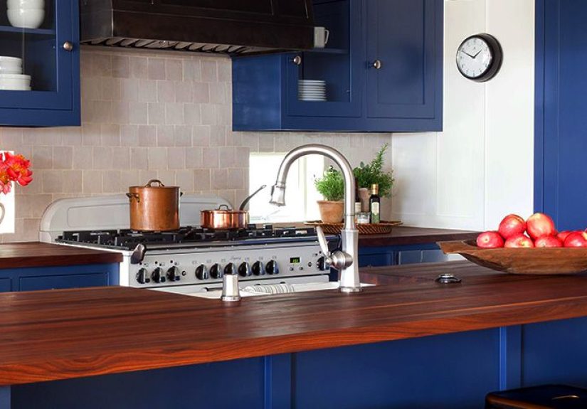
Navy or charcoal blue + white + warm metals
Blue kitchen cabinets are popular for a reason: they feel classic, not trendy-for-a-minute. Navy or a charcoal blue looks especially sharp on an island or lower cabinets, balanced with white uppers or white walls. Warm metals (brass, bronze) keep the palette from feeling cold. Add a white quartz or light stone countertop, and suddenly your kitchen has main-character energybut in a mature, “pays taxes on time” way.
Sage or olive green + cream + natural stone
Green kitchen cabinetsespecially sage and olivework like a color that pretends it’s a neutral. These shades pair beautifully with creamy whites, warm wood, and stone backsplashes. Olive skews warmer and moodier; sage is softer and airier. Either way, green connects to nature, which helps kitchens feel grounded (even if your herb garden is mostly “intentions”).
Smoky teal or blue-green + light wood + brushed nickel
Want a modern kitchen color scheme that isn’t the usual navy? Try smoky teal or a muted blue-green. It’s bold but not loud. Pair it with light wood shelving or a pale oak floor to prevent the space from feeling heavy. Brushed nickel and stainless appliances look particularly at home with these cooler tones.
Butter yellow + warm white + walnut (sunshine, but make it sophisticated)
Yellow can be risky when it’s too bright, but buttery, muted yellow is a warm, nostalgic choice that still feels current. Use it on walls, a pantry door, or even an island, then ground it with warm white cabinetry and darker wood accents like walnut stools or shelving. This scheme is a mood-booster that doesn’t scream for attention.
Terracotta or clay + off-white + matte black
Earthy reds and clay tones bring warmth and characterespecially in kitchens with lots of natural materials. Use terracotta as an accent (backsplash tile, painted island, or even a statement range hood), then keep the rest calm with off-white and matte black details. The result feels curated, not chaotic.
Two-Tone Kitchens: The Shortcut to “Designer”
Make the island the accent (the easiest win)
If you’re nervous about bold color, paint only the island. White perimeter cabinets + a navy, green, or charcoal island is a proven combo because it creates a focal point without dominating the room. Bonus: you can change an island color later with less stress than repainting everything.
Try uppers and lowers in different tones
Two-tone cabinets can also mean darker lowers and lighter uppers. This keeps the room feeling open while adding depth down low. Example pairings: warm white uppers + olive lowers, or light greige uppers + charcoal lowers.
Keep it cohesive with shared materials
The secret to a successful two-tone kitchen is repetition. Repeat one color in small places (bar stools, rug, pendant shades), and unify everything with a consistent countertop or backsplash. The goal is “intentional contrast,” not “two kitchens entered a roommate agreement.”
Small Kitchen Color Schemes That Make the Space Feel Bigger
Choose warm, light neutrals over stark white
In small kitchens, warm off-whites and pale warm neutrals reflect light and reduce harsh contrast. Stark white can work, but it often highlights shadows and makes the space feel colderespecially with limited daylight.
Go tone-on-tone for a seamless look
A monochrome kitchen palettesimilar shades on cabinets and wallsreduces visual breaks and can make a tight space feel calmer and larger. This works beautifully with soft greens, warm whites, and light greige. Add texture through tile, wood, or hardware so it doesn’t feel flat.
Use high contrast strategically
High contrast (like black and white) can look amazing in a small kitchen, but keep it controlled: use black in thin lines (hardware, lighting, faucet) rather than large dark surfaces that absorb light.
Matching Kitchen Colors with Materials
Countertops: let the stone lead
Stone and quartz often contain multiple undertonespull one and echo it in your paint choices. If your countertop has warm veining, choose warmer whites and earthy tones. If it’s cool and crisp, lean into cooler neutrals, blue-grays, or blue-greens. When in doubt, sample paint directly against the countertop in the actual kitchen lighting.
Backsplashes: treat them like jewelry
If your cabinets are neutral, your backsplash can be the statement (patterned tile, zellige texture, bold color). If your cabinets are bold, keep the backsplash calmer (white subway, warm off-white, or a simple stone slab) so the room doesn’t feel busy.
Floors: warm wood changes your paint choices
Warm wood floors make cool whites look icy and sometimes slightly bluish. That’s not a crime, but it is a clue. If you have warm floors, warm whites and warm neutrals usually look more harmonious. With cooler floors (gray tile, concrete), cooler whites and grays can look clean and modern.
Hardware & fixtures: the “third color” you forgot you picked
Brass warms up blues and greens. Polished chrome feels crisp and modern with cool palettes. Matte black adds definition almost anywhere (but looks best when it’s repeated at least twicesay, faucet + pendantsso it doesn’t feel random).
Common Kitchen Color Mistakes (And How to Avoid Them)
- Picking paint first: Choose fixed finishes (countertops, floors) before paint when possible.
- Ignoring undertones: “White” isn’t one color. Compare whites side-by-side to spot warm vs. cool.
- Overdoing trendy shades: Put the boldest color on the island, pantry, or lower cabinets first.
- Forgetting sheen: Cabinets often look best in durable finishes (satin/semi-gloss), walls usually in eggshell.
- Testing too small: Paint large sample boards and move them around the room morning-to-night.
Quick Kitchen Color Scheme Pairings (Steal These)
- If you like modern farmhouse: warm white + matte black + natural oak
- If you like coastal: soft blue + white + sandy beige accents
- If you like classic traditional: cream + deep green + brass + marble look
- If you like modern minimal: off-white + charcoal + stainless + light wood
- If you like eclectic: muted teal + warm white + patterned tile + mixed metals
- If you like “cozy chef”: taupe + clay accent + walnut + warm lighting
Conclusion
The best kitchen color schemes aren’t just prettythey’re practical. They respect your fixed finishes, work with your lighting, and give you a palette that feels good at breakfast and still looks great when you’re eating cereal straight from the box at midnight.
Start with undertones, keep your palette balanced, and use bold colors in controlled ways (islands, lower cabinets, or accents) if you’re not ready to commit. Your kitchen should feel like it belongs to your home and your lifenot like it’s auditioning for a paint commercial.
Experience Notes: Real-Life Lessons from Choosing Kitchen Color Schemes
Here’s what “real kitchens in real houses” teach you fast: paint chips are liars. Not malicious liars, but the kind that leave out important details like how your kitchen faces north, how your LED bulbs skew warm, and how your backsplash tile has a surprise pink undertone that only appears once you’ve bought three gallons of “the perfect white.” So the first lesson is simpletest bigger than you think. A tiny swatch is like judging a movie by a single frame. Paint a large sample board (or two), put it near the cabinets, then move it around. Check it by the sink in daylight, by the stove under task lighting, and near the fridge where shadows gather. You’re not being picky; you’re being smart.
Second: if you’re repainting cabinets, decide what you want them to do. Do you want them to disappear (blend with walls), frame the room (contrast), or become the feature (bold color)? A lot of regret comes from choosing a color because it’s popular, not because it matches the job description. Navy can be gorgeous, but if your kitchen is small and your counters are dark, navy everywhere can feel like you’re cooking inside a moody indie film. In that case, navy on the island only? Chef’s kiss.
Third: warm whites are almost always friendlier than stark whites. Many people chase “clean bright white” thinking it will make the kitchen look bigger, then wonder why it feels cold. Warm off-white reads soft, modern, and welcomingespecially next to wood floors, brass hardware, or creamy stone. If you still want a crisp look, add contrast with black accents and keep the cabinets slightly warm so the room doesn’t feel sterile.
Fourth: your “accent color” needs a support system. If you paint the island green and nothing else hints at green, it can look like the island got bored and moved in from another house. Repeat the accent color subtlybar stools, a runner, a piece of art, even a small appliance. Repetition is what makes a scheme feel designed instead of accidental.
Fifth (and this one is oddly emotional): live with your choice for a minute before you finalize it. People often paint, stand back, and panic because it looks different than they imagined. Give it a few days. Your eyes adjust, your brain stops comparing it to the “before,” and you can judge the color on its own merits. If you still don’t love it after you’ve seen it in every lighting condition, then yes, change it. But don’t let the first 30 seconds decide your fate.
Finally: choose a scheme you can decorate with. Kitchens aren’t just paint and cabinetsthey’re wood cutting boards, fruit bowls, towels, coffee makers, and the inevitable pile of mail. A good kitchen color scheme has enough flexibility that your everyday life doesn’t clash with it. That’s the real win: a kitchen that looks pulled together and lets you be a human who owns groceries.