Table of Contents >> Show >> Hide
- What is the PH Contrast/Kontrast?
- Poul Henningsen in one paragraph (because your ceiling can’t wait)
- Why the Kontrast feels different: it’s “light-technical” on purpose
- How the PH Kontrast lights a room
- Why it’s rare (and why collectors keep hunting it)
- Styling the Kontrast without turning your home into a museum exhibit
- Buying checklist: how to shop smarter for a vintage PH Kontrast
- Kontrast vs. other PH icons: a quick, useful comparison
- FAQ
- Experiences with the PH Contrast/Kontrast (the human side of a very technical lamp)
- Conclusion
Some lights illuminate a room. The PH Contrast (also spelled “PH Kontrast”) illuminates your
relationshipsbecause once you hang it, everyone suddenly has opinions about lighting. And honestly?
That’s a sign you bought the right lamp.
Designed by the Danish master Poul Henningsen for Louis Poulsen, the PH Contrast/Kontrast
is one of those rare, “how is this both engineering and art?” pendants. It’s a mid-century modern statement piece,
but it’s also a very serious optical device that happens to look like a floating sculpture.
What is the PH Contrast/Kontrast?
The PH Contrast/Kontrast is a vintage Danish modern pendant light created in the late 1950s to early 1960s
design period associated with Henningsen’s later work. You’ll see it listed as “PH Contrast,” “PH Kontrast,” or
simply “Kontrast” depending on the dealer and language. In most descriptions, it’s recognized as a
multi-layered, slatted/ringed pendant made in painted and polished metal, designed to shape and
soften light rather than blast it into your eyes.
Many vintage listings describe it as no longer in production and often connect that to its
unusually complex constructionbasically: it’s gorgeous, it’s fussy, and it was too labor-intensive to keep making
at scale. In collector terms, that translates to: harder to find, more debated, and frequently adored.
Poul Henningsen in one paragraph (because your ceiling can’t wait)
Poul Henningsenoften called “PH”spent his career obsessed with a problem most of us only notice after we’re
already squinting: glare. As electric bulbs became common, he pushed for lighting that felt comfortable,
controlled, and human. Museums and design institutions have documented how he approached lighting as a mix of
aesthetics and scienceshaping beams, softening shadows, and controlling the view of the light source.
His best-known contribution is the PH shade system (the family of multi-shade lamps that directs light
where it’s useful while preventing that “bare bulb interrogation” vibe). Many of his designslike PH table lamps,
the PH 5, and the PH Artichokebecame modern design icons and appear in major museum/design-store collections.
Why the Kontrast feels different: it’s “light-technical” on purpose
The PH Contrast/Kontrast is often described as one of Henningsen’s more technically ambitious pendants because it
doesn’t rely on a single simple shade. Instead, it uses a layered construction that manipulates light in stages:
reflect, diffuse, redirect, repeat. The goal is not “bright.” The goal is pleasant.
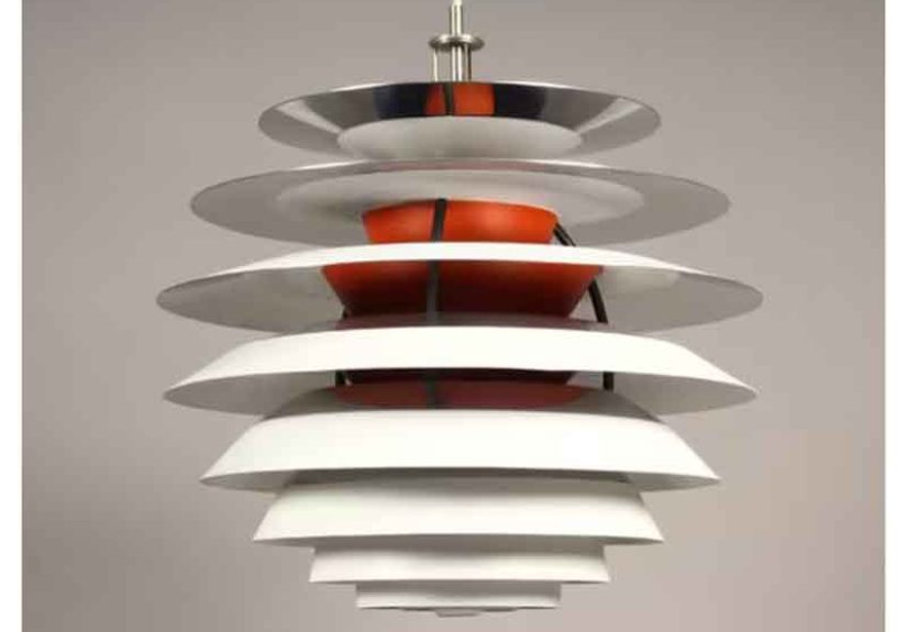
The ring-and-slat architecture
Many descriptions characterize the Kontrast as a multi-part metal constructionoften described as
rings or slatsbuilt to break up the bulb’s direct line of sight. That matters because glare is essentially the
lamp “showing you the source” at the wrong angle. The Kontrast’s geometry makes that difficult, which is a polite
way of saying: it refuses to bully your eyeballs.
Color that’s doing a job, not just looking cute
A recurring detail in vintage descriptions is the use of white surfaces paired with accents like
orange and blue and sections of polished metal. This isn’t random decoration. Color inside a
shade subtly influences perceived warmth, contrast, and shadow softness. A warm accent can make downlight feel
inviting (especially over a dining table), while cooler accents can keep the overall look crisp and modern.
An adjustable light source (yes, the mood can be tuned)
One of the most intriguing features often mentioned is that the light source height can be adjusted,
changing the way the lamp throws light. That’s a very Henningsen move: he didn’t want lighting to be one fixed
“on/off” event. He wanted a tool you could calibratelike sliding a dimmer, but mechanically.
How the PH Kontrast lights a room
Here’s what “layered light” means in real life: the lamp creates a focused pool of illumination where you need it
(tables, work surfaces, conversation zones), while also producing softer surrounding light that keeps the room from
feeling like a stage spotlight. Many PH-family lamps are celebrated for this balancedownward light plus ambient
side glowbecause comfort lives in the middle.
Over a dining table
The Kontrast shines (pun fully intended) when you hang it over a table. The layered construction helps keep the
bulb hidden from most seated angles, which reduces harsh highlights on faces and glossy surfaces. Translation:
your food looks better, your guests look kinder, and your table stops reflecting a tiny sun.
In an entryway or stairwell
In tall or transitional spaces, the Kontrast can act like a sculptural centerpiece that also provides functional
light. The ringed form reads strongly from below and from the sideso it doesn’t disappear when you walk past it.
It becomes an “object in space,” not just a utility.
In a living room with mixed lighting
If your space already has floor lamps and sconces, the Kontrast can be the “ceiling anchor” that ties everything
together. Because it’s engineered for comfort, it pairs well with warmer accent lighting. It’s less “club lighting”
and more “good conversation lighting.”
Why it’s rare (and why collectors keep hunting it)
Multiple vintage sources describe the PH Contrast/Kontrast as discontinued and point to the complexity
of its construction as a reason it became expensive to produce. Some listings place its production run across
decades and note that it’s now harder to come by than more continuously produced PH icons.
If you browse the vintage market, you’ll notice two things quickly: (1) sellers love describing it as a “classic,”
and (2) condition and originality matter a lot. Because it’s a multi-part piece with painted and polished elements,
dents, repainting, missing labels, or messy rewiring can affect both value and light quality.
Styling the Kontrast without turning your home into a museum exhibit
The Kontrast works best when you treat it like what it is: a sculptural pendant that also happens to be very good
at lighting. You don’t need a fully Scandinavian interior (though the lamp won’t complain if you do).
Pair it with honest materials
Oak, walnut, linen, leather, stone, and matte-painted walls all play nicely with the Kontrast’s mix of polished and
painted surfaces. The lamp’s “contrast” theme looks best when the room also has a bit of texture and restraint.
Mind the scale
Many PH pendants feel “right” when the diameter relates sensibly to the surface below. As a practical example:
for a medium dining table, you generally want a pendant that reads substantial but doesn’t dominate. If the Kontrast
feels visually busy in your space, raising it slightly (and relying on layered lighting elsewhere) can calm things
down.
Use the adjustable light source like a pro
If your Kontrast has the adjustable feature described in many vintage notes, experiment. Raise the source for a
softer, broader effect; lower it for more concentrated downlight. Think of it as “manual mood lighting,” minus the
existential dread of choosing a smart bulb app.
Buying checklist: how to shop smarter for a vintage PH Kontrast
-
Provenance and labels: Many authentic pieces have manufacturer marks/labels, but vintage items can lose
stickers over time. Ask for detailed photos and history when possible. -
Condition of slats/rings: Look for straight elements and consistent spacing. Minor wear is normal; major
deformation can change the light effect. -
Paint quality: Original finishes usually have a specific character (not overly glossy, not obviously
modern re-spray). Repainting can flatten the intended contrast. -
Wiring and safety: Many vintage lamps are rewired for modern standards. Confirm socket type, grounding,
and whether it’s compatible with your region’s electrical setup. -
Bulb choice: Warm LEDs often flatter the Kontrast’s interior accents. Avoid ultra-cool bulbs unless you
want your dinner to feel like a surgical consultation.
Kontrast vs. other PH icons: a quick, useful comparison
If you already know the PH universe, the Kontrast sits in a fascinating spot:
-
PH 5: Famous for its glare-control shade logic and everyday versatility. The Kontrast is rarer and more
sculptural, with a “collector” vibe. -
PH Artichoke: Dramatic, leaf-like layers and a major centerpiece. The Kontrast shares the idea of hiding
the source and shaping reflections, but in a more geometric, ringed language. -
PH Snowball: Another later pendant that emphasizes controlled reflection. The Kontrast tends to read more
architectural because of its segmented construction.
FAQ
Is “PH Contrast” different from “PH Kontrast”?
In most contexts, they refer to the same model, with spelling varying by language and listing conventions. When
shopping, focus on construction details and manufacturer attribution rather than the spelling alone.
Is it a good everyday light, or is it just a statement piece?
Both. It’s engineered to be comfortable, but it’s also visually assertive. If you want a pendant that disappears,
the Kontrast is not your introvert. If you want a pendant that makes a room feel designedeven when it’s offit’s a
strong candidate.
Why do people call PH lamps “glare-free”?
Because the geometry is designed to limit direct view of the bulb and to redirect light through reflections and
diffusion. Many PH-family products are explicitly described in retail and museum contexts as glare-reducing or
glare-free due to their multi-shade systems and reflective engineering.
Experiences with the PH Contrast/Kontrast (the human side of a very technical lamp)
People who live with a Kontrast often describe a specific kind of delight that’s hard to explain until you see it
in a real room: the lamp doesn’t just “turn on,” it arranges the air. That sounds dramatic, but lighting is
basically emotional architecture, and the Kontrast is an architect with opinions.
A common first experience is noticing how the lamp behaves when it’s off. In daylight, it reads as a floating
objectgraphic and structuredalmost like a piece of mid-century industrial sculpture. You walk into the room and
your eye goes up automatically, the way it does with good art. The Kontrast gets credit for the room’s “taste”
before it even does its main job. That’s unfair to your furniture, but furniture will have to cope.
Then, the first night you switch it on, the surprise is how non-aggressive it feels. Many people are used to
ceiling fixtures that blast light straight down, creating hard shadows and shiny highlights (especially if you have
a glossy table, quartz counters, or that one framed photo that always reflects the bulb like it’s trying to signal
planes). The Kontrast tends to make light feel composed. The bulb isn’t performing; it’s being managed.
Over a dining table, owners often notice something subtle: faces look better. Not in a “filter” way, but in a “why
does this feel calmer?” way. That’s usually glare control plus soft, layered distribution. People linger longer.
Conversation stretches. The lamp becomes the quiet reason dessert happens. (Lighting has power. Use it responsibly.)
Another experience people mention is the joy of tweaking the effect. If your Kontrast allows changing the
light source height, it becomes a practical experiment: raise it a bit and the room feels broader; lower it and
the table becomes more intimate. It’s like having two pendants in one, without having to store an extra lamp in
your closet like a guilty secret.
There’s also the “guest moment.” Someone inevitably asks, “What is that?”and you get to say “Poul Henningsen,”
which is a phrase that instantly makes you sound like you read design magazines recreationally. Even if you don’t,
it’s fine. The lamp can carry the persona for you.
Living with it long-term, people often appreciate how it plays with seasons. In winter, warmer bulbs make the
interior accents feel cozy and the shadows softer. In summer, with more daylight, the lamp’s form becomes more of a
sculptural object than a mood machine. Either way, the Kontrast keeps doing what great design does: it stays useful
while quietly making the room feel more intentional.
Finally, the most practical experience: it can change how you think about “brightness.” Many owners stop chasing
the brightest possible bulb and start chasing the best possible quality of light. And that might be the most
Henningsen outcome of all.
Conclusion
The PH Contrast/Kontrast is a rare kind of object: a vintage Danish modern pendant that looks like sculpture
but behaves like a carefully tuned lighting instrument. It reflects Poul Henningsen’s lifelong missionturning
electric light from harsh utility into comfortable, human-centered atmospherewhile adding its own bold, geometric
personality. If you want a statement that also treats your eyes with respect, the Kontrast earns its reputation.