Table of Contents >> Show >> Hide
- What the Pinterest Palette Is (and Why People Actually Care)
- The Big Theme: Bold, Expressive ColorWith a Safety Net
- Color #1: Cherry Red The “Make It a Moment” Shade
- Color #2: Butter Yellow The Soft Glow That Makes Rooms Look Happier
- Color #3: Aura Indigo Lilac, But Make It Otherworldly
- Color #4: Dill Green Yes, It’s Inspired by Pickles (and It Works)
- Color #5: Alpine Oat The Neutral That Makes Everything Else Look Intentional
- How These Colors Fit the Bigger 2025 Color-Trend Picture
- 3 Ready-to-Use Color Combos for a Vibrant (But Livable) 2025
- How to Use the Pinterest Palette in Branding, Content, and Marketing
- Common Mistakes (So Your “Vibrant 2025” Doesn’t Become “Why Is This So Loud?”)
- A Simple Weekend Plan to Try the Pinterest Palette
- Conclusion: The Pinterest Palette Is Basically Permission to Have Fun Again
- of Real-World “Experience” with the Pinterest Palette (What It Feels Like to Live With These Colors)
If you’ve felt personally victimized by yet another “safe neutral” mood board, Pinterest just showed up with a bright, slightly unhinged fruit basketand honestly, it’s refreshing.
The platform’s Pinterest Palette for 2025 doesn’t whisper. It winks, it pops, it orders a fun mocktail and convinces your living room to do the same.
The headline: a vibrant 2025 that still feels livable. Think statement reds, playful butter yellows, cosmic purples, pickle-adjacent greens, and one cozy neutral that keeps the whole party from turning into a clown car.
What the Pinterest Palette Is (and Why People Actually Care)
The Pinterest Palette is essentially Pinterest turning its massive trend radar into five “colors you’re about to see everywhere.” It’s built from how people search, save, and engage on the platformthen matched with Pin color data to identify which shades are gaining momentum over time.
Translation: it’s not just a designer guessing. It’s a preview of what millions of people are already quietly planning for their homes, closets, and manicures.
The 2025 Pinterest Palette spotlights five trending colors:
Cherry Red, Butter Yellow, Aura Indigo, Dill Green, and Alpine Oat.
They’re meant to show up across categoriesinteriors, fashion, beauty, food styling, packaging, branding, and content creationbecause color trends don’t respect industry boundaries. (Color said, “I contain multitudes,” and then showed up on your sofa and your nails.)
The Big Theme: Bold, Expressive ColorWith a Safety Net
Here’s what makes this palette feel different from random “loud color” predictions: it’s not a neon takeover. It’s specific color with personalitypunchy accents balanced by grounded, cozy elements.
In other words: 2025 isn’t “paint everything bright red.” It’s “add a cherry-red lamp like a wink,” then calm it down with oatmeal-toned linen and wood.
If you’ve been flirting with color but commitment feels scary, this palette is basically color therapy:
one statement shade + one playful shade + one moody shade + one fresh green + one neutral that holds your hand.
Quick-glance: The 2025 Pinterest Palette, decoded
| Color | Vibe | Where it shines | Easy “try it” move |
|---|---|---|---|
| Cherry Red | Confident, classic, attention-grabbing | Accents, fashion staples, statement decor | Swap in red throw pillows or a bold vase |
| Butter Yellow | Warm, whimsical, nostalgic | Kitchens, bathrooms, spring styling | Try yellow cookware or a soft-yellow runner |
| Aura Indigo | Cosmic, dreamy, “lilac with an edge” | Bedrooms, beauty looks, creative spaces | Add purple-toned bedding or iridescent decor |
| Dill Green | Fresh, tangy, unexpectedly cool | Kitchens, cabinetry, cocktails, “preppy dark” rooms | Start with green dishware or a plant-heavy vignette |
| Alpine Oat | Cozy, layered, modern neutral | Whole-home base color, textures, minimal-to-boho | Introduce rattan, chunky knits, or oat-toned baskets |
Color #1: Cherry Red The “Make It a Moment” Shade
Cherry Red is the palette’s main character. It’s bold, timeless, and basically impossible to ignore (like that friend who says, “Let’s take one cute photo,” and suddenly you’re in a three-hour shoot).
Pinterest ties this to the “cherry-coded” vibepopping up in style, beauty, and home accents.
How to use Cherry Red in the home (without living in a lipstick tube)
- Accent strategy: Choose one “hero” iteman armchair, a bar cart, a lamp, or even a backsplash detail.
- Trim or micro-moments: Red looks expensive when it’s deliberate: painted trim, a red interior door, or a small gallery wall frame set.
- Textile layering: A red throw + patterned rug with a tiny red thread = cohesive, not chaotic.
Cherry Red pairing ideas
- Cherry Red + Alpine Oat: bold + calm (the palette’s “power couple”).
- Cherry Red + Dill Green: preppy, playful contrast that feels curated.
- Cherry Red + Aura Indigo: moody and artsygreat for bedrooms or creative studios.
Pro tip: If red scares you, start with something you can movelike a vase, a tray, or a throw. Color confidence is built, not installed.
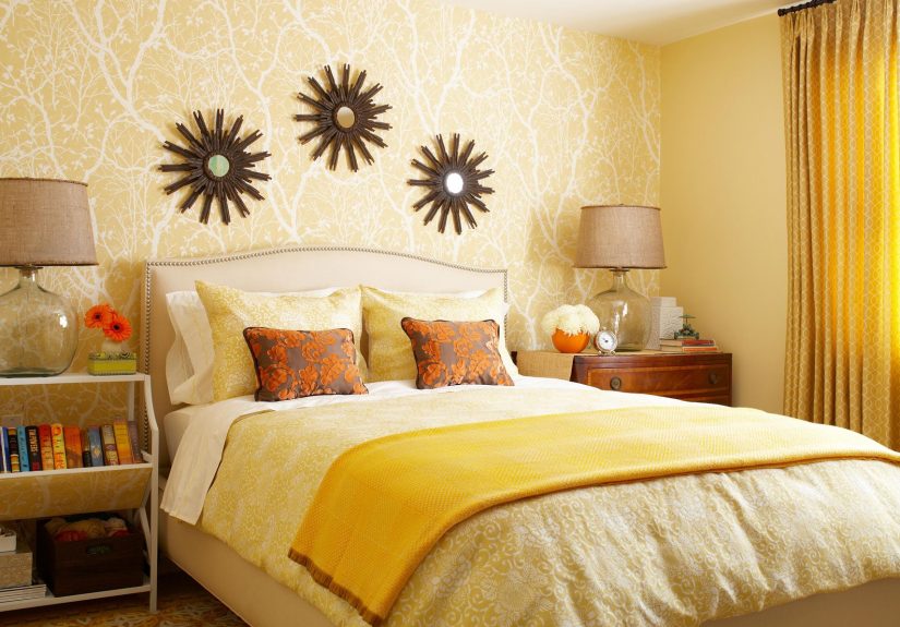
Color #2: Butter Yellow The Soft Glow That Makes Rooms Look Happier
Butter Yellow is the warm, whimsical shade that doesn’t feel juvenile or fluorescent. It’s tied to playful aesthetics (think doll-like details, surreal touches, and even a fisherman-inspired charm),
which explains why it shows up as both “cozy vintage” and “modern quirky” depending on styling.
Where Butter Yellow works best
- Kitchens: cookware, small appliances, tiled details, cafe curtains, or a buttery island.
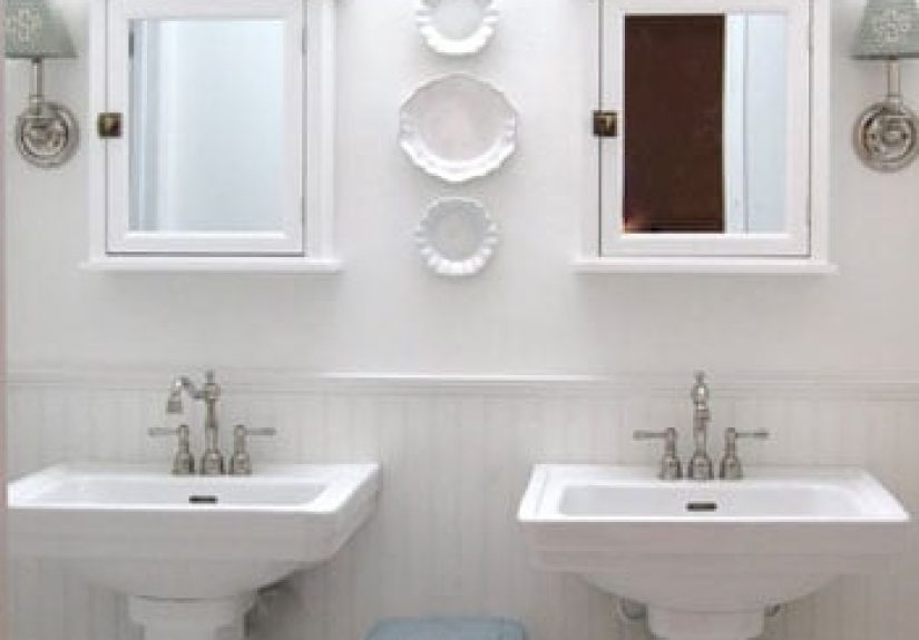
- Bathrooms: shower curtains, towels, or a pale-yellow paint that reads sunny instead of sterile.
- Entryways: a light yellow wall can make a small space feel open and inviting.
How not to mess it up (lovingly)
Yellow changes dramatically in different lighting. On walls, it often looks brighter than you expectso test a few samples and don’t be shy about going a shade lighter.
Butter Yellow is best when it reads creamy, not “highlighter had a bad day.”
Butter Yellow pairing ideas
- Butter Yellow + Dill Green: cheerful and organiclike a kitchen garden, but cuter.
- Butter Yellow + Aura Indigo: a dreamy contrast that feels modern and slightly surreal.
- Butter Yellow + Alpine Oat: soft-on-soft, perfect for calm minimal spaces.
Color #3: Aura Indigo Lilac, But Make It Otherworldly
Aura Indigo is the moody, cosmic curveball. It’s a lilac-leaning tone with depthPinterest frames it as perfect for “otherworldly” styling, including beauty looks like mermaid-inspired makeup and manicures.
In interiors, it’s the color that says: “Yes, I do own a candle collection. No, you may not judge me.”
How to bring Aura Indigo into your space
- Bedrooms: purple-toned sheets, a quilt, or curtains can add softness without committing to paint.
- Accent wall: Aura Indigo can feel magical as a single statement wallespecially paired with warm neutrals.
- Texture trick: Combine with opalescent or pearly finishes (mother-of-pearl, glass, metallic accents) for that “aura” effect.
Aura Indigo pairing ideas
- Aura Indigo + Alpine Oat: calm and elevatedgreat for a “quiet luxury” vibe with personality.
- Aura Indigo + Cherry Red: bold, editorial, and artsyuse in small doses for major impact.
Color #4: Dill Green Yes, It’s Inspired by Pickles (and It Works)
Dill Green is energetic and unexpected, and Pinterest links it to “pickle”-inspired culture momentsshowing up in kitchens, living rooms, and even cocktails.
The surprise factor is exactly why it feels fresh: it’s green, but not the predictable “safe sage.” It’s tangy.
How to use Dill Green without turning your home into a deli
- Cabinet moment: This shade is incredible on cabinetry, especially with glossy or lacquered finishes.
- Double-drenching: Pair Dill Green with a deeper forest green for a layered, academic look (think “preppy dark academia,” but with better snacks).
- Soft launch: If you’re cautious, start with dishware, linens, or velvet upholstery.
Dill Green pairing ideas
- Dill Green + Butter Yellow: sunny, playful, garden-fresh.
- Dill Green + Cherry Red: bold contrast that feels styled, not accidental.
- Dill Green + Alpine Oat: nature-forward calmperfect for living rooms and offices.
Color #5: Alpine Oat The Neutral That Makes Everything Else Look Intentional
Alpine Oat is your “new neutral” base: warm, cozy, and built for layering. Pinterest positions it as the palette’s anchorsomething you can build around in both wardrobe and home.
It’s not cold gray. It’s not stark white. It’s that latte-and-linen zone where everything looks more expensive than it probably was.
How to style Alpine Oat like a pro
- Texture stacking: rattan furniture, bamboo blinds, chunky knit throws, woven baskets.
- Blend old and new: vintage lace + modern lighting = cozy, curated contrast.
- Make it a backdrop: Alpine Oat is perfect for letting Cherry Red, Aura Indigo, or Dill Green take the spotlight.
If you only adopt one thing from the Pinterest Palette, make it this: pick a warm neutral base, then add color on purpose.
That’s how vibrant looks “designer,” not “accident at the paint counter.”
How These Colors Fit the Bigger 2025 Color-Trend Picture
Pinterest isn’t predicting color in a vacuum. Across the broader design world, many 2025 forecasts lean into warmth, depth, and personalitythink rich browns, plums, and layered palettes rather than flat gray minimalism.
Some major paint brands are emphasizing nuanced, cozy tones (hello, “quietly colorful” palettes), while others are offering multi-color capsules designed to mix-and-match.
What Pinterest adds is the cultural spark: these shades are connected to aesthetics and behaviors people are already savingfashion microtrends, nostalgic styling, “foodie” color inspiration, and mood-based design.
The result is a palette that feels both trend-aware and useful.
Practical takeaway
If you’re designing a room, a brand identity, product packaging, or even just your spring wardrobe, treat the Pinterest Palette like a “starter kit”:
pick one anchor (Alpine Oat) + one statement (Cherry Red) + one mood (Aura Indigo) + one freshness (Dill Green) + one warmth boost (Butter Yellow).
3 Ready-to-Use Color Combos for a Vibrant (But Livable) 2025
1) Warm & Modern: Alpine Oat + Butter Yellow + Cherry Red
Use Alpine Oat on large surfaces (walls, rugs, sofa). Add Butter Yellow in mid-sized pieces (chairs, bedding, kitchen accents).
Finish with Cherry Red as the “jewelry”: a lamp, art detail, or a single bold accessory.
2) Moody & Magical: Alpine Oat + Aura Indigo + Brass/Opal Accents
This is for anyone who wants a bedroom or office that feels calming but not bland. Aura Indigo adds depth; Alpine Oat keeps it warm.
Add pearly textures or warm metals to get that dreamy “aura” glow.
3) Playful & Fresh: Dill Green + Butter Yellow + Natural Wood
Perfect for kitchens, breakfast nooks, and creative spaces. Dill Green brings energy, Butter Yellow adds cheer, and wood tones keep it grounded.
Toss in a few plants and you’ve basically built serotonin with furniture.
How to Use the Pinterest Palette in Branding, Content, and Marketing
If you’re a creator or business, these colors aren’t just “pretty.” They can guide campaign styling, product photography, packaging, and seasonal rollouts.
Pinterest even frames the Palette as a tool for creative professionalshelping brands align visuals with what audiences are already drawn to.
Smart, non-cringe ways to apply it
- Campaign styling: Use one palette color as the “thread” across props, wardrobe, and backgrounds for instant cohesion.
- Monochrome moments: A product shot where everything is Butter Yellow (with texture variation) can stop scrolls without screaming.
- Seasonal mapping: Butter Yellow for spring, Dill Green for summer kitchens, Cherry Red for holiday or romance, Aura Indigo for fall/winter mood, Alpine Oat year-round.
- Accessibility check: Make sure text contrast worksespecially with Butter Yellow and Alpine Oat backgrounds. Pretty should still be readable.
Common Mistakes (So Your “Vibrant 2025” Doesn’t Become “Why Is This So Loud?”)
- Going full saturation everywhere: Pick one “hero” zone per room. Let the rest support it.
- Ignoring undertones: Cherry Red and Aura Indigo can swing warm or cool depending on lighting and surrounding finishes.
- Forgetting texture: Alpine Oat only looks rich when you layer materialslinen, wood, ceramics, knits, woven pieces.
- Skipping test samples: Especially with yellow and purple. Your light bulbs have opinions.
A Simple Weekend Plan to Try the Pinterest Palette
- Pick your anchor: Start with Alpine Oat textures (rug, throw, baskets, curtains) to warm the base.
- Add one color in small doses: Choose Cherry Red or Dill Green for accessories you can move.
- Introduce a second color as a bridge: Butter Yellow in the kitchen or Aura Indigo in the bedroom works beautifully.
- Photograph it: If it looks good on camera, it usually means your contrast and balance are working.
of Real-World “Experience” with the Pinterest Palette (What It Feels Like to Live With These Colors)
Here’s the funny thing about color trends: they sound dramatic in theory, but in practice they’re usually a series of small, oddly satisfying upgrades that make your day feel smoother. Imagine trying the Pinterest Palette like a low-stakes experimentless “total home makeover,” more “let’s see if my living room can flirt.”
Day 1: Alpine Oat shows up first. You don’t announce it. You just swap in oatmeal-toned pillow covers and a textured throw that looks like it belongs in a boutique hotel lobby. Suddenly the room feels calmer, like it started drinking water and doing Pilates. Nothing is loud yet, but everything looks more intentional. Even the random chair in the corner stops looking like it’s waiting for an intervention.
Day 2: Butter Yellow sneaks inmaybe as a tea towel, a little vase, or (if you’re brave) a soft yellow runner in the kitchen. This is when people start saying things like, “Why does it feel sunnier in here?” even though the weather is doing its usual nonsense. Butter Yellow has a way of making everyday routines feel lighter. Making toast becomes a small event. You’ll catch yourself smiling at a yellow mug like it told you a joke.
Day 3: Cherry Red is the confidence booster. It could be a bowl on the coffee table, a single statement candle, or a red lamp that turns on and immediately says, “We are not boring.” The magic is that you don’t need much. One pop of Cherry Red makes neutrals look sharper and warmer colors look richer. It’s the visual equivalent of adding lipstick or a great pair of shoessuddenly the whole outfit makes sense.
Day 4: Aura Indigo changes the mood. In a bedroom, it might be a purple-toned duvet or curtains that shift color as the light changes. At night, it feels cozy and a little dreamylike you live inside a playlist. In the daytime, it can read fresh and creative instead of heavy. People who “don’t do purple” often discover they actually don’t do bright purple. Aura Indigo is more nuanced; it’s the color that makes your room feel like it has a secret hobby.
Day 5: Dill Green is the surprise hit. It’s especially good in kitchens and dining spaces, where green reads lively and appetizing. Even small touchesgreen dishes, a table runner, cabinet hardware near a plantmake the space feel more energetic. It’s the kind of color that makes guests say, “This is coolwhat is this shade?” while pretending they’re not taking mental notes for their own homes.
After a week, the “experience” is less about living in a rainbow and more about living in a space that feels awake. The Pinterest Palette works because it encourages contrast: cozy + bold, playful + grounded, moody + warm. And once you feel how much a few strategic colors can shift the vibe, you’ll never look at an all-gray room the same way again. (No offense to gray. You had a great run.)