Table of Contents >> Show >> Hide
- Collapse vs. Hide: Which One Do You Actually Need?
- How to Collapse Columns in Excel: 7 Steps
- Step 1: Set up a “summary” column (so collapsing actually makes sense)
- Step 2: Select the columns you want to collapse
- Step 3: Group the selected columns
- Step 4: Collapse the group (the satisfying part)
- Step 5: Add nested groups for multi-level collapsing (up to 8 levels)
- Step 6: Fix outline direction and missing buttons (so Excel stops playing hide-and-seek)
- Step 7: Ungroup cleanlyand troubleshoot “stuck hidden” columns
- Specific Examples You Can Copy Into Real Work
- Common Problems (and Fast Fixes)
- When Collapsing Columns Is the Right Move (and When It Isn’t)
- Conclusion
- Experiences: What Collapsing Columns Looks Like in Real Life
Big Excel sheets have a special talent: they look totally reasonable while you’re building them… and then, the moment you try to present them, they turn into a horizontal scroll marathon. If you’ve ever thought, “I just need these columns to politely disappear until I ask for them,” you’re in the right place.
In Excel, “collapsing columns” usually means using Groups/Outlines so you can expand and collapse a section with a click (or a shortcut). This is different from hiding columns, which is more like putting tape over your spreadsheet’s mouth: it works, but it’s not exactly presentation-friendly.
Collapse vs. Hide: Which One Do You Actually Need?
Before we jump into the steps, here’s the quick decision:
- Use Group/Outline (Collapse) when you want a clean “show details / hide details” toggle with plus/minus buttons and outline levels. Great for reports, budgets, dashboards, and anything you’ll revisit.
- Use Hide when columns should stay out of sight (helper columns, temporary cleanup, sensitive info you don’t want casually visible). It’s finejust less elegant for frequent expand/collapse.
For most “collapse columns in Excel” situations, grouping is the star. So let’s make your spreadsheet behave.
How to Collapse Columns in Excel: 7 Steps
Step 1: Set up a “summary” column (so collapsing actually makes sense)
Collapsing columns works best when you have a summary view and a detail view. For example, you might have monthly columns (detail) and quarterly totals (summary). When you collapse the monthly columns, the quarterly totals remain visiblelike a spreadsheet magic trick that’s actually useful.
Example layout:
- Q1 Total (summary)
- Jan, Feb, Mar (detail columns you’ll collapse)
- Q2 Total (summary)
- Apr, May, Jun (detail)
If you don’t have a summary column, you can still group and collapseExcel won’t stop youbut the result may feel like hiding a hallway by closing the door to the room you’re standing in.
Step 2: Select the columns you want to collapse
Click the first column letter, then drag across to select multiple columns (for example, select Jan–Mar). If you love keyboard efficiency:
- Select an entire column: click any cell in that column, then press Ctrl + Spacebar.
- Select multiple adjacent columns: select the first column, then hold Shift and use the arrow keys (or drag across headers).
The key is selecting the detail columns you want to collapse, not the summary column you want to keep visible.
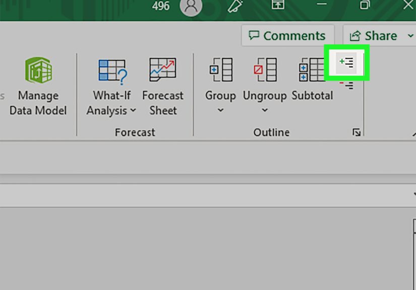
Step 3: Group the selected columns
Go to the Data tab on the Ribbon. In the Outline section, click Group. Excel will create a bracket over your selected columns and add outline controls (the little plus/minus buttons).
Prefer shortcuts? On Windows, a common one is Alt + Shift + Right Arrow to group selected rows/columns. If you selected cells (not full columns), Excel may ask whether you want to group rows or columnschoose Columns.
Small but important note: Excel also has a “Group” on the Page Layout tab for grouping shapes/objects. That’s not the one you want for collapsing columns. The outline grouping lives on the Data tab.
Step 4: Collapse the group (the satisfying part)
Once grouped, you’ll see a minus (–) button near the grouped columns (usually above the column letters). Click the minus (–) to collapse/hide the detail columns. Click the plus (+) to expand them again.
You can also use outline level buttons (often 1, 2, 3) to jump between summary and detail views. For example, clicking 1 might show only high-level totals, while 2 shows the next layer of detail.
Keyboard fans: Excel supports outline show/hide shortcuts too, so you can collapse or expand without touching the mouse. (Yes, you can absolutely become the kind of person who collapses columns with the confidence of a concert pianist.)
Step 5: Add nested groups for multi-level collapsing (up to 8 levels)
If your sheet is complexsay you want to collapse months into quarters, and quarters into a yearly viewyou can create nested groups. Group smaller sections first (months), then group larger sections (quarters). Excel supports multiple outline levelsup to eight.
Example nesting strategy:
- Group Jan–Mar (collapse months inside Q1)
- Group Apr–Jun (collapse months inside Q2)
- Then group the entire Q1 section, and the entire Q2 section (collapse quarters)
This is especially helpful for finance models, sales reporting, editorial calendars, or any spreadsheet where you want a “zoomed out” view and a “show me everything” view without reformatting the sheet every time.
Step 6: Fix outline direction and missing buttons (so Excel stops playing hide-and-seek)
Two common “wait, where did the collapse buttons go?” issues are:
- Outline symbols aren’t showing: Excel can hide outline symbols at the worksheet level. Turn them back on in Excel Options (and you can also toggle outline symbol display with a shortcut in many setups).
- Groups collapse the “wrong” way: You can change whether summary columns appear to the right or left of detail columns using Outline settings. This matters a lot if you want the bracket and +/- controls to appear exactly where your eyes naturally look.
Practical tip: If your outline looks backwards (like it’s collapsing the wrong side of your report), check the Outline settings and the placement of your summary columns. Once configured, your groups behave more predictably across the sheet.
Step 7: Ungroup cleanlyand troubleshoot “stuck hidden” columns
To remove a group, select the grouped columns and go to Data → Ungroup. Keyboard shortcut lovers often use Alt + Shift + Left Arrow to ungroup.
One sneaky issue: if you ungroup while the details are collapsed, the detail columns can sometimes remain hidden. If that happens, don’t panicjust unhide the columns the normal way: select the adjacent visible column letters, then use Home → Format → Hide & Unhide → Unhide Columns.
If your goal is “collapse for viewing” (not permanent hiding), it’s usually best to expand the group first, then ungroup. Think of it as returning borrowed library books before canceling your library card.
Specific Examples You Can Copy Into Real Work
Example 1: Budget report (Monthly detail → Quarterly summary)
You have Jan–Dec columns plus quarterly totals. Group Jan–Mar, Apr–Jun, Jul–Sep, Oct–Dec. When presenting, collapse the month groups so only quarterly totals show. When analyzing, expand months to find where expenses ballooned (spoiler: it’s usually “subscriptions”).
Example 2: Project tracker (Task-level detail → Phase summary)
Create phase summary columns (e.g., “Discovery Summary,” “Build Summary”) and group the columns containing detailed tasks, estimates, and notes. Collapse during status meetings so stakeholders see clean progress, then expand later when you need to remember why Week 3 was “complicated.”
Example 3: Dashboard sheet (Helper columns you want available, not visible)
If you use helper columns for calculations (lookups, intermediate steps, flags), group them instead of hiding them. That way, you can expand to debug formulas and collapse for a clean dashboard viewwithout the “where did my columns go?” guessing game.
Common Problems (and Fast Fixes)
“Group is greyed out.”
- Make sure you’re on Data → Group (Outline grouping), not object grouping on another tab.
- Check whether the worksheet/workbook is protected or restricted in a way that disables outlining.
- If Auto Outline is failing, try manual grouping first (Auto Outline can be picky depending on structure).
“I grouped columns, but I can’t see the plus/minus buttons.”
- Enable outline symbols in Excel options for that worksheet.
- Try toggling outline symbols (this is often a quick shortcut fix).
- If it only happens on one sheet, remember: outline symbol display can be worksheet-specific.
“My group collapses, but the summary is on the wrong side.”
- Move the summary column so it sits consistently to the right or left of detail columns.
- Adjust outline direction settings so Excel places controls where you expect.
When Collapsing Columns Is the Right Move (and When It Isn’t)
Grouping and collapsing columns is perfect when you want to control visibility without deleting context. But if you’re trying to summarize thousands of rows or build interactive reporting, consider:
- PivotTables for fast aggregation and drill-down.
- Excel Tables for structured references and easy filtering.
- Power Query if your “spreadsheet” is really a data pipeline wearing gridlines as a disguise.
Still, for day-to-day reporting, collapsing columns is one of the highest return-on-effort tools in Excel. It’s simple, it’s visual, and it makes you look like you have your life togethereven if your formulas say otherwise.
Conclusion
If you remember nothing else, remember this: Grouping creates a toggle. Hiding creates a mystery. With grouping, your spreadsheet becomes easier to read, easier to present, and easier to maintain. Use the 7 steps above to group detail columns, collapse them with the outline controls, and build multi-level views that make big sheets feel manageable.
Your future self (and your coworkers who hate horizontal scrolling) will thank you.
Experiences: What Collapsing Columns Looks Like in Real Life
The first time most people “discover” collapsing columns in Excel, it’s not during a calm, well-planned productivity session. It’s usually mid-meeting, five minutes into screen sharing, when someone says, “Can you zoom in?” and you realize zooming in turns the sheet into a text-message-width strip of sadness. That’s when grouping becomes less of a feature and more of a lifeline.
One common scenario is budgeting. You start with a clean plan: twelve monthly columns, tidy categories, a couple of totals. Then reality shows upnew categories appear (“software,” “more software,” “software we forgot we had”), departments want separate breakouts, and suddenly your budget sheet is wide enough to qualify as a zip code. Grouping months into quarters is the moment the sheet becomes presentable again. You collapse Jan–Mar, and instantly the room can see Q1 totals without squinting. Then, when the inevitable question arrives “Why did marketing spike in February?”you expand the group, answer it, and collapse again. It feels like switching camera lenses: wide shot for the story, zoom for the detail, back to wide before anyone gets motion sickness.
Another real-life use is project tracking. Many teams keep “helper” columns: risk flags, dependency notes, internal comments, calculation columns, and status codes that are meaningful to the spreadsheet owner but overwhelming to everyone else. If you hide them, they stay hidden… until someone filters or copies the sheet and the hidden columns reappear at the worst possible time, like a jump-scare in a horror movie. Grouping those columns solves the social problem, not just the technical one. You collapse the helper columns so the main timeline and deliverables are front and center. When you need to debug a status or confirm a dependency, you expand the group privately, do the check, and collapse again. It keeps the spreadsheet honest without forcing everyone to stare at the plumbing.
The best “experience hack” is building a habit: when you add new detail columns, immediately decide whether they belong in an existing group. If you wait, you’ll end up with the spreadsheet equivalent of a junk drawer: useful items everywhere, but no easy way to tidy up fast. On the flip side, don’t over-group. If everything is nested eight levels deep, you’ll spend more time expanding and collapsing than actually working. A practical sweet spot is two levels: a clean summary view and a detailed view.
Finally, collapsing columns shines when sharing files. Before sending a workbook to a client or stakeholder, many people do a “presentation pass”: collapse groups, set the view to the summary level, and make the sheet instantly readable. It’s a small touch that changes how professional the file feels. Instead of dumping raw detail on the reader, you’re guiding them: “Here’s the story at a high levelexpand when you want receipts.” That’s not just Excel skill; it’s communication skill with gridlines.